Chapter Eight
Visual Objects and Data Objects
The object metaphor is pervasive in the way we think about information, no matter how abstract. Object-oriented programming is one example; the body politic is another. Object-related concepts are also basic in modern systems design. A modular system is one that has easily understood and easily replaced components. Good modules are plug compatible with one another; they are discrete and separate parts of a system. The concept of a module has a lot in common with the perceptual and cognitive structures that define visual objects. This suggests that visual objects may be an excellent way to represent modular system components. A visual object provides a useful metaphor for encapsulation and cohesiveness, both important concepts in defining modular systems.
In purely visual terms, an object can be thought of as any identifiable, separate, and distinct part of the visual world. Information about visual objects is cognitively stored in a way that ties together critical features, such as oriented edges and patches of color and texture, so that they can be identified, visually tracked, and remembered. Because visual objects cognitively group visual attributes, if we can represent data values as visual features and group these features into visual objects, we will have a very powerful tool for organizing related data.
Two radically different types of theory have been proposed to explain object recognition. The first is image based. It proposes that we recognize an object by matching the visual image with something roughly like a snapshot stored in memory. The second type is structure based. It proposes that objects are analyzed in terms of primitive three-dimensional (3D) forms and the structural interrelationships between them. Both of these models have much to recommend them, and it is entirely plausible that each is correct in some form. It is certainly clear that the brain has multiple ways of analyzing visual input. Both models provide interesting insights into how to display data effectively. We begin with the image-based theory of object recognition and examine some evidence supporting it.
Image-Based Object Recognition
The image-based theory is supported by the fact that people have a truly remarkable ability to recognize pictorial images they have seen before. In an arduous experiment, Standing et al. (1970) presented subjects with 2560 pictures at a rate of one every 10 seconds. This was like the family slide show from hell; it took more than 7 hours spread over a 4-day period to show them all. Amazingly, when subsequently tested, subjects were able to distinguish pictures from others not previously seen with better than 90% accuracy.
It is important to make a distinction between recognition and recall. We have a great ability to recognize information that we have encountered before, as the picture memory experiment of Standing et al. shows. However, if we are asked to reconstruct visual scenes—for example, to recall what happened at a crime scene—our performance is much worse. Recognition is much better than recall. People did not really remember all of those pictures; they were only able to say, tentatively, that they might have seen them.
People can also recognize objects in images that are presented very rapidly. Suppose you asked a group of people “Is there a dog in one of the following pictures?” and then showed them a set of images, rapidly, all in the same place, at a rate of 10 per second. Remarkably, they will be able to detect the presence, or absence, of a dog, somewhere in the sequence of images most of the time. This experimental technique is called rapid serial visual presentation (RSVP). Experiments have shown that the maximum rate for the ability to detect common objects in images is about 10 images per second (Potter & Levy, 1969; Potter, 1976). We should interpret this result cautiously. Although interesting, it does not mean that people processed more than a small amount of information from each image.
A related phenomenon is attentional blink. If, in a series of images, a second dog were to appear in an image within 350 ms of the first, people do not notice it (or anything else). This moment of blindness is the attentional blink (Coltheart, 1999). It is conjectured that the brain is still processing the first dog, even though the image is gone, and this prohibits the identification of other objects in the sequence.
More support for image-based theories comes from studies showing that three-dimensional objects are recognized most readily if they are encountered from the same view direction as when they were initially seen. Johnson (2001) studied subjects’ abilities to recognize bent pipe structures. Subjects performed well if the same viewing direction was used in the initial viewing and in the test phase. They performed poorly if a different view direction was used in the test phase, but they were also quite good at identification from exactly the opposite view direction. Johnson attributed this unexpected finding to the importance of silhouette information. Silhouettes would have been similar, although flipped left-to-right from the initial view.
Although most objects can easily be recognized independent of the size of the image on the retina, image size does have some effect. Figure 8.1 illustrates this. When the picture is seen from a distance, the image of the Mona Lisa face dominates; when it is viewed up close, smaller objects become dominant: A gremlin, a bird, and a claw emerge. Experimental work by Biederman and Cooper (1992) suggests that the optimal size for recognizing a visual object is about 4 to 6 degrees of visual angle. This gives a useful rule of thumb for the optimal size for rapid presentation of visual images so that we can best see the visual patterns contained in them.

Figure 8.1 When the image is viewed from a distance, the face dominates, but when looked at from 30 cm the gremlin hiding in the shadows of the mouth and nose emerges. At this distance, the gremlin has a visual angle of about 4 degrees, optimal for seeing a pattern. Adapted from the work of the Tel Aviv artist Victor Molev.
[G8.1] For optimal identification, make important patterns and complex objects so that they have a size of approximately 4 to 6 degrees of visual angle. This is not a rigid requirement, as there is only a gradual falloff in skill as we depart from the optimal.
Priming
If you identify something, even if it is a fleeting meaningless encounter, you will identify it faster if you see it again in the near future (Bartram, 1974). This effect is called priming. Most studies of priming involve intervals between the two events of minutes or hours, but Cave and Squire (1992) showed priming effects for picture naming that lasted for weeks.
Priming effects can occur even if information is not consciously perceived, and because of this priming is sometimes called implicit memory. Bar and Biederman (1998) exposed pictorial images to subjects so briefly that it was impossible for them to identify the objects. They followed the brief image exposure with what is called a visual mask, a random pattern shown immediately after the target stimulus to remove the target from the visual iconic store (a short-term buffer that holds the visual image for a fraction of a second), and they rigorously tested to show that subjects performed at chance levels when reporting what they had seen. Nevertheless, 15 minutes later, this unperceived exposure substantially increased the chance of recognition. Although the information was not consciously perceived, exposure to the particular combination of image features apparently primed the visual system to make subsequent recognition easier. They found that the priming effect decreased substantially if the imagery was displaced sideways. They concluded that the mechanism of priming is highly image dependent and not based on high-level semantic information.
Lawson et al. (1994) devised a series of experiments in which subjects were required to identify a specified object in a series of briefly presented pictures. Recognition was much easier if subjects had been primed by visually similar images that were not representations of semantically related objects. They argued that this should not be the case if objects are recognized on the basis of a high-level, 3D structural model of the kind that we will discuss later in this chapter; only image-based storage can account for their results. All of this adds support to the image-based theory of object recognition, because the effects are based on two-dimensional (2D) image information.
Also adding support to the multiple-view, image-based theory of object recognition is neurophysiological evidence from recordings of single cells in the inferotemporal cortexes of monkeys. Perrett et al. (1991) discovered cells that respond preferentially to particular views of faces. Figure 8.2 shows some of their results. One cell (or cell assembly) responds best to a three-quarter view of a face; another to profiles, either left or right; still another to a view of a head from any angle. We can imagine a kind of hierarchical structure, with the cell assemblies that respond to particular views feeding into higher level cell assemblies that respond to any view of the object.
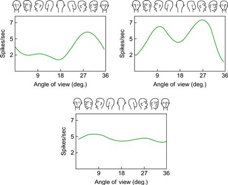
Figure 8.2 The responses of three neurons in the temporal cortex of a monkey to faces in different orientations. At the top left is a cell most sensitive to a right profile; the right cell responds well to either profile; the cell at the bottom responds to a head irrespective of orientation.
Searching an Image Database
Presenting images rapidly in sequence (RSVP) may be a useful way to allow users to scan picture databases (Wittenburg et al., 1998; de Bruijn et al., 2000). The fact that people can search rapidly for an image in a sequence of up to 10 pictures per second suggests that presenting images using RSVP may be efficient. Contrast this with the usual method of presenting image collections in a regular grid of small thumbnail images. If it is necessary to make an eye movement to fixate each thumbnail image, it will not be possible to scan more than three to four images per second. Even though RSVP seems promising, there are a number of design problems that must be solved in building a practical interface. Once a likely candidate image is identified as being present in an RSVP sequence, the particular image must be extracted from the set. By the time a user responds with a mouse click several images will have passed, more if the user is not poised to press the stop button. Thus, either controls must be added for backing up through the sequence, or part of the sequence must be fanned out in a conventional thumbnail array to confirm that candidate’s presence and study it further (Wittenburg et al., 1998; Spence, 2002).
Rapid serial presentation may also provide a way of searching video content by viewing a rapidly presented sequence of selected frames (Tse et al., 1998). Wildemuth et al. (2003) suggested that a speed up of 64× faster than the original video may be optimal in allowing viewers to get the gist of what is occurring. Video data compressed in this way might make it possible to review a day’s worth of video in a few minutes.
Life Logging
It is becoming possible to have a personal memory data bank containing video and audio data collected during every waking moment through the course of a person’s lifetime. This can be achieved with an unobtrusive miniature camera, perhaps embedded in a pair of eyeglasses, and, assuming continuing progress in solid-state storage, the data can be stored in a device weighing a few ounces and costing a few hundred dollars (Gemmel et al., 2006). The implications of such life logging devices seem profound at first encounter; they appear to represent the ultimate memory aid—the user need never forget anything.
A key issue, though, is the interface to the stored data. If we want to recall a meeting we know happened sometime in 2004 we clearly cannot replay the entire year’s worth of data to find the event, even very fast. But the most serious problem for the life logging concept is that seeing a video replay is not at all the same as remembering. A replay of some forgotten event, such as a meeting, will be more akin to a re-experience, one that occurs without the context of the goals of the person involved, even if it is oneself. When people review their own videos, they do not spontaneously remember what happened; instead, they must mentally reconstruct it (Sellen et al., 2007). A meaningful reconstruction of a particular meeting may require a review of videos of other activities for weeks prior to the event, together with relevant documents and e-mail communications between the participants. The result is that a reconstruction of a single meeting might take days of work if a well-designed interface to the data is available.
Such arguments have led researchers to suggest that the main value of life logging is to jog the memory of the participant rather than being a substitute for memory. Accordingly, a study by Sellen et al. (2007) investigated the value of video imagery in helping people recall personal events using their SenseCam system. They found that a few days later SenseCam imagery roughly doubled the number of events that could be recalled, from two to four, for a particular half-day interval.
Another SenseCam application that has been explored is its use as an aid for the memory impaired. A trial was conducted in collaboration with a woman who had damage to the hippocampus area, a part of the brain that is involved in the ability to form long-term memories. In a comparison between careful note taking, the use of SenseCam video, and no aids, the SenseCam approach proved most effective, but the method involved the woman reviewing recent videos with her husband to construct meaning from them. So, again, it was not the video itself that provided the memory; rather, it was the video being used as a tool in the active construction of memories.
Overall, the research results suggest that video imagery can indeed help to support memory to some extent, but it does not provide anything close to perfect recall.
Structure-Based Object Recognition
Image-based theories of object recognition imply a rather superficial level of analysis of visual objects, but there is evidence that a much deeper kind of structural analysis must also occur. Figure 8.3 shows two novel objects, probably never seen by the reader before. Yet, despite the fact that the images in Figure 8.3(a) and (c) are very different from one another, they can be rapidly recognized as representations of the same object. No image-based theory can account for this result; it can only be based on a structural analysis of the relationships of the component parts.

Figure 8.3 The object shown in (a) seems most similar to the object shown in (c), despite the fact that the images of (a) and (b) are most similar.
Geon Theory
Figure 8.4 provides a somewhat simplified overview of a neural network model of structural object perception, developed by Hummel and Biederman (1992). This theory proposes a hierarchical set of processing stages leading to object recognition. Visual information is decomposed first into edges, then into component axes, oriented blobs, and vertices. At the next layer, 3D primitives such as cones, cylinders, and boxes, called geons, are identified. A selection of geons is illustrated in Figure 8.5(a). Next, the structure is extracted that specifies how the geon components interconnect; for example, in a human figure, the arm cylinder is attached near the top of the torso box. Finally, object recognition is achieved.
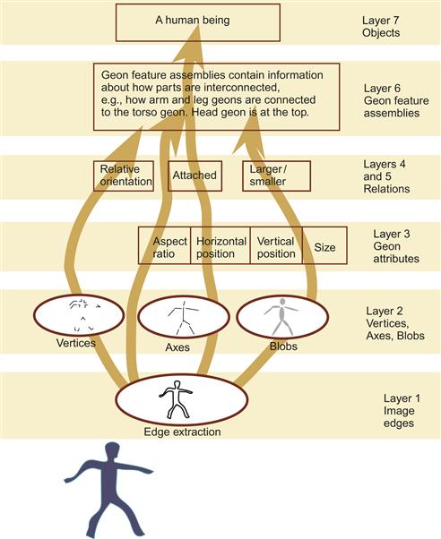
Figure 8.4 A simplified view of Hummel and Biederman’s (1992) neural network model of form perception.
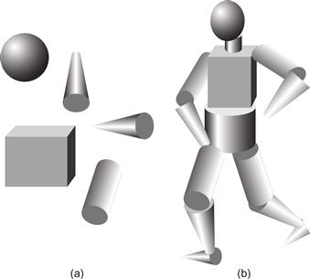
Figure 8.5 According to Biederman’s geon theory, the visual system interprets 3D objects by identifying 3D component parts called geons. (a) A sample of geons. (b) A human figure constructed from geons.
Silhouettes
Silhouettes appear to be especially important in determining how we perceive the structure of objects. The fact that simplified line drawings are often silhouettes may, in part, account for our ability to interpret them. At some level of perceptual processing, the silhouette boundaries of objects and the simplified line drawings of those objects excite the same neural contour extraction mechanisms. Halverston (1992) noted that modern children tend to draw objects on the basis of the most salient silhouettes, as did early cave artists. Many objects have particular silhouettes that are easily recognizable—think of a teapot, a shoe, a church, a person, or a violin. These canonical silhouettes are based on a particular view of an object, often from a point at right angles to a major plane of symmetry. Figure 8.6 illustrates canonical views of a teapot and a person.

Figure 8.6 Many objects have canonical silhouettes, defined by the viewpoints from which they are most easily recognized. In the case of the man, the overall posture is unnatural, but the component parts—hands, feet, head, etc.—are all given in canonical views.
David Marr suggested ways in which the brain might use silhouette information to extract the structures of objects (Marr, 1982). He argued that “buried deep in our perceptual machinery” are mechanisms that contain constraints determining how silhouette information is interpreted.
Three rules are embedded in this perceptual machinery:
1. Each line of sight making up a silhouette grazes the surface exactly once. The set of such points is the contour generator. The idea of the contour generator is illustrated in Figure 8.7.
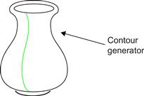
Figure 8.7 According to Marr, the perceptual system makes assumptions that occluding contours are smoothly connected and lie in the same plane. Adapted from Marr (1982).
2. Nearby points on the contour of an image arise from nearby points on the contour generator of the viewed object.
3. All the points on the contour generator lie on a single plane.
Under Marr’s default assumptions, contour information is used in segmenting an image into its component solids. Marr and Nishihara (1978) suggested that concave sections of the silhouette contour are critical in defining the ways in which different solid parts are perceptually defined. Figure 8.8 illustrates a crudely drawn animal that we nevertheless readily segment into head, body, neck, legs, and so on. The most important features for this segmentation are concavities in the silhouette. Marr and Nishihara also proposed that the axes of the parts become cognitively connected to form a structural skeleton, so the object description consists of component parts and a description of how they are connected.

Figure 8.8 Concave sections of the silhouette define subparts of the object and are used in the construction of a structural skeleton. Redrawn from Marr & Nishihara (1978).
One of the consequences of structural theories of perception is that certain simplified views should be easier to read. There are practical advantages to this; for example, a clear diagram may sometimes be more effective than a photograph. This is exactly what Ryan and Schwartz (1956) showed when they found that a hand could be perceived more rapidly in the form of a simplified line drawing than in the form of a photograph (see Figure 8.9), but this result should not be overgeneralized. Other studies have shown that time is required for detailed information to be perceived (Price & Humphreys, 1989; Venturino & Gagnon, 1992). Simplified line drawings may be most appropriate only when rapid responses are required.

Figure 8.9 A photograph and a simplified line drawing of a hand. Ryan and Schwartz (1956) showed that a cartoon drawing was recognized more rapidly than a photograph.
Although image-based theories and structure-based theories of object recognition are usually presented as alternatives, it may be that both kinds of processes occur. If geons are extracted based on concavities in the silhouette, certain views of a complex object will be much easier to recognize. Further, it may well be that viewpoint-dependent aspects of the visual image are stored in addition to the 3D structure of the object. Indeed, it seems likely that the brain is capable of storing many kinds of information about an object or scene if they have some usefulness. The implication is that, even though 3D objects in a diagram may be more effective in some cases, care should be taken to provide a good 2D layout. Both image-based cues and structural cues should be clearly presented.
The Object Display and Object-Based Diagrams
Wickens (1992) is primarily responsible for the concept of an object display as a graphical device employing a “single contoured object” to integrate a large number of separate variables. Wickens theorized that mapping many data variables onto a single object will guarantee that these variables are processed together, in parallel. This approach, he claimed, has two distinct advantages. The first is that the display can reduce visual clutter by integrating the variables into a single visual object. The second is that the object display makes it easier for an operator to integrate multiple sources of information.
Generally, object displays will be most effective when the components of the objects have a natural or metaphorical relationship to the data being represented. Figure 8.10 shows an object display developed for anesthesiologists working in operating theaters. It is the responsibility of anesthesiologists to monitor the output from a large number of sensors attached to a patient and from the reading to infer the state of the patient, especially relating to the delivery of oxygen to the brain through the cardiovascular system. George Blike and his coworkers developed a display that maps these instrument readings to a set of complex glyphs as illustrated in the figure (Blike et al., 1999). The central glyph represents the heart and this incorporates four different measurements. The height of the glyph represents the volume pumped by a single heart-beat, and its width represents the heart rate (number of beats per minute). The glyph size is an emergent property showing overall heart throughput. The bowing or bulging of the sides of the heart object is produced from two cleverly transformed measurements, the pulmonary wedge pressure (PWP) and the central venous pressure (CVP), representing the pressure in the left- and right-hand sides of the heart, respectively. These control the degree of convexity or concavity on each side of the glyph in such a way that a concave shape is the result of too low pressure and a convex shape is the result of too high pressure. This provides an intuitive visual metaphor for these variables. The display enables an anesthesiologist to rapidly diagnose problems such as an embolism (blockage) or hemorrhage, and the laterality of the bulge or concavity indicate where they are occurring. In an evaluation study comparing this display with a more conventional display, errors were reduced by 66%.
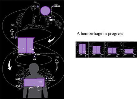
Figure 8.10 A geon diagram design for use by anesthesiologists (Blike et al., 1999). © Draeger Medical Systems, Inc. All rights reserved. Not to be reproduced without written permission.
In the Blike design, the object display has a number of clear advantages. It can reduce accidental misreadings of data values. Mistakes are less likely because components act as their own descriptive icons. In addition, the structural architecture of the system and the connections between system components are always visible, and this may help in diagnosing the causes and effects of problems.
The disadvantage of object displays is that they lack generality; an object display must be custom designed for each specific application, which means that they are only appropriate when a great deal of effort can be devoted to a careful design. Object displays should be validated with a user population to ensure that the data representation is clear and properly interpreted. This requires far more effort than displaying data as a table of numbers or a simple bar chart.
[G8.2] Consider using an object display where standardized sets of data must be repeatedly analyzed and where the data can be mapped to semantically meaningful objects.
The general properties of an effective object display are summarized in the following guidelines.
[G8.3] Design object displays in such a way that numbers are tied to recognizable visual objects representing system components.
[G8.4] Design object display layouts using connecting elements that clearly indicate the physical connections between components of a system.
[G8.5] Design object display glyphs to have emergent properties revealing the effect of important interactions between variables.
[G8.6] Design object display glyphs to become more salient when critical values are reached in the data.
The Geon Diagram
Biederman’s geon theory, outlined earlier, can be applied directly to object display design. If cylinders and cones are indeed perceptual primitives, it makes sense to construct diagrams using these geon elements. This should make the diagrams easy to interpret if a good mapping can be found from the data to a geon structure. The geon diagram concept is illustrated in Figure 8.11(b). Geons are used to represent the major components of a compound data object, whereas the architecture of the data object is represented by the structural skeleton linking the geons. The size of a geon becomes a natural metaphor for the relative importance of a data entity, or its complexity or relative value. The strength of the connections between the components is given by the neck-like linking structures. Additional attributes of entities and relationships can be coded by coloring and texturing.
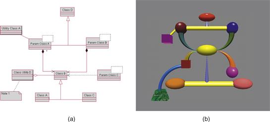
Figure 8.11 (a) Unified Modeling Language (UML) diagram. (b) Geon diagram constructed using a subset of Biederman’s geon primitives. Both diagrams show the same set of entities and relationships.
We evaluated the geon diagram concept in a comparison with Unified Modeling Language (UML) diagrams (Irani et al., 2001). UML is a widely used, standardized diagramming notation for representing complex systems. Equivalent diagrams were constructed by matching geon elements to UML elements, as shown in Figure 8.11(a). We found that when the task involved rapid identification of substructures in a larger diagram, participants performed both faster and with only half the errors using the geon diagrams. Another experiment showed that geon diagrams were easier to remember.
In Biederman’s theory, surface properties of geons, such as their colors and textures, are secondary characteristics. This makes it natural to use the surface color and texture of the geon to represent data attributes of a data object. The important mappings between data and a geon diagram are as follows.
Although the geon diagram is a 3D representation, there are reasons to pay special attention to the way it is laid out in 2D in the x, y plane. As discussed earlier, some silhouettes are especially effective in allowing the visual system to extract object structure. A commonsense design rule is to lay out structural components principally on a single plane. A diagramming method resembling the bas-relief stone carvings common in classical Rome and Greece may be optimal. Such carvings contain careful 3D modeling of the component objects, combined with only limited depth and a mainly planar layout.
[G8.7] Consider representing system components using geons—simple 3D shaded objects such as spheres, cylinders, cones, and boxes.
[G8.8] Consider using the color and surface texture of geons to represent secondary attributes of represented entities.
[G8.9] Consider using a geon-based diagram in instances where the diagram is relatively simple, fewer than 30 components, and where entities and relationships must be shown.
[G8.10] Consider representing relationships between components by means of joints between objects. Tubes can be used to express certain types of relations. A small geon attached to a larger geon can show that it is a component part.
[G8.11] Consider using geon shapes to represent the primary attribute of represented entities.
[G8.12] When creating 3D diagrams, lay out system components as much as possible in a 2D plane orthogonal to the line of sight. Be sure that connections between diagram components are clearly visible.
Abstract semantics may be expressible, in a natural way, through the way geons are interconnected. In the everyday environment there is meaning to the relative positioning of objects that is understood at a deep, possibly innate level. Because of gravity, above is different from below. If one object is inside another transparent object, it is perceived either as contained by that other object or as a part of it. Irani et al. (2001) suggested that the semantics inherent in the different kinds of relationships of real-world objects might be applied to diagramming abstract concepts. Based on this idea, the researchers developed a set of graphical representations of abstract concepts. Some of the more successful of these mappings are illustrated in Figure 8.12 and listed as follows. Only some of these are given formal status as guidelines.
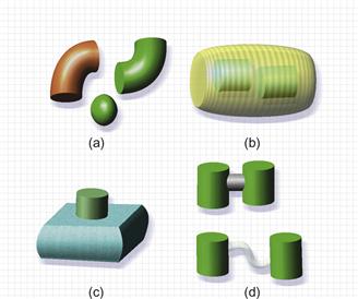
Figure 8.12 Certain spatial relationships between objects can readily represent abstract concepts. (a) That objects belong to the same class is better shown by shape than by color. (b) A part-of relationship. (c) A dependency relationship. (d) Strong and weak relationships.
• Sometimes we wish to show different instances of the same generic object. Geon theory predicts that having the same shape should be the best way of doing this. Geon shape is dominant over color, which is a secondary attribute. Thus, the elbow shapes in Figure 8.12(a) are seen as two instances of the same object, whereas the two green objects are not.
• Having an object inside another transparent object is a natural representation of a part-of relationship. The inside objects seem part of the outside object, as seen in Figure 8.12(b).
[G8.13] When creating 3D diagrams, consider placing an object inside a second transparent object to express a part-of relationship.
• One object above and touching another, as shown in Figure 8.12(c), is easily understood as representing a dependency relationship.
• A thick bar between two objects is a natural representation of a strong relationship between two objects; a thinner, transparent bar represents a weak relationship. See Figure 8.12(d).
[G8.14] When creating diagrams showing entities and relationships, use properties such as size and thickness to represent the strength of the relationship between entities.
Faces
Faces are special objects in human perception. Infants learn about faces faster than they learn about other objects. We are born with visual systems primed to learn to recognize important humans, especially our own mothers (Bushnell et al., 1989; Morton & Johnson, 1991; Bruce & Young, 1998). A specific area of our brains, the right middle fusiform gyrus, is critically important in face perception (Puce et al., 1995; Kanwisher et al., 1997; Kanwisher et al., 1999). This area is also useful for recognizing other complex objects, such as automobiles. Faces have an obvious importance in communication; we use facial expressions to communicate our emotion and degree of interest. Cross-cultural studies by Paul Ekman and coworkers strongly suggest that certain human expressions are universal communication signals, correctly interpreted across cultures and social groups (Ekman & Friesen, 1975; Ekman, 2003). Ekman identified six universal expressions: anger, disgust, fear, happiness, sadness, and surprise. These are illustrated in Figure 8.13, along with determination and elation (a variation on happiness).
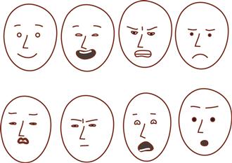
Figure 8.13 Happiness, elation, anger, sadness, disgust, determination, fear, and surprise.
The motion of facial features is also important in conveying emotion. Animated images are necessary to convey a full range of nuanced emotion; it is especially important to show motion of the eyebrows (Basilli, 1978; Sadr et al., 2003). Both static and dynamic facial expressions are produced by the contractions of facial muscles, and the facial action coding system (FACS) is a widely applied method of measuring and defining groups of facial muscles and their effect on facial expression (Ekman et al., 1988).
The eyebrows and mouth are particularly significant in signaling emotions, but the shape of the eyes is also important. There is evidence that false smiles can be distinguished from true smiles from the particular expression around the eyes that occurs with the contraction of a muscle that orbits the eye (Ekman et al., 1988; Ekman, 2003). This muscle contracts with true smiles but not with false ones. According to Ekman (2003) it is difficult, if not impossible, to control this voluntarily and thus fake a “true” smile.
The main application of FACS theory in computer displays has been in the creation of computer avatars that convey human emotion (Kalra et al., 1993; Ruttkay et al., 2003). Appropriate emotional expression may help make a virtual salesperson more convincing. In computer-aided instruction, the expression on a human face could reward or discourage. The little symbols called emoticons, such as Θ and Λ, commonly used in text messaging take advantage of the ease with which we recognize emotions even when expressed using the most rudimentary graphics.
[G8.15] For perceptually efficient and compact expressions of human emotion, consider using small glyphs representing simplified faces. These are likely to be especially effective in conveying the basic emotions of anger, disgust, fear, happiness, sadness, and surprise.
Among the earlier examples of object displays are Chernoff faces, named after their inventor, Herman Chernoff (1973). In his technique, a simplified image of a human face is used as a display. Examples are shown in Figure 8.14. To turn a face into a display, data variables are mapped to different facial features, such as the length of the nose, the curvature of the mouth, the size of the eye, the shape of the head, etc. Jacob et al. (1976) carried out a classification task using a series of displays that were progressively more objectlike. The displays included Chernoff faces, tables, star plots, and the whisker plots described in Chapter 5. They found that more objectlike displays, including Chernoff face plots, enabled faster, more accurate classification.
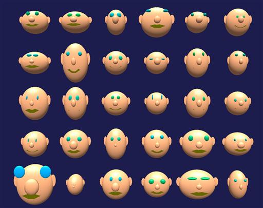
Figure 8.14 Chernoff faces. Different data variables are mapped to the sizes and shapes of different facial features—a bad idea because of unpredictable effects from emergent expressions. From dheise@andrews.edu. Permission needed.
Despite their initial promise, Chernoff faces have not generally been adopted in practical visualization applications. The likely reason for this is the idiosyncratic nature of the method. When data is mapped to faces, many kinds of perceptual interactions can occur. Sometimes the combination of variables will result in a particular stereotypical face, perhaps a happy face or a sad face, and this will be identified more readily. In addition, there are undoubtedly great differences in our sensitivity to the different features. We may be more sensitive to the curvature of the mouth than to the height of the eyebrows, for example. This means that the perceptual space of Chernoff faces is likely to be extremely nonlinear. In addition, there are almost certainly many uncharted interactions between facial features, and these are likely to vary from one viewer to another, leading to large distortions in the way the data is perceived.
Coding Words and Images
Bertin, in his seminal work, Semiology of Graphics (1983), distinguished two distinct sign systems. One cluster of sign systems is associated with auditory information processing and includes mathematical symbols, natural language, and music. The second cluster is based on visual information processing and includes graphics, together with abstract and figurative imagery. More recently, the dual coding of Paivio (1987) proposed that there are fundamentally two different types of information stored in distinct working memory and long-term memory systems; he called them imagens and logogens. Roughly speaking, imagens denote the mental representation of visual information, whereas logogens denote the mental representation of language information. This duality of systems is called dual coding theory.
Visual imagens consist of objects, natural groupings of objects, and whole parts of objects (for example, an arm), together with spatial information about the way they are laid out in a particular environment, such as a room. Logogens store basic information pertaining to language, although not the sounds of the words. Logogens are processed by a set of functional subsystems that provide support for reading and writing, understanding and producing speech, and logical thought. Logogens need not necessarily be tied to speech, but they are associated with non-visual language. In the profoundly deaf the same language subsystems exist and are used in the reading and production of Braille and sign language.
The architecture of dual coding theory is sketched in Figure 8.15. Visual–spatial information enters through the visual system and is fed into association structures in the nonverbal imagen system. Visual text is processed visually at first, but the information is rapidly transferred into the nonvisual association structures of logogens. Acoustic verbal stimuli are processed primarily through the auditory system and then fed into the logogen system. Logogens and imagens, although based on separate subsystems, can be strongly interlinked; for example, the word cat and language-based concepts related to cats will be linked to visual information related to the appearance of cats and their environment.
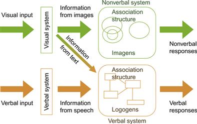
Figure 8.15 Dual coding theory.
Mental Images
Much of dual coding theory is uncontroversial. It has been known for decades that there are different neural processing centers for verbal information and visual information. Examples of purely verbal processing brain regions are Broca’s area, which is part of the frontal cortex that when damaged results in an inability to speak intelligibly, and Wernicke’s area, which results in an inability to comprehend speech when damaged.
It is the idea that we can “think” visually that is relatively recent. One line of evidence comes from mental imaging. When people are asked to compare the size of a light-bulb with the size of a tennis ball, or the green of a pea with the green of a pine tree, most claim that they use mental images of these objects to carry out the task (Kosslyn, 1994). Other studies by Kosslyn and his coworkers show that people treat objects in mental images as if they have real sizes and locations in space. Recently, positron emission tomography (PET) has been used to reveal which parts of the brain are active during specific tasks. This shows that when people are asked to perform tasks involving mental imaging the visual processing centers in the brain are activated. When they mentally change the size and position of an imagined object, different visual areas of the brain are activated (Kosslyn et al., 1993). In addition, if visual processing centers in the brain are damaged, mental imaging ability is disrupted (Farah et al., 1992). It would seem that when we see a cow and when we mentally visualize a cow, the same neural pathways are excited, at least in part. Indeed, modern visual memory theory takes the position that visual object processing and visual object recognition are part of the same process. To some extent, the visual memory traces of objects and scenes are stored as part of the processing mechanism; thus, it is not necessary for an object to be fully processed for recognition to take place (Beardsley, 1997). This can account for the great superiority of recognition over recall. We can easily recognize that we have seen something before, but reproducing it in a drawing or with a verbal description is much more difficult.
This implies that the simple dual coding theory illustrated in Figure 8.15 is misleading in one important respect. The diagram implies that memories for visual inputs are stored after processing through the visual system; however, image memory is not a separate storage bin but an integral part of the perceptual system. Visual images are analyzed on their way through the system and visual memories are activated by the incoming information as they simultaneously shape it. There is no separate store; memory is distributed through the brain at every level of processing.
Labels and Concepts
Much of what we perceive when we “see” an object is not out there in the world, but stored in our memories. We perceive objects as tables, chairs, trees, flowers, cups, books, or as one of the thousands of other things we know about. As part of perception, objects are automatically labeled, and our knowledge of the characteristics, uses, and relationships to other objects is brought to a state of readiness in mind. Even an unknown amorphous blob is seen as like other objects of a similar size and smoothness—its material properties are automatically inferred from its texture and color, and its potential for manipulation is automatically assessed.
It takes learning and prior experience to develop high-level object concepts, and their characteristics are necessarily somewhat idiosyncratic. A musician will see a violin in a very different way than a nonmusician who hates classical music. In each case, the violin will be seen to have a very different set of affordances and what is perceived will be colored by this. Despite these differences, human communication depends on socially agreed-upon labels for objects, classes of objects, and concepts within a community, and the perception of the more basic characteristics of common objects will be similar for most individuals.
Object Categorization
Categorization is the abstraction of things and ideas into groups and most if not all categories have verbal labels. The words cheese, tree, plant, company, and bacteria are all category labels. Virtually all of the things we see and think of as objects are classified automatically in the brain within 100 ms of our seeing them. When we see a spoon, not just its shape is registered, but the verbal label also becomes activated. A large array of concepts relating to culinary activity and eating may become primed and brought to a state of readiness.
Objects that we know well combine clusters of attributes that are visual with clusters of attributes that are verbally related concepts. They may also have properties that awaken activities in our movement control systems, in the case of things that we may pick up and manipulate or use as tools. Kahneman et al. (1992) named this collection of visual and nonvisual properties an object file (see Figure 8.16).
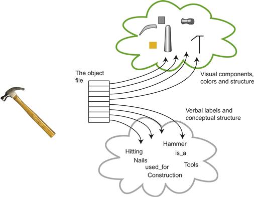
Figure 8.16 The object file is a proposed cognitive mechanism that links multiple attributes of an object. These attributes can be both visual and nonvisual.
Even objects that are unfamiliar can be categorized by their utility. A fist-sized chunk of any material may be used as a projectile, as potential building material, or, if it is hard, as a tool.
Our modern understanding of how the human brain categorizes objects began with the pioneering research of Eleanor Rosch (1973, 1975). Prior to this, from the time of Aristotle, object classification had been treated as if the brain did a formal logical analysis of sensory data. This approach leads to a world in which things belong to categories with sharp boundaries. Either something is a fruit, or it is not. Rosch’s work showed that the way we actually perceive objects is much more flexible. People perceive apples and oranges to definitively be fruits, but they are much less certain about cucumbers and tomatoes.
Rosch discovered that there are certain categories she called basic level, with other categories above and below. The concept of dog is a basic-level category, with animals as a superordinate category and particular breeds as subordinate categories. Basic-level categories are the most commonly used broad categories and are learned first by infants. People are more likely to categorize a particular animal, such as pet canine, as a dog than as members of the higher level category of animal. Rosch defined basic-level categories in terms of three criteria: They have similar shape; this is obviously true of dogs, which are much more mutually similar than, say, the category of animals. They have similar motor interactions; that is, we tend to do the same things with members of a particular class. They have similar nonvisual attributes, which refers to all the nonvisual properties we learn to be associated with objects, including the materials they are made from and their likely associations with other objects. Because of the visual similarity of basic-level categories, Rosch observed that usually a single drawing can be used to represent the entire class. Such drawings are also classified with the shortest reaction times.
Later work by Jolicoeur et al. (1984) added refinements to Rosch’s work. He and his co-workers found that certain category members are identified faster than others even though they are at the same level of the hierarchy. For example, a medium-sized canine with neither especially long or short legs will be categorized as a dog faster than a dachshund.
Canonical Views and Object Recognition
Palmer et al. (1981) showed that not all views of an object are equally easy to recognize. They found that many different objects have something like a canonical view from which they are most easily identified. From this and other evidence, a theory of object recognition has been developed, proposing that we recognize objects by matching the visual information with internally stored viewpoint-specific exemplars, or prototypes; the brain stores a number of key views of each object (Edelman & Buelthoff, 1992; Edelman, 1995). This is the image-based object memory theory introduced at the start of this chapter. The views are not simple snapshots; however, they allow recognition despite simple geometric distortions of the image that occur in perspective transformation. This explains why object perception survives the kinds of geometric distortions that occur when a picture is viewed and tilted with respect to the observer.
There are strict limits on the extent to which we can change an image before recognition problems occur. Palmer et al. (1981) had observers rate how well pictures taken from different perspectives resembled the object depicted. The results showed strongly that certain views were judged more typical than others (see Figure 8.17). Moreover, this had a large effect on the amount of time it took subjects to name the object shown. Other studies have revealed that objects are named faster when they are upright (Jolicoer, 1985), but changing the size of the represented object has a relatively small effect. Also, numerous studies show impaired face recognition if the faces are shown upside down (Rhodes, 1995).
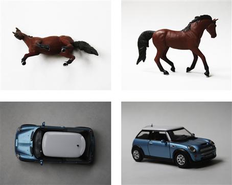
Figure 8.17 Noncanonical and canonical views of a horse and a car.
[G8.16] To make a visual image that represents a class of things, use a canonical example in its normal orientation displayed from a typical viewpoint, but only if a suitable exemplar exists.
There are many cases where simple images cannot be used to represent categories of objects. One reason is that most things belong to many overlapping sets of categories, and many categories do not have canonical object representations. Consider the category of pet. A pet can be a goldfish, an insect, or a snake, as well as the more typical dogs and cats. No simple sketch can represent all of these, as they do not share a canonical set of visual features. Some abstract categories are even more difficult. The philosopher Wittgenstein (1953) used the example of games to argue that categories should be thought of as loosely associated bundles of properties, rather than concepts that can be defined by a few formal rules. Board games, sports such as soccer, and games such as charades all belong to the game category. Such categories are very difficult to formally pin down, and, like pets, have no canonical representation.
What does this have to do with visualization? In many diagrams and charts it is common to use pictorial symbols to represent various kinds of categorical information. This is especially true of so-called infographics. Stacks of little house-shaped symbols and stacks of little car-shaped symbols may be used to represent the rates of home and car ownership in different countries. A hamburger is sometimes used to represent junk food in a chart. Broccoli has achieved similar status as a symbol for healthy food. Figure 8.21 shows an example of these symbols used in an information graphic. In this case, the effectiveness of hamburgers and broccoli does not have to do with their having a canonical visual form in the Roschean sense. Rather, if they are effective it is because of their culturally determined status as symbols for these categories.
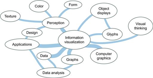
Figure 8.18 A concept map surrounding the concept “information visualization.”
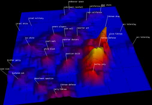
Figure 8.19 An entire week of CNN news stories is summarized in a ThemeScape. From Wise et al. (1995). Reproduced with permission.
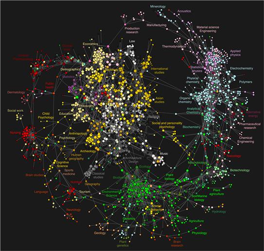
Figure 8.20 A diagram showing the links between academic disciplines using clickstream data. From Bollen et al. (2009). Reproduced with permission.
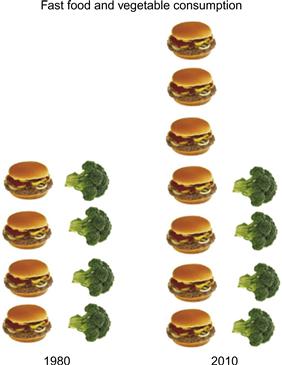
Figure 8.21 In infographics, repeated pictorial icons are often used to represent quantity.
Concept Mapping
Researchers in the field of information visualization have put considerable effort into creating visual representations of ideas and abstract concepts. These can be considered as potential visual thinking tools.
Concept Maps and Mind Maps
A technique that is promoted as a learning aid for students is called mind mapping (Jonassen et al., 1993). It consists of sketching out links between concepts, as illustrated in Figure 8.18. Usually, such maps are constructed informally by sketching them on paper, but computer-based tools also exist. Essentially, a concept map is a type of node–link diagram in which the nodes represent concepts and the links represent relationships between concepts. An individual can use a concept map as a tool for organizing his or her own personal concept structure, and it may reveal patterns of relationships between ideas that had not been evident when the concepts were stored internally. A concept map can also be constructed as a group exercise, in which case it becomes a tool for building a common understanding.
Most educational theory suggests that in order to learn concepts it is important that students actively work to integrate new ideas into the framework provided by their existing knowledge (Willis, 1995). This is the central theme of constructivist education theory that has its roots in the work of the Russian psychologist Lev Vygotsky (1978). Constructivism also emphasizes the social roots of knowledge and that much of our concept formation is shaped by social pressures (Karagiorgi & Symeou, 2005).
Superficially, concept maps would seem to fit well with constructivist theory. To construct such a map, students must actively draw out links between various concepts as they understand them. The problem is that the cognitive engagement tends to be somewhat superficial, since it does not require that students think about the nature of the links. For example, simply knowing that there is a link between disease and urban living is of marginal value, but if we know something about how diseases are propagated then we can design better sanitation systems. A more elaborate concept might be used to trace out propagation mechanisms, but written notes may be more effective for the reasons outlined in Chapter 9.
The best note-taking techniques appear to be hybrids combining concept organization techniques (using connecting lines and boxes) with more detailed textual information (Novak, 1981). Other structured note-taking methods can be effective, such as arranging ideas in a matrix (Kiewra, 1999).
There are other reasons for mapping concepts into a visual space. Recently, sophisticated computer algorithms have been developed to parse large text databases in order to understand how ideas, as expressed in society at large, are related to one another and how they develop over time. For example, the SPIRE system creates a classification of documents with respect to a keyword query and can be applied to databases consisting of hundreds of thousands of documents (Wise et al., 1995). The result of the SPIRE algorithm is a set of vectors in an n-dimensional space. To help people understand the resulting clusters of documents, Wise et al. created a visualization called a ThemeScape, which shows the two most important dimensions as a kind of data landscape. This is illustrated in Figure 8.19. Flags on top of hills label and identify the largest clusters of documents in this space. Essentially, a ThemeScape uses the two most significant dimensions of the abstract data space to create a smoothed 2D histogram. Spatial proximity and salience show the major concentrations of information and, to some extent, their relationships. This kind of display will be useful when two dimensions really do capture most of the variability in the data.
Other visualizations have been designed to map out the temporal evolution of larger themes in text databases. ThemeRiver is an application developed by Havre et al. (2000) designed to show how ideas become more prevalent over time, and then fade away. It has been used to show the temporal trajectory of major news stories.
Visualizations such as ThemeScape and ThemeRiver can perhaps be used to understand the zeitgeist of the time. Politicians want to know which issues are receiving the most press attention and these displays may help. But, like concept maps, both displays provide only the most superficial information about the relationships of ideas. In addition, because very high-dimensional data has been mapped into a low-dimensional space, proximities between concepts are only sometimes meaningful.
Other systems have been developed to map human knowledge into a node–link diagram. Bollen et al. (2009) used a very large university database derived from Internet searches carried out by university students and faculty. Their goal was to understand which areas of scholarly endeavor are most closely related. Their algorithm judged there to be a connection between disciplines when there were information selections (via mouse clicks) in different disciplines by the same person, close together in time. This is called clickstream data. The resulting map of knowledge is shown in Figure 8.20. It shows the physical sciences to the right and social sciences and clinical areas to the left, with the arts in the center. This particular layout is arbitrary, an artifact of the algorithm, but the connections between areas is meaningful. Highly interconnected areas mean that scholars were researching in both disciplines. Such a map might be used by university administrators thinking about the logical structure of faculties, or it might be used to organize government funding agencies according to the most closely linked scholarly areas.
Iconic Images versus Words versus Abstract Symbols
We have choices when creating a visualization that requires symbols. We can use abstract visual symbols such as triangles, squares, or circles; we can use pictorial icons, such as an image of broccoli to represent “vegetables”; or we can use words or phrases. The best solution depends on a number of factors—the purpose of the visualization, the number of data points and how dense they are, and the availability of canonical images. For example, if the quantity represented is something like the price/earnings ratio of a stock, then pictorial icons are not available.
In general, pictorial icons are best used when the purpose of a visualization is pedagogical, and they are not intended for the data analyst who usually insists on far more detailed information. The reason for using the pictorial icon in an infographic is cognitive efficiency, especially for the occasional user. Using an image to represent a data object means that it is not necessary to consult a key to get its category, ensuring one less step in the process of understanding. Infographics are often designed for rapid understanding by people who may have only a marginal interest in the content—for example, the readers of magazine or newspaper articles. A general audience may lack familiarity with more specialized (and abstract) charting conventions, so reducing a step can easily make the difference between something that is ignored and something that provides information. Also, in infographics the information content is usually quite low, so there is more space available for images.
[G8.17] Consider using pictorial icons for pedagogical purposes in infographics. Use them only where a canonical or culturally defined image is available.
When using visual symbols as glyphs to display quantity we must beware of the potential distortion inherent in varying size to display relative quantity; linear coding using multiples is generally preferable. Using the stacked hamburgers, as shown in Figure 8.21, is likely better than using a single big hamburger and a single big broccoli, each sized to represent some quantity. As discussed in Chapter 5 (guideline G5.17), it is particularly disastrous to use the volume of an object to represent a numerical quantity.
The choice of abstract symbols versus labeled points and regions should also be made on the basis of cognitive efficiency. Abstract symbols are effective when there are many data points belonging to a few different categories. Abstract symbols can be more compact than pictorial icons. Also, if visual clustering is important, the effective use of low-level visual features discussed in Chapters 5 and 6 becomes critical.
[G8.18] When a large number of data points must be represented in a visualization, use symbols instead of words or pictorial icons.
Written and spoken language has orders of magnitude more category labels than there are standardized pictorial icons. This means that words must be chosen over pictorial icons in most cases, but diagrams densely populated with printed words can become unintelligible. Directly labeling objects in visualizations using words is most suitable when there is a single member for each category, or only a few, and where the category density is low.
[G8.19] Use words directly on the chart where the number of symbolic objects in each category is relatively few and where space is available.
Static Links
When text is integrated into a static diagram, the Gestalt principles discussed in Chapter 6 apply, as Figure 8.22 shows. Simple proximity is commonly used in labeling maps. A line drawn around the object and text creates a common region. A line or common region can also be used to associate groups of objects with a particular label. Arrows and speech balloons linking text and graphics also apply the principle of connectedness.

Figure 8.22 Gestalt principles used to guide the linking of text and graphics: (a) Proximity. (b) Continuity/connectedness. (c) Common region. (d) Common region combined with connectedness.
[G8.20] Use Gestalt principles of proximity, connectedness, and common region to associate written labels with graphical elements.
Scenes and Scene Gist
Rapid categorization occurs with scenes as well as visual objects. If you flip channels on a TV, within 100 ms of the new image appearing your brain will have classified it as being a beach scene, a street scene, an interior, a store, a bar, an office, or any one of many different types of scenes. Moreover, your brain will be primed for activities within that particular scene; in particular, the sequences of eye movements needed to find a certain detail in a specific scene will be facilitated (Oliva et al., 2003; Oliva, 2005).
In the perception of gist, the broad spatial layout of a scene is identified in addition to the identification of its basic-level category (Potter, 1976). Also, a cognitive framework may be activated that includes priming the actions that may be useful for dealing with the new information.
Scene gist is important in data visualization because what we see depends enormously on the context. The gist of familiar visual displays will be processed just as fast as the gist of natural scenes, and it will have a similar effect on our response biases. The expectations and priming of the brain will have a huge effect, especially in cases where a rapid response is required. This provides another argument for consistency of representation for common types of visualization.
Priming, Categorization, and Trace Theory
We now return to the topic of priming and discuss how it affects categorization. Priming can have both positive and negative consequences with regard to categorization. In some ways, priming can be regarded as a biasing of perception. Ratcliff and McKoon (1996) made sketches of pairs of objects that were visually very similar but belonged to very different categories (Figure 8.23). They found normal priming when an image was shown for a second time, a week later, in a rapid naming task; however, when the similar image (within a different category) was shown a week later, naming was actually slowed.

Figure 8.23 Pairs of sketches developed by Ratcliff and McKoon (1996). Each pair has visual similarity, but the objects represented have very different uses.
They argued that the result adds support to a trace theory of cognitive skill learning. According to this theory, whenever we successfully complete a cognitive activity, such as identifying an object, all the various neural pathways that were activated at the time become strengthened, so that the next time the same object is presented, processing is facilitated. But, strengthening a set of pathways inevitably means that alternative pathways are less likely to be activated in similar circumstances, introducing a form of bias. One of the implications is that priming, and indeed all categorization, is a two-edged sword. Priming and categorization can lead to errors. Once we learn a particular interpretation of a pattern, we get faster at classifying it in a certain way, automatically classifying it at a glance, but this means that we are less likely to come up with alternative interpretations.
We shall return to the issue of priming, and sensory learning in general, in the following chapters as we begin to consider the process of visual thinking.
Conclusion
In this chapter, we have moved well beyond thinking of perception only as the extraction of information from what is imaged on the retina. Once an object is identified as something, as opposed to an abstract collection of features and colors, a range of associations is automatically activated in the brain, and these associations are what make up most of what we subjectively perceive. Some of these cognitive responses are in the visual system; others are in the language centers and in the regions that control actions. To illustrate this point, Figure 8.24 shows the range of cognitive activities that might occur when someone looks at a diagram of the human blood circulation system. They are fixating on, and trying to understand, a part of the diagram that schematically depicts the heart. A small amount of information is held in visual working memory, consisting of visual patterns relating to the left and right chambers of the heart. The overall topology (chambers are part of heart) and shape have also been processed and held in working memory. As part of the mental act of identification, the verbal label “heart” becomes activated, as well as a network of related concepts. Concepts further from the current focus of cognitive attention are brought to a state of readiness. Simultaneously, eye-movement programming systems are brought to a state of readiness to do such things as trace the pathways, as represented in the diagram. All of this visual and nonvisual activity is exquisitely focused on the cognitive task of the moment. Little or no irrelevant information is processed. It is this ability to flexibly combine diverse types of information that makes human visual thinking so powerful.
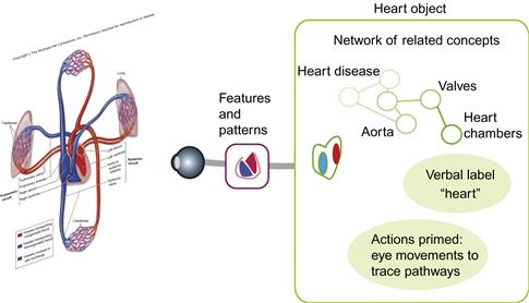
Figure 8.24 The percept of an object consists mostly of information stored in memory that has been activated by the visual information; this remains linked to a relatively small amount of information coming from the external world.