Chapter Two
The Environment, Optics, Resolution, and the Display
We can think of the world itself as an information display. Each object by its shape suggests uses, such as a tool or construction material, or it may be seen as an obstacle to be avoided. Every intricate surface reveals the properties of the material from which it is made. Creatures signal their intentions inadvertently or deliberately through movement. There are almost infinite levels of detail in nature, and we must be responsive to both small and large things, but in different ways: Large things, such as logs, may be seats or tables; smaller things, such as hand-sized rocks, can be used as tools; still smaller things, such as grains of sand, are useful by the handful. In an evolutionary sense, our visual system is designed to extract useful information from the environment, and lessons from this can lead to the design of better visualizations.
The visual display of a computer is only a single rectangular planar surface, divided into a regular grid of small colored dots. It is astonishing how successful it is as an information display, given how little it resembles the world we live in. This chapter concerns the lessons we can learn about information display by appreciating the environment in broad terms and how the same kind of information can be picked up from a flat screen. It begins with a discussion of the most general properties of the visual environment and then considers the lens and receptor system of the eye as the principal instrument of vision. Later, the basic abilities of the eye are applied in an analysis of problems inherent in creating optimal display devices.
This level of analysis bears on a number of display problems. If we want to make virtual objects seem real, how should we simulate the interaction of light with their surfaces? What is the optimal display device and how do current display devices measure up? How much detail can we see? How faint a target can we see? How good is the lens system of the human eye? This is a foundation chapter, introducing much of the basic vocabulary of vision research.
The Environment
A strategy for designing a visualization is to transform the data so that it appears like a common environment—a kind of data landscape. We should then be able to transfer skills obtained in interpreting the real environment to understanding our data. This is not to say that we should represent data by means of synthetic trees, flowers, and undulating lawns—that would be quaint and ludicrous. It seems less ludicrous to create synthetic offices, with desks, filing cabinets, phones, books, and Rolodexes, and this is already being done in a number of computer interfaces. But, still, the space efficiency of these designs is poor; better methods exist, and understanding the properties of the environment is important for a more basic reason than simple imitation.
When trying to understand perception, it is always useful to think about what perception is for. The theory of evolution tells us that the visual system must have survival value, and adopting this perspective allows us to understand visual mechanisms in the broader context of useful skills, such as navigation, food seeking (which is an optimization problem like information seeking), and tool use (which depends on object-shape perception).
What follows is a short tour of the visual environment, beginning with light.
Visible Light
Perception is about understanding patterns of light. Visible light constitutes a very small part of the electromagnetic spectrum, as is shown in Figure 2.1. Some animals, such as snakes, can see in the infrared, while certain insects can see in the ultraviolet. Humans can perceive light only in the range of 400 to 700 nanometers. (In vision research, wavelength is generally expressed in units of 10–9 meters, called nanometers). At wavelengths shorter than 400 nm are ultraviolet light and X-rays. At wavelengths longer than 700 nm are infrared light, microwaves, and radio waves.
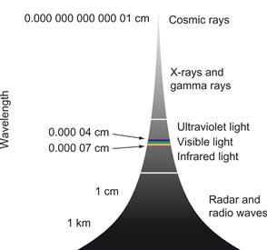
Figure 2.1 The visible light spectrum is a tiny part of a much larger spectrum of electromagnetic radiation.
Ecological Optics
The most useful broad framework for describing the visual environment is given by ecological optics, a discipline developed by J. J. Gibson. Gibson radically changed the way we think about perception of the visual world. Instead of concentrating on the image on the retina, as did other vision researchers, Gibson emphasized perception of surfaces in the environment. The following quotations strikingly illustrate how he broke with a traditional approach to space perception that was grounded in the classical geometry of points, lines, and planes (Gibson, 1979):
A surface is substantial; a plane is not. A surface is textured; a plane is not. A surface is never perfectly transparent; a plane is. A surface can be seen; a plane can only be visualized.
A fiber is an elongated object of small diameter, such as a wire or thread. A fiber should not be confused with a geometrical line.
In surface geometry the junction of two flat surfaces is either an edge or a corner; in abstract geometry the intersection of two planes is a line.
Much of human visual processing becomes more understandable if we assume that a key function of the visual system is to extract properties of surfaces. As our primary interface with objects, surfaces are essential to understanding the potential for interaction and manipulation in the environment that Gibson called affordances (discussed in Chapter 1).
A second key concept in Gibson’s ecological optics is the ambient optical array (Gibson, 1986). To understand the ambient optical array, consider what happens to light entering the environment from some source such as the sun. It is absorbed, reflected, refracted, and diffracted as it interacts with various objects such as stones, grass, trees, and water. The environment, considered in this way, is a hugely complex matrix with photons traveling in all directions, consisting of different mixtures of wavelengths and polarized in various ways. This complexity is impossible to simulate; however, from any particular stationary point in the environment, critical information is contained in the structure of the light arriving at that point. This vast simplification is what Gibson called the ambient optical array. This array encompasses all the rays arriving at a particular point as they are structured in both space and time. Figure 2.2 is intended to capture the flavor of the concept.
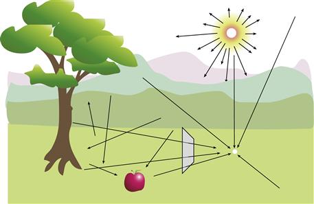
Figure 2.2 Ambient optical array is a term that describes the spherical array of light arriving from all directions at some designated point in the environment. Simulating the colors of the subset of rays that would pass through a glass rectangle is one of the main goals of computer graphics.
Much of the effort of computer graphics can be characterized as an attempt to model the ambient optical array. Because the interactions of light with surfaces are vastly complex, it is not possible to directly model entire environments, but the ambient array provides the basis for simplifications such as those used in ray tracing so that approximations can be computed. If we can capture the structure of a bundle of rays passing through a glass rectangle on their way to the stationary point, we have something that we may be able to reproduce on a screen (see Figure 2.2).
Optical Flow
The ambient optical array is dynamic, changing over time both as the viewpoint moves and as objects move. As we advance into a static environment, a characteristic visual flow field develops. Figure 2.3 illustrates the visual field expanding outward as a result of forward motion. There is evidence that the visual system contains processes to interpret such flow patterns and that they are important in understanding how animals (including humans) navigate through space, avoid obstacles, and generally perceive the layout of objects in the world. The flow pattern in Figure 2.3 is only a very simple case; if we follow something with our eyes while we move forward, the pattern becomes more complex. The perceptual mechanisms to interpret flow patterns must therefore be sophisticated. The key point here is that visual images of the world are dynamic, so that the perception of motion patterns may be as important as the perception of the static world, albeit less well understood. Chapter 7 deals with motion perception in the context of space perception and three-dimensional (3D) information display.
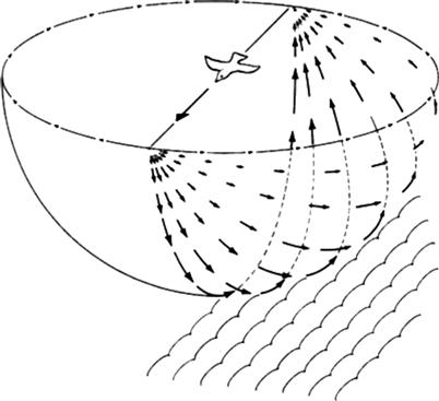
Figure 2.3 An expanding flow pattern of visual information is created as an observer moves while gazing in a forward direction. From Gibson (1979). Reproduced with permission.
Textured Surfaces and Texture Gradients
Gibson pointed out that surface texture is one of the fundamental visual properties of an object. In visual terms, a surface is merely an unformed patch of light unless it is textured. Texture is critical to perception in a number of ways. The texture of an object helps us see where an object is and what shape it has. On a larger scale, the texture of the ground plane on which we walk, run, and crawl is important in judging distances and other aspects of space. Figure 2.4 shows that the texture of the ground plane produces a characteristic texture gradient that is important in space perception. Of course, surfaces themselves are infinitely varied. The surface of a wooden table is very different from the surface of an ocelot. Generally speaking, most surfaces have clearly defined boundaries; diffuse, cloudlike objects are exceptional. Perhaps because of this, we have great difficulty in visualizing uncertain data as fuzzy clouds of points. At present, most computerized visualizations present objects as smooth and untextured. This may be partly because texturing is not yet easy to do in most visualization software packages and computer screens lack the resolution to display fine textures. Perhaps visualization designers have avoided texturing surfaces by applying the general esthetic principle that we should avoid irrelevant decoration in displays—“chart junk,” to use Edward Tufte’s memorable phrase (Tufte, 1983), but texturing surfaces is not chart junk, especially in 3D visualizations. Even if we texture all objects in exactly the same way, this can help us perceive the orientation, shape, and spatial layout of a surface. Textures need not be garish or obtrusive, but when we want something to appear to be a 3D surface, it should have at least a subtle texture. As we shall see in Chapter 6, texture can also be used to code information, but using unobtrusive textures will require better pixel resolution than is available on most displays.
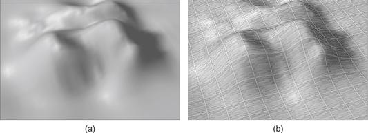
Figure 2.4 An undulating surface with (a) and without (b) surface texture.
The Paint Model of Surfaces
Surfaces in nature are endlessly varied and complex. Microtextures give irregular patterns of reflection, so the amount and color of reflected light can vary with both the illumination angle and the viewing angle. However, there is a simple model that approximates many common materials. This model can be understood by considering a glossy paint. The paint has pigment particles embedded in a more or less clear medium, as shown in Figure 2.5. Some of the light is reflected from the surface of the glossy medium and is unchanged in color. Most of the light penetrates the medium and is selectively absorbed by the pigment particles, altering its color. According to this model, there are three important direct interactions of light with surfaces, as described in the following paragraphs. An additional fourth property is related to the fact that parts of objects cast shadows, revealing more information about their shapes (see Figure 2.6).
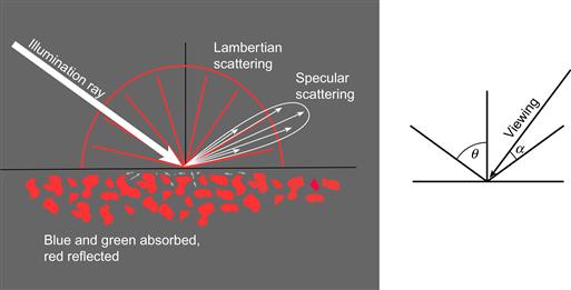
Figure 2.5 This simplified model of light interacting with surfaces is used in most computer graphics. Specular reflection is light that is reflected directly from the surface without penetrating into the underlying pigment layer.
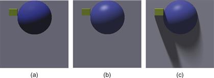
Figure 2.6 (a) Lambertian shading only. (b) Lambertian shading with specular and ambient shading. (c) Lambertian shading with specular, ambient, and cast shadows.
• Lambertian shading. With most materials, light penetrates the surface and interacts with the pigment in the medium. This light is selectively absorbed and reflected depending on the color of the pigment, and some of it is scattered back through the surface out into the environment. If we have a perfectly matte surface, how bright the surface appears depends only on the cosine of the angle between the incident light and the surface normal. This is called the Lambertian model, and although few real-world materials have exactly this property it is computationally very simple. A patch of a Lambertian surface can be viewed from any angle and the surface color will seem the same. Figure 2.6(a) shows a surface with only Lambertian shading. Lambertian shading is the simplest method for representing surface shape from shading. It can also be highly effective.
• Specular shading. The light that is reflected directly from a surface is called specular. This is what we see as the highlights on glossy objects. Specular reflection obeys the optical principle of mirror reflection: The angle of reflection equals the angle of incidence. It is possible to simulate high-gloss, semigloss, or eggshell finishes by causing the specular light to spread out somewhat, simulating different degrees of roughness at a microscopic level. Specular light reflected from a surface retains the color of the illuminant; it is not affected by the color of the underlying pigment. Hence, we see white highlights gleaming from the surface of a red automobile. Specular reflection depends on the viewpoint, unlike Lambertian reflection; both the viewing direction and the positions of the light sources affect the locations where highlights appear. Figure 2.6(b) shows a surface with both Lambertian and specular shading.
• Ambient shading. Ambient light is the light that illuminates a surface from everywhere in the environment, except for the actual light sources. In reality, ambient light is as complex as the scene itself; however, in computer graphics, ambient light is often grossly simplified by treating it as a constant, which is like assuming that an object is situated in a uniformly gray room. The radiosity technique (Cohen & Greenberg, 1985) properly models the complexity of ambient light, but it is rarely used for visualization. One of the consequences of modeling ambient light as a constant is that no shape-from-shading information is available in areas of cast shadow. In Figures 2.6(b) and 2.6(c), ambient light is simulated by the assumption that a constant amount of light is reflected from all points on the surface. Ambient light is reflected both specularly and nonspecularly.
• Cast shadows. An object can cast shadows either on itself or on other objects. As shown in Figure 2.6(c), cast shadows can greatly influence the perceived height of an object.
The mathematical expression for the amount of light reflected, r, toward a particular viewpoint, according to this simplified model, is as follows:
 (2.1)
(2.1)
where θ is the angle between the incident ray and the surface normal, α is the angle between the reflected ray and the view vector, and a, b, and c represent the relative amounts of ambient, Lambertian, and specular light, respectively. The exponent k is used to control the degree of glossiness. A high value of k, such as 50, models a very shiny surface, whereas a lower value, such as 6, results in a semigloss appearance. Note that this is a simplified treatment, providing only the crudest approximation of the way light interacts with surfaces, but nevertheless it is so effective in creating real-looking scenes that it is widely used in computer graphics with only a small modification to simulate color. It is sufficient for most visualization purposes. This surface/light interaction model and others are covered extensively by computer graphics texts concerned with realistic image synthesis. More information can be found in Shirley and Marschner (2009) or any other standard computer graphics text.
What is interesting is that these simplifying assumptions may, in effect, be embedded in our visual systems. The brain may assume a model similar to this when we estimate the shape of a surface defined by shading information. Arguably, using more sophisticated modeling of light in the environment might actually be detrimental to our understanding of the shapes of surfaces. Chapter 7 discusses the way we perceive this shape-from-shading information.
Figures 2.7 and 2.8 illustrate some consequences of the simplified lighting model. Figure 2.7 shows glossy leaves to make the point that the simplified model is representative of at least some nonsynthetic objects. In this picture, the specular highlights from the shiny surface are white because the illuminant is white. The nonspecular light from the leaf pigmentation is green. As a tool in data visualization, specular reflection is useful in visualization of fine surface features, such as scratches on glass. The effect is illustrated in Figure 2.8, in which the grid lines are most distinct in the region of specular reflection. Specular highlights can be similarly useful in revealing subtle differences in surface micro-roughness. The nonspecular Lambertian reflection is more effective in giving an overall impression of the shape of the surface.

Figure 2.7 Note how the highlights are the color of the illuminant on glossy leaves.
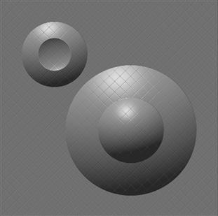
Figure 2.8 Specular light can reveal fine details of surface structure, depending on the viewpoint.
The different kinds of information contained in the different lighting models suggest the following three guidelines:
[G2.1] Use Lambertian shading to reveal the shapes of smooth surfaces.
[G2.2] Use specular shading to reveal fine surface details. Make it possible to move the light source or rotate the object so that specular light is reflected from regions of critical interest.
[G2.3] Consider using cast shadows to reveal large-scale spatial relationships. Shadows should be created only where the connection between the shadow and the casting object is clear and where the value of the additional information outweighs the information that it obscured.
Another source of spatial information can come from the amount of ambient light that reaches into the interstices of an object. This is called ambient occlusion because in the depths of hollows some of the ambient light is occluded by other parts of the object. Tarini et al., (2006) used ambient occlusion to help reveal the shape of a complex molecule (Figure 2.9). The generality of this technique may be questioned, however, because the object on the left in Figure 2.9 is highly unusual in that it provides no Lambertian shading information, shading is only applied to individual spheres, not to the overall shape of the molecule.
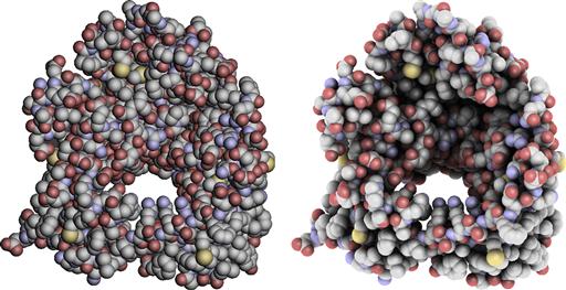
Figure 2.9 In the molecule on the left, only individual atoms are shaded. In the molecule on the right, the amount of ambient light reaching the inner parts of the molecule is reduced due to occlusion by the outer atoms.
[G2.4] Consider applying ambient occlusion in the lighting model to support two-dimensional (2D) shape perception for objects that otherwise supply no shading information.
To summarize this brief introduction to the visual environment, we have seen that much of what is useful to organisms is related to objects, to their layout in space, and to the properties of their surfaces. As Gibson so effectively argued, in understanding how surfaces are perceived, we must understand how light becomes structured when it arrives at the eye. We have covered two important kinds of structuring. One is the structure that is present in the ambient array of light that arrives at a viewpoint. This structure has both static pattern components and dynamic pattern flows as we move through the world. The second is the more detailed structuring of light that results from the interaction of light with surfaces. In data the goal is to use rendering techniques that best convey the important information, not to obtain photorealistic realism.
The Eye
We now consider the instrument of sight. The human eye, like a camera, contains a variable focus lens, an aperture (the pupil), and a sensor array (the retina). Figure 2.10 illustrates these parts. The lens focuses a small, inverted picture of the world onto the retina. The iris performs the function of a variable aperture, helping the eye to adjust to different lighting conditions. Some people find it difficult to understand how we can see the world properly when the image is upside down. The right way to think about this is to adopt a computational perspective. We do not perceive what is on the retina; instead, a percept is formed through a complex chain of neural computations. A control computer does not care which way is up, and inversion of the image is the least of the brain’s computational problems.
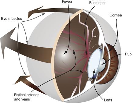
Figure 2.10 The human eye. Important features include the fovea, where vision is sharpest; the pupil, a round aperture through which light enters the eye; the two principal optical elements, the lens and the cornea; and the large eye muscles that control eye movements. This blind spot is caused by the absence of receptors where the retinal arteries enter the eyeball.
We should not take the eye/camera analogy too far. If seeing were like photography, you would only have to copy the image on the back of the eye to produce a perfect likeness of a friend; anyone could be a great portrait painter. Yet, artists spend years studying perspective geometry and anatomy and constantly practice their skills. It took thousands of years, culminating in the golden age of Greek art, for artists to develop the skills to draw natural figures, properly shaded and foreshortened. Following this, the skill was largely lost again until the Renaissance, in the 15th century. Yet, in the image on the back of the eye, everything is in perfect proportion and in perspective. Clearly, we do not “see” what is on the retina. The locus of conscious perception is farther up the chain of processing, and at this later stage most of the simple properties of the retinal image have been lost.
The Visual Angle Defined
The visual angle is a key concept in defining the properties of the eye and early vision. As Figure 2.11 illustrates, a visual angle is the angle subtended by an object at the eye of an observer. Visual angles are generally defined in degrees, minutes, and seconds of arc. (A minute is 1/60 degree and a second is 1/60 minute). As a useful approximation, a thumbnail held at arm’s length subtends about 1 degree of visual angle. Another useful fact is that a 1-cm object viewed at 57 cm has a visual angle of approximately 1 degree, and 57 cm is a reasonable approximation for the distance at which we view a computer monitor. To calculate visual angle, use this equation:
 (2.2)
(2.2)
 (2.3)
(2.3)

Figure 2.11 The visual angle of an object is measured from the optical center of the eye.
Lens
The human eye contains a compound lens. This lens has two key elements: the curved front surface of the cornea and the crystalline lens. The nodal point is the optical center of the compound lens; it is positioned approximately 17 mm from the retina. The distance from the eye to an object is usually measured from the cornea, but in terms of optics it is better to estimate the distance from the nodal point (see Figure 2.11). The following equation describes the imaging properties of a simple lens:
 (2.4)
(2.4)
where f is the focal length of the lens, d is the distance to the object that is imaged, and r is the distance to the image that is formed. If the units are meters, the power of a lens is given by the reciprocal of the focal length (1/f) in units of diopters. Thus, a 1-diopter lens has a focal length of 1 m. The 17-mm focal length of the human lens system corresponds to a power of 59 diopters. To get this from Equation 2.3, consider viewing an object at infinity (d = ∞).
To a first approximation, the power of a compound lens can be computed by adding the powers of the components. We obtain the focal length of a two-part compound lens by using the following equation:
 (2.5)
(2.5)
where f3 is the result of combining lenses f1 and f2.
In the compound lens of the human eye, most of this power, about 40 diopters, comes from the front surface of the cornea; the remainder comes from the variable-focus lens. When the cillary muscle that surrounds the lens contracts, the lens assumes a more convex and more powerful shape, and nearby objects come into focus. Young children have very flexible lenses, capable of adjusting over a range of 12 diopters or more, which means that they can focus on an object as close as 8 cm. However, the eye becomes less flexible with age, at roughly the rate of 2 diopters per decade, so that by the age of 60 the lens is almost completely rigid (Sun et al., 1988), hence the need for reading glasses at about the age of 48, when only a few diopters of accommodation are left.
The depth of focus of a lens is the range over which objects are in focus when the eye is adjusted for a particular distance. The depth of focus of the human eye varies with the size of the pupil (Smith & Atchison, 1997), but assuming a 3-mm pupil and a human eye focused at infinity, objects between about 3 m and infinity are in focus. Depth of focus can usefully be described in terms of the power change that takes place without the image becoming significantly blurred. This is about 1/3 diopter for a 3-mm pupil.
Assuming the 1/3-diopter depth-of-focus value and an eye focused at distance d (in meters), objects in the range:
 (2.6)
(2.6)
will be in focus. To illustrate, for an observer focusing at 50 cm, roughly the normal monitor viewing distance, an object can be about 7 cm in front of the screen or 10 cm behind the screen before it appears to be out of focus. In helmet-mounted displays, it is common to use lenses that set the screen at a virtual focal distance of 2 m. This means that in the range 1.2 m to 6.0 m it is not necessary to worry about simulating depth-of-focus effects, something that is difficult and computationally expensive to do. In any case, the large pixels in typical virtual-reality displays prevent us from modeling image blur to anywhere near this resolution.
Table 2.1 gives the range that is in focus for a number of viewing distances, given a 3-mm pupil. For more detailed modeling of depth of focus as it varies with pupil diameter, consult Smith and Atchison (1997).
Table 2.1. Depth of Focus at Various Viewing Distances
| Viewing distance | Near | Far |
| 50 cm | 43 cm | 60 cm |
| 1 m | 75 cm | 1.5 m |
| 2 m | 1.2 m | 6.0 m |
| 3 m | 1.5 m | Infinity |
Optics and Augmented-Reality Systems
Augmented-reality systems involve superimposing visual imagery on the real world so that people can see a computer-graphics-enhanced view of the world. For this blending of real and virtual imagery to be achieved, the viewpoint of the observer must be accurately known and the objects’ positions and shapes in the local environment must also be stored in the controlling computer. With this information, it is a straightforward application of standard computer graphics techniques to draw 3D images that are superimposed on the real-world images. Getting the perspective right is easy; the difficult problems to solve include accurately measuring the observer’s eye position, which is essential to precise registration, and designing optical systems that are light, undistorted, and portable.
Figure 2.12 illustrates an experimental augmented-reality system in which a surgeon sees a brain tumor highlighted within the brain during surgical planning or to guide a biopsy needle (Grimson et al., 1996). Given how difficult it is for the surgeon to accomplish this task, such a development would have very large benefits. Other applications for augmented displays include aircraft maintenance, where the mechanic sees instructions and structural diagrams superimposed on the actual machinery; tactical military displays, in which the pilot or tank driver sees indicators of friendly or hostile targets superimposed on a view of the landscape; and shopping, where information about a potential purchase appears next to the item. In each case, visual data is superimposed on real objects to supplement the information available to the user and enable better or more rapid decision making. This data may take the form of written text labels or sophisticated symbology.
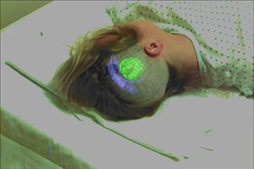
Figure 2.12 Augmented reality has been used experimentally in the medical field. Here, an image of a tumor is superimposed on a patient’s head. From Grimson et al. (1996). Reproduced with permission.
In many augmented-reality systems, a device called a beam splitter is used to superimpose computer graphics imagery on the environment. The splitter is actually used not to split but to combine the images coming from the real world with those presented on a small computer monitor. The result is like a double-exposed photograph. A typical beam splitter allows approximately half the light to pass through and half the light to be reflected. Figure 2.13 illustrates the essential optical components of this type of display.
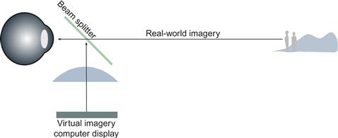
Figure 2.13 In augmented-reality displays, computer graphics imagery is superimposed on the real-world environment using a beam splitter. The effect is like a transparent overlay on the environment. The focal distance of the computer imagery depends on the power of the lenses used.
Because the optics are typically fixed, in augmented-reality systems there is only one depth at which both the computer-generated imagery and the real-world imagery are in focus. This can be both good and bad. If real-world and virtual-world scenes are both in focus, it will be easier to perceive them simultaneously. If this is desirable, care should be taken to set the focal plane of the virtual imagery at the typical depth of the real imagery. It is sometimes desirable, however, that the computer imagery remain perceptually distinct from the real-world image; for example, a transparent layer of text from an instruction manual might be presented on a see-through display (Feiner et al., 1993). If the focal distances are different, the user can choose to focus either on the text or on the imagery and in this way selectively attend to one or the other.
[G2.5] In augmented-reality systems, an augmenting image linked to an external object should be at the same focal distance.
[G2.6] In augumented-reality systems, when augmenting imagery does not need to be linked to external objects, the focal distance of the augumenting imagery should be closer, which will reduce visual interference. This will not work for older users who have little or no ability to change the focus of their eyes.
There is evidence that focus can cause problems with distance estimation in aircraft heads-up displays (HUDs). In these displays, the virtual image is set at optical infinity, because only distant objects are normally seen through a cockpit screen. Despite this, experiments have shown that observers tend to focus at a distance closer than infinity with HUDs, and this can cause overestimation of distances to objects in the environment (Roscoe, 1991). This may be a serious problem; according to Roscoe, it has been at least partially responsible for large numbers (one per month) of generally fatal “controlled flight into the terrain” accidents in the U.S. Air Force.
Roscoe’s theory of what occurs is that in normal vision the average apparent size of objects is almost perfectly correlated with the distance at which the eyes are focused (Iavecchia et al., 1988). But, with HUDs, the eyes are focused closer (for reasons that are not fully understood), leading to an underestimation of size and an overestimation of distance. Roscoe suggests that this can also partially account for the fact that when virtual imaging is used, either in simulators or in real aircraft with HUDs, pilots make fast approaches and land hard.
There are a number of other optical and perceptual problems with head-mounted displays (HMDs). The complex optics of progressive eyeglass lenses is not compatible with HMD optics. With progressive glasses, the optical power varies from top to bottom of the lens. Also, people normally use coordinated movements of both the eyes and the head to conduct visual searches of the environment, and HMDs do not allow for redirection of the gaze with head movements. Ordinarily, when the angular movement of the eyes to the side is large, head movements actually begin first. Peli (1999) suggests that looking sideways more than 10 degrees off the center line is very uncomfortable to maintain. With an HMD the image moves with the head, so compensatory head movements will fail to eliminate the discomfort.
[G2.7] When using a head-mounted display to read text, make the width of the text area no more that 18 degrees of visual angle.
Another problem is that see-through HMDs are typically only worn over one eye, and the effect of binocular rivalry means that parts of the visual world and HMD imagery are likely to spontaneously appear and disappear (Laramee & Ware, 2002). Someone wearing such a display while walking along a sidewalk would be likely to walk into lampposts!
Optics in Virtual-Reality Displays
Virtual-reality (VR) displays block out the real world, unlike the see-through augmented-reality displays discussed previously. The VR system designer need only be concerned with computer-generated imagery. It is still highly desirable, however, that correct depth-of-focus information be presented to the user. Ideally, objects on which the user fixates should be in sharp focus, while objects farther away or nearer should be blurred to the appropriate extents. Focus is important in helping us to differentiate objects that we wish to attend to from other objects in the environment.
Unfortunately, simulating depth of focus using a flat-screen display is difficult. The problem has two parts: simulating optical blur and simulating the optical distance of the virtual object. There is also the problem of knowing what the user is looking at so that the object of attention can be made sharp while other objects are displayed as though out of focus. Figure 2.14 illustrates one way that correct depth-of-focus information could be presented on a flat-screen VR display. An eye tracker is used to determine where in the scene the eye is fixated. If binocular eye trackers were used in a stereoscopic display, they would have to be accurate enough for convergence information to be used to estimate the distance to a fixated object.
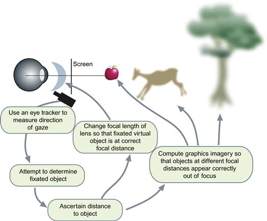
Figure 2.14 A possible solution to the problem of how correct depth-of-focus information might be displayed in a virtual-reality (VR) display. The apple is the fixated object and is drawn in sharp focus. The other objects are drawn out of focus, depending on their relative depths.
Once the object of attention is identified by the computer, it constructs an image in such a way that the fixated object is in sharp focus and other objects are appropriately out of focus. A sophisticated system might measure pupil diameter and take this information into account. At the same time, other system components change the focal lengths of the lenses in the display system so that the attended virtual object is placed at the correct focal distance (Liu & Hua, 2009). All virtual objects are actually displayed on the screen in the conventional way, but with simulated depth of focus based on the properties of the human eye. Neveau and Stark (1998) described the optical and control requirements of such a system.
Chromatic Aberration
The human eye is not corrected for chromatic aberration. Chromatic aberration means that different wavelengths of light are focused at different distances within the eye. Short-wavelength blue light is refracted more than long-wavelength red light. A typical monitor has a blue phosphor peak wavelength at about 480 nm and a red peak at about 640 nm, and a lens with a power of 1.5 diopters is needed to make blue and red focus at the same depth. This is the kind of blur that causes people to reach for their reading glasses. If we focus on a patch of light produced by the red phosphor, an adjacent blue patch will be significantly out of focus. Because of chromatic aberration, it is inadvisable to make fine patterns that use undiluted blue phosphor on a black background. Pure blue text on a black background can be almost unreadable, especially if there is white or red text nearby to attract the focusing mechanism. The addition of even a small amount of red and green will alleviate the problem, because these colors will provide luminance edges to perceptually define the color boundary.
The chromatic aberration of the eye can give rise to strong illusory depth effects (Jackson et al., 1994), although the actual mechanism remains unknown. This is illustrated in Figure 2.15, where both blue text and red text are superimposed on a black background. For about 60% of observers, the red appears closer, but 30% see the reverse, and the remaining 10% see the colors lying in the same plane. It is common to take advantage of this in slide presentations by making the background a deep blue, which makes white or red lettering appear to stand out for most people.

Figure 2.15 Chromostereopsis. For most people, red seems nearer than blue on a black background.
Receptors
The lens focuses an image on a mosaic of photoreceptor cells that line the back of the eye in a layer called the retina. There are two types of such cells: rods, which are extremely sensitive at low light levels, and cones, which are sensitive under normal working light levels. There are about 100 million rods and only 6 million cones. Rods contribute far less to normal daytime vision than cones do. The input from rods is pooled over large areas, with thousands of rods contributing to the signal that passes up through a single fiber in the optic nerve. Rods are so sensitive that they are overloaded in daylight and effectively shut down; therefore, most vision researchers ignore their very slight contribution to normal daylight vision.
The fovea is a small area in the center of the retina that is densely packed only with cones, and it is here that vision is sharpest. Cones at the fovea are packed about 20 to 30 seconds of arc apart (180 per degree). There are more than 100,000 cones packed into this central small area, subtending a visual angle of 1.5 to 2 degrees. Although it is usual to speak of the fovea as a 2-degree field, the greatest resolution of detail is obtained only in the central 1/2 degree of this region. Remember that 1 degree is about the size of your thumbnail held at arm’s length. Figure 2.16 is an image of the receptor mosaic in the fovea. The receptors are arranged in an irregular but roughly hexagonal pattern.
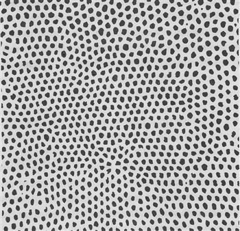
Figure 2.16 The receptor mosaic in the fovea.
Simple Acuities
Visual acuities are measurements of our ability to see detail. Acuities are important in display technologies because they give us an idea of the ultimate limits on the information densities that we can perceive. Some of the basic acuities are summarized in Figure 2.17.
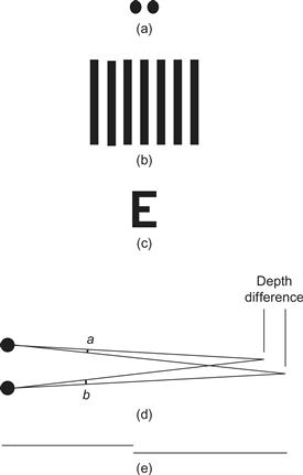
Figure 2.17 The basic acuities. (a) Point acuity (1 minute of arc): The ability to resolve two distinct point targets. (b) Grating acuity (1 to 2 minutes of arc): The ability to distinguish a pattern of bright and dark bars from a uniform gray patch. (c) Letter acuity (5 minutes of arc): The ability to resolve letters. The Snellen eye chart is a standard way of measuring this ability. 20/20 vision means that a 5-minute letter can be seen 90% of the time. (d) Stereo acuity (10 seconds of arc): The ability to resolve depth. The acuity is measured as the difference between two angles (a and b). (e) Vernier acuity (10 seconds of arc): The ability to see if two line segments are collinear.
Most of the acuity measurements in Figure 2.17 suggest that we can resolve things, such as the presence of two distinct lines, down to about 1 minute of arc. This is in rough agreement with the spacing of receptors in the center of the fovea. For us to see that two lines are distinct, the blank space between them should lie on a receptor; therefore, we should only be able to perceive lines separated by roughly twice the receptor spacing. However, there are a number of superacuities; vernier acuity and stereo acuity are two examples. A superacuity is the ability to perceive visual properties of the world to a greater precision than could be achieved based on a simple receptor model. Superacuities can be achieved only because postreceptor mechanisms are capable of integrating the input from many receptors to obtain better than single-receptor resolution. A good example of this is vernier acuity, the ability to judge the colinearity of two fine line segments. This can be done with amazing accuracy to better than 10 seconds of arc. To give an idea of just how accurate this is, a normal computer monitor has about 40 pixels (picture elements) per centimeter. We can perform vernier acuity tasks that are accurate to about 1/10 of a pixel.
Neural postprocessing can
efficiently combine input from two eyes. Campbell and Green (1965) found that
binocular viewing improves acuity by 7% as compared with monocular
viewing. They also found a  improvement in contrast sensitivity.
This latter finding is remarkable because it supports the theory
that the brain is able to perfectly pool information from the two
eyes, despite the three or four synaptic connections that lie
between the receptors and the first point at which the information
from the two eyes can be combined. Interestingly, Campbell and
Green’s findings suggest that we should be able to use the ability
of the eye to integrate information over space and time to allow
perception of higher resolution information than is actually
available on our display device. One technique for achieving higher
than device resolution is antialiasing, which is discussed later in
this chapter. There is also an intriguing possibility that the
temporal integration capability of the human eye could be used to
advantage. This is why a sequence of video frames seems of
substantially higher quality than any single frame.
Acuity Distribution and the Visual Field
If we look directly ahead and hold our arms straight out to either side, then we can just see both hands when we wiggle our fingers. This tells us that both eyes together provide a visual field of a bit more than 180 degrees. The fact that we cannot see our fingers until they move also tells us that motion sensitivity in the periphery is better than static sensitivity. Figure 2.18 illustrates the visual field and shows the roughly triangular region of binocular overlap within which both eyes receive input. The reason that there is not more overlap is that the nose blocks the view. Visual acuity is distributed over this field in a very nonuniform manner. As shown in Figure 2.19, acuity outside of the fovea drops rapidly, so that we can only resolve about one-tenth the detail at 10 degrees from the fovea.
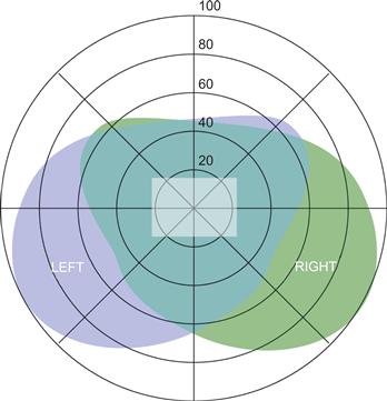
Figure 2.18 The visual field of view for a person gazing straight ahead. The irregular boundaries of the left and right fields are caused by facial features such as the nose and eyebrow ridges. The central blue–green area shows the region of binocular overlap. The rectangle at the center is the area covered by a monitor at a typical viewing distance.
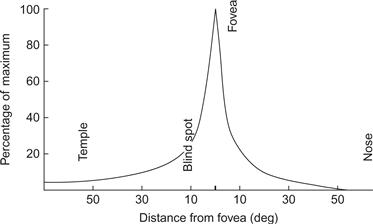
Figure 2.19 The acuity of the eye falls off rapidly with distance from the fovea.
Normal acuity measures are one dimensional; they measure our ability to resolve two points or two parallel lines as a function of the distance between them. But, if we consider the total number of points that can be perceived per unit area, this measure falls according to an inverse square law. We can actually only see one hundredth the number of points in an area at 10 degrees of eccentricity from the fovea. To put it another way, in the middle of the visual field, at the fovea, we can resolve about 100 points on the head of a pin. At the edge of the visual field, we can only discriminate objects the size of a fist.
The variation in acuity has been vividly expressed in an eye chart developed by Stuart Anstis (1974). The chart is shown in Figure 2.20. If you look at the center of the chart, each of the characters is equally distinct. To make this chart, Anstis took measurements of the smallest letter that could be seen at many angles of eccentricity from the fovea. In this version, each letter is about 5 times the smallest resolvable size for people with 20/20 vision. Anstis found that the size of the smallest distinct characters could be approximated by the simple function:
 (2.7)
(2.7)
where e is the eccentricity from the fovea measured in degrees of visual angle.

Figure 2.20 An eye chart developed by Anstis (1974). Each character is about five times the smallest perceivable size when the center is fixated. This is the case for any viewing distance.
This variation in acuity with eccentricity comes from something called cortical magnification. Visual area 1 (V1) is the primary cortical reception area for signals from the eye. Fully half of the neurons in V1 are devoted to processing signals from the central 10 degrees of vision, representing only about 3% of the visual field.
Because space in the brain is carved up very differently than the uniform pixels of a computer screen, we need a new term to talk about the image units used by the brain to process space. Let’s call them brain pixels. Although there are many areas in the brain with nonuniform image maps, retinal ganglion cells best capture the brain pixel idea. Retinal ganglion cells are neurons that send information from the eyeball up the optic nerve to the cortex. Each one pools information from many rod and cone receptors, as illustrated in Figure 2.21. In the fovea, a single ganglion cell may be devoted to a single cone, whereas in the far periphery each ganglion cell receives information from thousands of rods and cones. Each neuron has one nerve fiber called an axon, which carries the signal from each ganglion cell, and there are about a million axons in each optic nerve. The visual area that feeds into a ganglion cell is called its receptive field. Drasdo (1977) found that retinal ganglion cell size could be approximated by the function:
 (2.8)
(2.8)
where e is the eccentricity from the fovea measured in degrees of visual angle. Note that Equation 2.8 is very similar to Anstis’ equation (2.7) when we take into account that many brain pixels are needed to resolve something as complex as a letter of the alphabet. Assuming that a 7 × 7 matrix of brain pixels is needed to represent a character brings the two functions into close agreement.
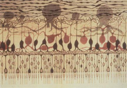
Figure 2.21 The retina is comprised of receptors and several layers of neurons. The big octopus-like neurons at the top of this drawing are retinal ganglion cells. Each integrates information from many receptors and transmits it to the brain. Illustration by Ferruccio Tartufieri (1887).
Brain Pixels and the Optimal Screen
In light of the extreme variation in the sizes of brain pixels, we can talk about the visual efficiency of a display screen by asking what screen size provides the best match of screen pixels to brain pixels. What happens when we look at the very wide-angle screen provided by some head-mounted virtual-reality displays? Are we getting more information into the brain, or less? What happens when we look at the small screen of a personal digital assistant or even a wristwatch-sized screen? One way to answer these questions is to model how many brain pixels are stimulated by different screens having different sizes but the same number of pixels. To make the comparison fair, we should keep the viewing distance constant. The two types of inefficiency that occur when we view flat displays are illustrated in Figure 2.22. At the fovea, there are many brain pixels for each screen pixel. To have higher-resolution screens would definitely help foveal vision; however, off to the side, the situation is reversed, as there are many more screen pixels than brain pixels. We are, in a sense, wasting information, because the brain cannot appreciate the detail and we could easily get away with fewer pixels. In modeling the visual efficiency of different screen sizes, we can compute the total number of brain pixels (TBP) stimulated by the display simply by adding up all of the retinal ganglion cells stimulated by a display image.
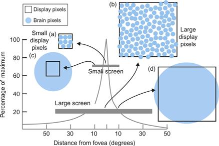
Figure 2.22 Differently sized screens having the same number of pixels have different areas of visual inefficiency. (a) With the small screen, there are 10 brain pixels per screen pixel at the center of the fovea. (b) With the large screen, the situation is worse, as there are 100 brain pixels per screen pixel at the center of the fovea. (c) At the edge of the small screen display, pixels are smaller than brain pixels. (d) At 10 degrees of eccentricity, with the big screen there is an approximate match between screen pixels and brain pixels.
We can also compute the number of uniquely stimulated brain pixels (USBP). Many brain pixels get the same signal when we look at a low-resolution screen and are therefore redundant, providing no extra information. Therefore, to count uniquely stimulated brain pixels, we use the following formula:
 (2.9)
(2.9)
To obtain a measure of how efficiently a display is being used, we take the ratio of USBP to screen pixels (SP). This measure is called display efficiency (DE).
 (2.10)
Note that if there were a perfect match, with one screen pixel for every brain pixel, we would have a display efficiency of 1.0, or 100%, but this is never the case because screen pixels are uniformly distributed and brain pixels are not.
Finally, we might be interested in the ratio between USBP and the brain pixels covered by a display. This measure of visual efficiency (VE) tells us the proportion of brain pixels in the screen area that are getting unique information.
 (2.11)
Figure 2.23 illustrates a numerical simulation of what happens to TBP and USBP as we change the size of the screen. It is based on Drasdo’s (1977) model and assumes 1 million square pixels in a 1000 × 1000 array at a constant viewing distance of 50 cm. It takes into account that pixels near the edge of a large screen are both farther away and viewed obliquely—and are therefore visually smaller than pixels in the center. In fact, their visual area declines by cos2(θ), where θ is the angle of eccentricity. For illustrative purposes, the display widths equivalent to a conventional monitor and a single wall of a Cave Automatic Virtual Environment (CAVE) display are shown (Cruz-Neira et al., 1992). A CAVE is a virtual-reality display where the participant stands in the center of a cube, each wall of which is a display screen. In Figure 2.23, the sizes have been normalized to a standard viewing distance by using equivalent visual angles. Thus, a CAVE wall of 2 meters at a viewing distance of 1 meter is equivalent to a 1 meter display at 50 centimeters, given that both have the same number of pixels.
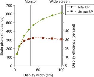
Figure 2.23 Results from a numerical simulation with a 1-million-pixel screen to show how many brain pixels are stimulated as a display increases in size. Display efficiency (right-hand scale) gives the percentage of screen pixels that uniquely influence the visual system (unique brain pixels) and only applies to the lower curve.
The simulation of the one-million pixel display reveals a number of interesting things. For a start, even though a conventional monitor covers only about 5 to 10% of our visual field when viewed normally, it stimulates almost 50% of our brain pixels. This means that even if we could have very high-resolution large screens, we would not be getting very much more information into the brain. Figure 2.23 shows that USBPs peak at a width close to the normal monitor viewing with a display efficiency of 30%, and decline somewhat as the screen gets larger. If we consider that our visual field is a precious resource and there are other things besides computer graphics that we may wish to see, this confirms that computer screens are currently about the right size for most tasks.
There is an argument that the center of the visual field is even more important for many tasks than its huge brain pixel concentration would suggest. A natural way of seeking information (discussed in Chapter 11) is to use eye movements to bring the information to the center of the visual field where we see the best. The parafovea may be optimal for pattern perception; it is an area that is about 6 degrees in diameter, centered on the fovea. Most charts and diagrams in this book are presented to be roughly parafoveal size. The periphery is undoubtedly important in situation awareness and alerting, but when visual pattern finding for decision making is required, the relatively small parafoveal region is the most critical.
The StarCAVE (DeFanti et al., 2009) is, at the time of this writing, perhaps the highest resolution completely immersive display currently available. It is a five-sided room with curved walls on which a total of 68 million pixels are projected, 34 million for each eye. Compare this with a high-quality monitor having about 2 million pixels or a high-quality cell phone display at about one-third of a million pixels.
The StarCAVE and its four-walled CAVE predecessors are the only displays that can fill the visual field of the eye. This arguably makes it very good for simulating the feel of an architectural space or for other simulator applications where a sense of presence is important. Presence is a term used by those who strive for virtual realism and is used to describe the degree to which virtual objects and spaces seem real.
But presence is not usually important in data visualization, and when we wish to understand the structure of a cell or the shape of a molecule, being inside of it does not help. We need to stand back. To best see the structure of a cell it should fill the parafovea, not the entire visual field, and ideally the most important information will fall on the fovea.
Of course, one conclusion to be drawn from this analysis is that we need more pixels in our displays. A display developed by IBM (T221) is only slightly larger than a normal desktop monitor, but it has 3840 × 2600 pixels, providing a visual quality close to that of high-quality printing. This means that when we move our eyes to a new spot we actually gain more information. The new iPhone displays make the most of a small screen by having a pixel density that matches the center of the fovea.
The brain’s way of getting new information is to make rapid eye movements of about 5 degrees on average. In a StarCAVE, when we make a rapid eye movement we get only another 10% of our brain pixels stimulated in our parafoveal region because of the low resolution. With the IBM T221, at normal viewing distances, an eye movement generates at least an additional 60% of new information within the parafovea. Ultimately, what matters is the time and mental effort required to get new information. The final chapters of this book deal with this in detail. But, for now, it is worth saying that interactive methods combined with moderately sized high-resolution screens are likely to be much more efficient than low-resolution immersive screens. They also use much less of the working environment of the user and are not as costly.
[G2.8] Use a high-resolution display with a moderate viewing angle (e.g., 40 degrees) for data analysis. This applies both to individual data analysis when the screen can be on a desktop and close to the user and to collaborative data analysis when the screen must be larger and farther away.
[G2.9] Use wrap-around screens to obtain a sensation of “presence” in a virtual space. This is useful in vehicle simulations and some entertainment systems.
Spatial Contrast Sensitivity Function
The rather simple pattern shown in Figure 2.24 has become one of the most useful tools in measuring basic properties of the human visual system. This pattern is called a sine wave grating because its brightness varies sinusoidally in one direction. There are five ways in which this pattern can be varied:

Figure 2.24 A sine wave grating.
1. Spatial frequency (the number of bars of the grating per degree of visual angle)
3. Contrast (the amplitude of the sine wave)
The grating luminance is defined by the following equation:
 (2.12)
where a is the contrast (amplitude), ω is the wavelength, ϕ is the phase angle, and x is the position on the screen. L denotes the resulting output light level in the range [0, 1], assuming that the monitor is linear (see the discussion of gamma correction in Chapter 3).
One way to use a sine wave grating is to measure the sensitivity of the eye/brain system to the lowest contrast that can be detected and to see how this varies with spatial frequency. Contrast is defined by:
 (2.14)
where Lmax is the peak luminance, Lmin is the minimum luminance, and C is the contrast. The result is called a spatial modulation sensitivity function.
Figure 2.25 is a pattern designed to allow you to directly see the high-frequency falloff in the sensitivity of your own visual system. It is a sinusoidally modulated pattern of stripes that varies from left to right in terms of spatial frequency and from top to bottom in terms of contrast. If you view this from 2 m, you can see how your sensitivity to high-frequency patterns is reduced. When it is close, you can also see a low-frequency falloff.

Figure 2.25 This grating pattern changes spatial frequency from the left to the right and varies in contrast in a vertical direction. The highest spatial frequency you can resolve depends on the distance from which you view the pattern.
The human spatial contrast sensitivity function varies dramatically with spatial frequency, falling off at both high and low values. We are most sensitive to patterns of bright and dark bars occurring at about 2 or 3 cycles per degree. Figure 2.26 shows typical functions for three different age groups. Sensitivity falls off to zero for fine gratings of about 60 cycles per degree for younger people. As we age, we become less and less sensitive to higher spatial frequencies (Owlsley et al., 1983). It is not just that the finest detail we can resolve declines with age. We actually become less sensitive to any pattern components above 1 cycle per degree.
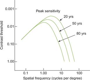
Figure 2.26 Contrast sensitivity varies with spatial frequency. The function is illustrated for three age groups. As we age, our sensitivity to higher spatial frequencies is reduced. Redrawn from Owlsley et al. (1983).
One of the practical implications of the low-frequency falloff in sensitivity is that many projectors are very nonuniform, yet this goes unremarked. A typical projector display will vary by 30% or more over the screen (it is usually brightest in the center), even if it is displaying a supposedly uniform field; but because we are insensitive to this very gradual (low-frequency) variation, we fail to notice the poor quality. Low spatial frequency acuity may also be critical for our perception of large spatial patterns as they are presented in large field displays.
Most tests of visual acuity, such as letter or point acuity, are really tests of high-frequency resolution, but this may not always be the most useful thing to measure. In tests of pilots, it has been shown that low-frequency contrast sensitivity is actually more important than simple acuity in measuring their performance in flight simulators (Ginsburg et al., 1982).
Visual images on the retina vary in time as well as in space. We can measure the temporal sensitivity of the visual system in much the same way that we measure the spatial sensitivity. This involves taking a pattern, such as that shown in Figure 2.24, and causing it to oscillate in contrast from high to low and back again over time. This temporal oscillation in contrast is normally done using a sinusoidal function. When this technique is used, both the spatial and the temporal sensitivity of human vision can be mapped out. Once this is done, it becomes evident that spatial frequency sensitivity and temporal frequency sensitivity are interdependent.
Figure 2.27 shows the contrast threshold for a flickering grating as a function of its temporal frequency and its spatial frequency (Kelly, 1979). This shows that optimal sensitivity is obtained for a grating flickering at between 2 and 10 cycles per second (Hz). It is interesting to note that the low-frequency falloff in sensitivity is much less when a pattern is flickering at between 5 and 10 Hz. If we were only interested in being able to detect the presence of blurry patterns in data, making those components of the image flicker at 7 or 8 Hz would be the best way to present them. There are many other reasons, however, why this is not a good idea; in particular, it would undoubtedly be extremely irritating. The limit of human sensitivity to flicker is about 50 Hz, which is why computer monitors and lightbulbs flicker at higher rates.
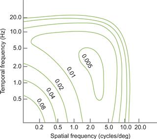
Figure 2.27 Contour map of the human spatiotemporal threshold surface. Each contour represents the contrast at which a particular combination of spatial and temporal frequencies can be detected. Redrawn from Kelly (1979).
When the spatial and temporal frequency analysis of the visual system is extended to color, we find that chromatic spatial sensitivity is much lower, especially for rapidly changing patterns. In Chapter 4, the spatial and temporal characteristics of color vision are compared to those of the black-and-white vision we have been discussing.
Visual Stress
On December 17, 1997, a Japanese television network canceled broadcasts of an action-packed cartoon because its brightly flashing scenes caused convulsions, and even vomiting of blood, in more than 700 children. The primary cause was determined to be the repetitive flashing lights produced by the computer-generated graphics. The harmful effects were exacerbated by the tendency of children to sit very close to the screen. Vivid, repetitive, large field flashes are known to be extremely stressful to some people.
The disorder known as pattern-induced epilepsy has been reported and investigated for decades. Some of the earliest reported cases were caused by the flicker from helicopter rotor blades; this resulted in prescreening of pilots for the disorder. In an extensive study of the phenomenon, Wilkins (1995) concluded that a particular combination of spatial and temporal frequencies is especially potent: Striped patterns of about 3 cycles per degree and flicker rates of about 20 Hz are most likely to induce seizures in susceptible individuals. Figure 2.28 illustrates a static pattern likely to cause visual stress. The ill effects also increase with the overall size of the pattern. Visual stress, however, may not be confined to individuals with a particular disorder. Wilkins argued that striped patterns can cause visual stress in most people. He gave normal text as an example of a pattern that may cause problems because it is laid out in horizontal stripes and suggested that certain fonts may be worse than others.
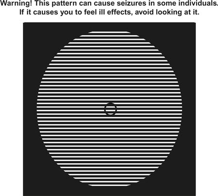
Figure 2.28 A pattern that is designed to be visually stressful. If it is viewed from 40 cm, the spacing of the stripes is about 3 cycles per degree.
[G2.10] Avoid using high-contrast grating patterns in visual displays. In particular, avoid using high-contrast grating patterns that flicker or any pattern flickering at rates between 5 Hz and 50 Hz.
The Optimal Display
Acuity information is useful in determining what is needed to produce either an adequate or an optimal visual display. A modern high-resolution monitor has about 35 pixels per centimeter. This translates to 40 cycles per degree at normal viewing distances. Given that the human eye has receptors packed into the fovea at roughly 180 per degree of visual angle, we can claim that in linear resolution we are about a factor of four from having monitors that match the resolving power of the human retina in each direction. A 4000 × 4000 pixel resolution monitor should be adequate for any conceivable visual task, leaving aside, for the moment, the problem of superacuities. Such a monitor would require 16 million pixels. The highest resolution monitor currently available is an IBM LCD display with 3840 × 2400 pixels, or more than 9 million pixels.
We come to a similar conclusion about the ultimate display from the spatial modulation transfer function. Humans can resolve a grating of approximately 50 cycles per degree in spatial frequency. If we take into account the sampling theory that states that we must sample at more than twice the highest frequency we wish to detect, this suggests that we need more than 100 pixels per degree. Perhaps 150 pixels per degree would be reasonable.
If 150 pixels per degree is sufficient, we must ask why manufacturers produce laser printers capable of 1200 dots per inch (460 dots per centimeter) or more. There are three reasons: aliasing, gray levels, and superacuities. The first two reasons are essentially technical, not perceptual, but they are worth discussing because they have significant implications in perception. The problems are significant for most display devices, not just for printers.
Aliasing
A fundamental theorem of signal transmission tells us that a signal can be reconstructed from its samples only if the samples are obtained at a frequency at least twice the highest frequency contained in the source. This is called the Nyquist limit (Gonzalez & Woods, 1993). Aliasing effects occur when a regular pattern is sampled by another regular pattern at a different spatial frequency. Figure 2.29 illustrates what happens when a pattern of black and white stripes is sampled by an array of pixels whose spacing is slightly greater than the wavelength. We assume that the pattern of input stripes is sampled at the center of each pixel. The resulting pattern has a much wider spacing. Aliasing can cause all kinds of unwanted effects. Patterns that should be invisible because they are beyond the resolving power of the human eye can become all too visible. Patterns that are unrelated to the original data can occur in Moiré fringes. This is surely the reason why the retinal mosaic of receptor cells is not regular except in small patches (Figure 2.16). Another aliasing effect is illustrated in Figure 2.30. The line shown in the top part of the figure becomes a staircase pattern when it is drawn using large pixels. The problem is that each pixel samples the line at a single point. Either that point is on the line, in which case the pixel is colored black, or it is not, in which case the pixel is colored white. A set of techniques known as antialiasing can help with this. Antialiasing consists of computing the average of the light pattern that is represented by each pixel. The result is shown in the lower part of Figure 2.30. Proper antialiasing can be a more cost-effective solution than simply increasing the number of pixels in the display. With it, a low-resolution display can be made as effective as a much higher resolution display, but it does require extra computation. Also, a full-color image requires properly antialiasing of the three color components, not just the brightness levels.
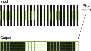
Figure 2.29 A striped pattern is sampled by pixels. The output is shown below.
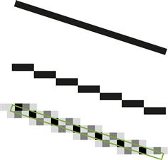
Figure 2.30 Aliasing artifacts with antialiasing as a solution.
In data visualization, aliasing effects can sometimes actually be useful; for example, it is much easier to judge whether a line is perfectly horizontal on the screen with aliasing than without it (Figure 2.31). Because of our ability to see very small line displacements (vernier acuity), aliasing makes small misalignments completely obvious. The spatial frequency amplification illustrated in Figure 2.29 can be used as a deliberate technique to magnify certain kinds of regular patterns to make invisibly fine variations visible (Post et al., 1997). It is used in optics to judge the sphericity of mirrors and lenses.
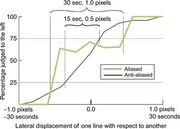
Figure 2.31 An aliased line that is not quite horizontal.
Number of Dots
The main reason why we need 1200 dots per inch on a laser printer is that the dots of a laser printer are either black or white; to represent gray, many dots must be used. Essentially, one pixel is made up of many dots. Thus, for example, a 16 × 16 matrix of dots can be used to generate 257 levels of gray because from 0 to 256 of the dots can be colored black. In practice, square patches are not used, because these cause aliasing problems. To correct aliasing effects, randomness is used in distributing the dots, and errors are propagated from one patch to neighboring patches. Most graphics textbooks provide an introduction to these techniques (e.g., Foley et al., 1990). The fact that grays are made from patterns of black and white dots means that the resolution of a laser printer actually is 1200 dots per inch only for black-and-white patterns. For gray patterns, the resolution is at least ten times lower.
[G2.11] Antialias visualizations wherever possible, especially where regular patterns, fine textures, or narrow lines are being displayed.
Superacuities and Displays
Superacuities provide a reason why we might wish to have very high-resolution monitors. As discussed earlier, superacuities occur because the human visual system can integrate information from a number of retinal receptors to give better than receptor resolution; for example, in vernier acuity, better than 10 arc-second resolution is achievable. However, in my laboratory, we have obtained experimental evidence that antialiasing can result in superacuity performance on vernier acuity tasks. This involves making judgments to see differences in the alignment of fine lines that are actually smaller than individual pixels. Figure 2.32 shows data from an experiment that my research assistant, Tim Millar, and I carried out to determine whether vernier acuity performance can be achieved to higher than pixel resolution if the lines are antialiased. In the standard vernier acuity task, subjects judge whether one vertical line is above or below another, as in Figure 2.17(d), although we did it with vertical lines displaced laterally instead. The purpose of the experiment was to determine how small a displacement can be perceived more than 50% of the time. In our study, one line was displaced horizontally by an amount that varied randomly in a range between 1 pixel and –1 pixel, corresponding to ±30 seconds of arc at the viewing distance we chose. The question asked was, “Is the lower line to the right of the upper line?” The percentage correct was computed based on the answers given over a large number of trials. By convention, vernier acuity is defined as half the difference between 25% correct performance and 75% correct performance. In Figure 2.32, two of our results are shown for aliased and antialiased lines. The actual threshold is half of each range on the x-axis. Thus, Figure 2.32 shows a 15 second vernier acuity threshold (30 seconds × 0.5) for aliased lines and a 7.5 second threshold (15 seconds × 0.5) for antialiased lines. This data shows that, given proper antialiasing, superacuity performance to better than pixel resolution can be achieved.
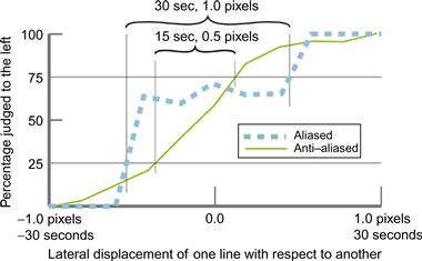
Figure 2.32 Results from an experiment showing that vernier acuity can be improved by antialiasing. The threshold is defined as half the horizontal difference between the 25% threshold and the 75% threshold.
Temporal Requirements of the Perfect Display
Just as we can evaluate the spatial requirements for a perfect monitor, so can we evaluate the temporal requirements. The limit of resolution that most of us can perceive is about 50-Hz flicker; hence, the 50- to 75-Hz refresh rate of the typical monitor would seem to be adequate. However, temporal aliasing artifacts are common in computer graphics and movies. The “reversing wagon wheel” effect is the one most often noticed (the wheel of a wagon in a western movie appears to rotate in the wrong direction). Temporal aliasing effects are especially pronounced when the image update rate is low, and it is common in data visualization systems to have animated images that are updated only about 10 times per second even though the screen is refreshed at 60 Hz or better. An obvious result is the breaking up of a moving object into a series of discrete objects. If the data contains a repetitive temporal pattern, aliasing and sampling effects can occur that are the analogs of the spatial aliasing effects. Sometimes a single object can appear to be multiple objects. To correct these problems, temporal antialiasing can be employed. Part of a moving image may pass through several pixels over the course of a single animation frame. The correct antialiasing solution is to color each pixel according to the percentage contributions of all the different objects as they pass through it for the duration of the animation frame. Thus, if the refresh rate is 60 Hz, a program must calculate the average color for each pixel that is affected by the moving pattern for each 1/60-second interval. This technique is often called motion blur. It can be computationally expensive in practice and is rarely done except in the case of high-quality animations created for the movie industry. As computers become faster, we can expect antialiasing to be more widely used in data visualization, because there is no doubt that aliasing effects can be visually disturbing and occasionally misleading.
Conclusion
In comparison with the richness of the visual world, the computer screen is simple indeed. It is remarkable that we can achieve so much with such a limited device. In the world, we perceive subtly textured, visually rich surfaces, differentiated by shading, depth-of-focus effects, and texture gradients. The computer screen merely produces a two-dimensional array of colors. Gibson’s concept of the ambient optical array, introduced at the beginning of this chapter, provides a context for understanding the success of this device, despite its shortcomings. Given a particular direction and a viewing angle of 20 degrees or so, a computer monitor is capable of reproducing many (but not all) of those aspects of the ambient array that are most important to perception. As discussed in Chapter 4, this is especially true in the realm of color, where a mere three colors are used to effectively reproduce much of the gamut to which humans are sensitive. Spatial information, in the form of texture gradients and other spatial cues, is also reproducible to some extent on a monitor; however, there are problems in the reproduction of fine texture. The actual pixel pattern may provide a texture that visually competes with the texture designed for display. As discussed in Chapter 5, this represents a serious shortcoming when we wish to use texture as a display option.
A typical monitor only stimulates perhaps 5 to 10% of the visual field at normal viewing distances, as shown in Figure 2.18. This is not as serious a shortcoming as it might seem, because the central field of view is heavily overweighted in human visual processing. In fact, looking at the center of a monitor screen from a normal viewing distance stimulates considerably more than 50% of the visual processing mechanisms in the brain.
If we wish to create artificial virtual-reality displays as a method for presenting visual data, current displays have serious problems. One of these is their lack of ability to provide focal depth-of-focus information. In the real world, the eye must refocus on objects at different distances. Because this is not the case for computer graphics presented on the screen, it can confuse our spatial processing systems. This problem will be discussed further in Chapter 7 under the heading “The Vergence–Focus Problem.”
Fortunately, the most important pattern perception mechanisms for data visualization operate in two dimensions, not three. The value of VR approaches has yet to be demonstrated although the naïve assumption that interactive 3D must be better has caused much squandering of money and resources. The good news is that we can achieve almost everything that is important without recourse to radical new technologies.