Chapter Six
Static and Moving Patterns
Data analysis is about finding patterns that were previously unknown or that depart from the norm. The stock market analyst looks for any pattern of variables that may predict a future change in price or earnings. The marketing analyst is interested in perceiving trends and patterns in a customer database. The scientist searches for patterns that may confirm or refute an hypothesis. When we look for patterns, we are making visual queries that are key to visual thinking. Sometimes the queries are vague; we are on the lookout for a variety of structures in the data or any exception to a general rule. Sometimes they are precise, as when we look for a positive trend in a graph.
The visual brain is a powerful pattern-finding engine; indeed, this is the fundamental reason why visualization techniques are becoming important. There is no other way of presenting information so that structures, groups, and trends can be discovered among hundreds of data values. If we can transform data into the appropriate visual representation, its structure may be revealed, but what is the best mapping from data to display? What does it take for us to see a group? How can two-dimensional (2D) space be divided into perceptually distinct regions? Under what conditions are two patterns recognized as similar? What constitutes a visual connection between objects? These are some of the perceptual questions addressed in this chapter. The answers are central to visualization, because most data displays are two dimensional and pattern perception deals with the extraction of structure from 2D space. Consider again our three-stage model of perception (illustrated in Figure 6.1). At the early stages of feature abstraction, the visual image is analyzed in terms of primitive elements of form, motion, color, and stereoscopic depth. At the middle 2D pattern-perception stage, active processes driven by top-down visual queries cause contours to be formed, distinct regions to be segmented, and connections to be made. At the top level, objects and scenes are discovered, using information about the connections between component parts, shape-from-shading information, and so on. Pattern perception can be thought of as a set of mostly 2D processes occurring between feature analysis and full object perception, although aspects of three-dimensional space perception, such as stereoscopic depth and structure-from-motion, can be considered particular kinds of pattern perception. Finally, objects and significant patterns are pulled out by attentional processes to meet the needs of the task at hand. There are radical differences in the kinds of processing that occur at the different stages. In the early stages, massively parallel processing of the entire image occurs. This drives perception from the bottom up, but object and pattern recognition is driven from the top down through active attention, meeting the requirements of visual thinking. At the highest level, only one to five objects (or simple patterns) are held in visual working memory from one fixation to the next, as we make comparisons and conduct visual searches.
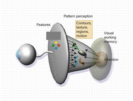
Figure 6.1 Pattern perception occurs in a middle ground where bottom-up feature processing meets the requirements of top-down active attention.
Pattern perception is the flexible middle ground where objects are extracted from patterns of features. Active processes of attention reach down into the pattern space to keep track of those objects and to analyze them for particular tasks; the essentially bottom-up processing of feature primitives meets the top-down processes of cognitive perception. Rensink (2000) called the middle ground a proto-object flux. According to Ullman (1984), active processes under top-down control, called visual routines, pull out only a small number of patterns at any given instant.
Our knowledge of pattern perception can be distilled into abstract design principles stating how to organize data so that important structures will be perceived. If we can map information structures to readily perceived patterns, then those structures will be more easily interpreted.
Gestalt Laws
The first serious attempt to understand pattern perception was undertaken by a group of German psychologists who, in 1912, founded what is known as the Gestalt school of psychology. The group consisted principally of Max Westheimer, Kurt Koffka, and Wolfgang Kohler (see Koffka, 1935, for an original text). The word Gestalt simply means “pattern” in German. The work of the Gestalt psychologists is still valued today because they provided a clear description of many basic perceptual phenomena. They produced a set of Gestalt laws of pattern perception. These are robust rules that describe the way we see patterns in visual displays, and, although the neural mechanisms proposed by these researchers to explain the laws have not withstood the test of time, the laws themselves have proved to be of enduring value. The Gestalt laws easily translate into a set of design principles for information displays. Eight Gestalt laws are discussed here: proximity, similarity, connectedness, continuity, symmetry, closure, relative size, and common fate (the last concerns motion perception and appears later in the chapter).
Proximity
Spatial proximity is a powerful perceptual organizing principle and one of the most useful in design. Things that are close together are perceptually grouped together. Figure 6.2 shows two arrays of dots that illustrate the proximity principle. Only a small change in spacing causes us to change what is perceived from a set of rows, in Figure 6.2(a), to a set of columns, in Figure 6.2(b). In Figure 6.2(c), the existence of two groups is perceptually inescapable. Proximity is not the only factor in predicting perceived groups. In Figure 6.3, the dot labeled x is perceived to be part of cluster a rather than cluster b, even though it is as close to the other points in cluster b as they are to each other. Slocum (1983) called this the spatial concentration principle; we perceptually group regions of similar element density. The application of the proximity law in display design is straightforward.
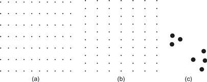
Figure 6.2 Spatial proximity is a powerful cue for perceptual organization. A matrix of dots is perceived as rows on the left (a) and columns on the right (b). In (c) we perceive two groups of dots because of proximity relationships.
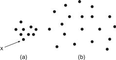
Figure 6.3 The principle of spatial concentration. The dot labeled x is perceived as part of cluster a rather than cluster b.
[G6.1] Place symbols and glyphs representing related information close together.
In addition to the perceptual organization benefit, there is also a perceptual efficiency to using proximity. Because we more readily pick up information close to the fovea, less time and effort will be spent in neural processing and eye movements if related information is spatially grouped.
Similarity
The shapes of individual pattern elements can also determine how they are grouped. Similar elements tend to be grouped together. In Figure 6.4(a, b) the similarity of the elements causes us to see rows more clearly. In terms of perception theory, the concept of similarity has been largely superseded. The channel theory and the concepts of integral and separable dimensions provide much more detailed analysis and better support for design decisions. Two different ways of visually separating row and column information are shown in Figure 6.4(c) and (d). In Figure 6.4(c), integral color and grayscale coding is used. In Figure 6.4(d), green is used to delineate rows and texture is used to delineate columns. Color and texture are separate channels, and the result is a pattern that can be more readily visually segmented either by rows or by columns. This technique can be useful if we are designing so that users can easily attend to either one pattern or the other.
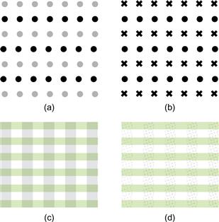
Figure 6.4 (a, b) According to the Gestalt psychologists, similarity between the elements in alternate rows causes the row percept to dominate. (c) Integral dimensions are used to delineate rows and columns. (d) When separable dimensions (color and texture) are used, it is easier to attend separately to either the rows or the columns.
[G6.2] When designing a grid layout of a data set, consider coding rows and/or columns using low-level visual channel properties, such as color and texture.
Connectedness
Palmer and Rock (1994) argued that connectedness is a fundamental Gestalt organizing principle that the Gestalt psychologists overlooked. The demonstrations in Figure 6.5 show that connectedness can be a more powerful grouping principle than proximity, color, size, or shape. Connecting different graphical objects by lines is a very powerful way of expressing that there is some relationship between them. Indeed, this is fundamental to the node–link diagram, one of the most common methods of representing relationships between concepts.
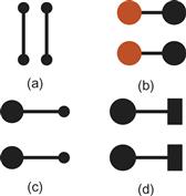
Figure 6.5 Connectedness is a powerful grouping principle that is stronger than (a) proximity, (b) color, (c) size, or (d) shape.
[G6.3] To show relationships between entities, consider linking graphical representations of data objects using lines or ribbons of color.
Continuity
The Gestalt principle of continuity states that we are more likely to construct visual entities out of visual elements that are smooth and continuous, rather than ones that contain abrupt changes in direction. (See Figure 6.6.) The principle of good continuity can be applied to the problem of drawing diagrams consisting of networks of nodes and the links between them. It should be easier to identify the sources and destinations of connecting lines if they are smooth and continuous. This point is illustrated in Figure 6.7.
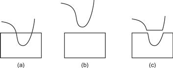
Figure 6.6 The pattern on the left (a) is perceived as a smoothly curved line overlapping a rectangle (b) rather than as the more angular components shown in (c).
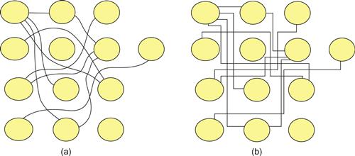
Figure 6.7 In (a), smooth continuous contours are used to connect nodes in the diagram; in (b), lines with abrupt changes in direction are used. It is much easier to perceive connections with the smooth contours.
Symmetry
Symmetry can provide a powerful organizing principle. The symmetrically arranged pairs of lines in Figure 6.8 are perceived more strongly as forming a visual whole than the pair of parallel lines. A possible application of symmetry is in tasks in which data analysts are looking for similarities between two different sets of time-series data. It may be easier to perceive similarities if these time series are arranged using vertical symmetry, as shown in Figure 6.9, rather than using the more conventional parallel plots.

Figure 6.8 The pattern on the left consists of two identical parallel contours. In each of the other two patterns, one of the contours has been reflected about a vertical axis, producing bilateral symmetry. The result is a much stronger sense of a holistic figure.
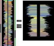
Figure 6.9 An application designed to allow users to recognize similar patterns in different time-series plots. The data represents a sequence of measurements made on deep ocean drilling cores. Two subsets of the extended sequences are shown on the right.
To take advantage of symmetry the important patterns must be small. Research by Dakin and Herbert (1998) suggests that we are most sensitive to symmetrical patterns that are small, less than 1 degree in width and 2 degrees in height, and centered around the fovea. The display on the right in Figure 6.9 is far too large to be optimal from this point of view.
We more readily perceive symmetries about vertical and horizontal axes, as shown in Figure 6.10(a, b); however, this bias can be altered with a frame of reference provided by a larger-scale pattern, as shown in Figure 6.10(c) and (d). See Beck et al. (2005).
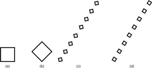
Figure 6.10 Because symmetries about vertical and horizontal axes are more readily perceived, (a) is seen as a square and (b) is seen as diamond. (c, d) A larger pattern can provide a frame of reference that defines the axes of symmetry; (c) is seen as a line of diamonds and (d) as a line of squares.
[G6.4] Consider using symmetry to make pattern comparisons easier, but be sure that the patterns to be compared are small in terms of visual angle (<1 degree horizontally and <2 degrees vertically). Symmetrical relations should be arranged on horizontal or vertical axes unless some framing pattern is used.
Closure and Common Region
A closed contour tends to be seen as an object. The Gestalt psychologists argued that there is a perceptual tendency to close contours that have gaps in them. This can help explain why we see Figure 6.11(a) as a complete circle and a rectangle rather than as a circle with a gap in it as in Figure 6.11(b).

Figure 6.11 The Gestalt principle of closure holds that neural mechanisms operate to find perceptual solutions involving closed contours. In (a), we see a circle behind a rectangle, not a broken ring as in (b).
Wherever a closed contour is seen, there is a very strong perceptual tendency to divide regions of space into “inside” or “outside” the contour. A region enclosed by a contour becomes a common region in the terminology of Palmer (1992), who showed common region to be a much stronger organizing principle than simple proximity.
Closed contours are widely used to visualize set concepts in Venn–Euler diagrams. In an Euler diagram, we interpret the region inside a closed contour as defining a set of elements. Multiple closed contours are used to delineate the overlapping relationships among different sets. A Venn diagram is a more restricted form of Euler diagram containing all possible regions of overlap. The two most important perceptual factors in this kind of diagram are closure and continuity. A fairly complex structure of overlapping sets is illustrated in Figure 6.12, using an Euler diagram. This kind of diagram is almost always used in teaching introductory set theory, and this in itself is evidence for its effectiveness. Students easily understand the diagrams, and they can transfer this understanding to the more difficult formal notation (Stenning & Oberlander, 1994).
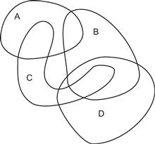
Figure 6.12 An Euler diagram. This diagram tells us (among other things) that entities can simultaneously be members of sets A and C but not of A, B, and C. Also, anything that is a member of both B and C is also a member of D. These rather difficult concepts are clearly expressed and understood by means of closed contours.
When the boundary of a contour-defined region becomes complex, what is inside or outside may become unclear. In such cases, using color, texture, or Cornsweet contours (discussed in Chapter 3) will be more effective (Figure 6.13). Although simple contours are generally used in Euler diagrams to show set membership, we can effectively define more complex sets of overlapping regions by using color and texture in addition to simple contours (Figure 6.14). Figure 6.15 shows an example from Collins et al. (2009) where both transparent color and contour are used to define extremely convoluted boundaries for three overlapping sets.
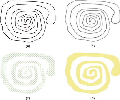
Figure 6.13 When the shape of the region is complex, a simple contour (shown in the upper left) is inadequate. (a) It is not easy to see if the x is inside or outside of the enclosed region. Common region can be defined less ambiguously by means of (b) a Cornsweet (1970) edge, (c) texture, or (d) color.
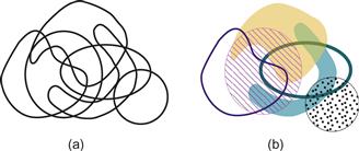
Figure 6.14 An Euler diagram enhanced using texture and color can convey a more complex set of relations than a conventional Euler diagram using only closed contours.
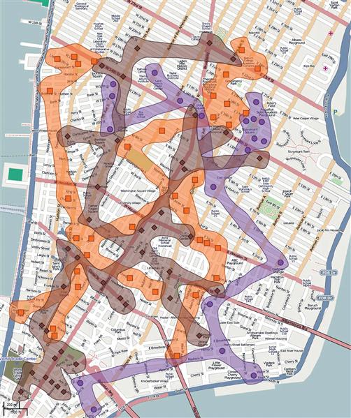
Figure 6.15 Both contour- and color-defined regions have been added to make clear the distribution of hotels (orange), subway stations (brown), and medical clinics (purple). From Collins et al. (2009). Reproduced with permission.
[G6.5] Consider putting related information inside a closed contour. A line is adequate for regions having a simple shape. Color or texture can be used to define regions that have more complex shapes.
[G6.6] To define multiple overlapping regions, consider using a combination of line contour, color, texture, and Cornsweet contours.
Both closure and closed contours are critical in segmenting the monitor screen in windows-based interfaces. The rectangular overlapping boxes provide a strong segmentation cue, dividing the display into different regions. In addition, rectangular frames provide frames of reference: The position of every object within the frame tends to be judged relative to the enclosing frame (see Figure 6.16).
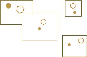
Figure 6.16 Closed rectangular contours strongly segment the visual field. They also provide reference frames. The positions and sizes of the enclosed shapes are, to some extent, interpreted with respect to the surrounding frame.
Figure and Ground
Gestalt psychologists were also interested in what they called figure–ground effects. A figure is something objectlike that is perceived as being in the foreground. The ground is whatever lies behind the figure. In general, smaller components of a pattern tend to be perceived as objects. In Figure 6.17(a), a black propeller is seen on a white background, as opposed to the white areas being perceived as objects.

Figure 6.17 (a) The black areas are smaller and therefore more likely to be perceived as an object. It is also easier to perceive patterns that are oriented horizontally and vertically as objects. (b) The green areas are seen as figures because of several Gestalt factors, including size and closed form. The area between the green shapes in (c) is generally not seen as a figure.
The perception of figure as opposed to ground can be thought of as part of the fundamental perceptual act of identifying objects. All of the Gestalt laws contribute to creating a figure, along with other factors that the Gestalt psychologists did not consider, such as texture segmentation. Closed contour, symmetry, and the surrounding white area all contribute to the perception of the two shapes in Figure 6.17(b) as figures, as opposed to cut-out holes. But, by changing the surroundings, as shown in Figure 6.17(c), the irregular shape that was perceived as a gap in Figure 6.17(b) can be made to become the figure.
[G6.7] Use a combination of closure, common region, and layout to ensure that data entities are represented by graphical patterns that will be perceived as figures, not ground.
Figure 6.18 shows the classic Rubin’s Vase figure, in which it is possible to perceive either two faces, nose to nose, or a green vase centered in the display. The fact that the two percepts tend to alternate illustrates how competing active processes are involved in constructing figures from the pattern; however, the two percepts are driven by very different mechanisms. The vase percept is supported mostly by symmetry and being a closed region. Conversely, the faces percept is mostly driven by prior knowledge, not gestalt factors. It is only because of the great importance of faces that they are so readily seen. The result is a competition between high-level and mid-level processes.

Figure 6.18 Rubin’s Vase. The cues for figure and ground are roughly equally balanced, resulting in a bistable percept of either two faces or a vase.
More on Contours
We now return to the topic of contours to discuss what recent research tells us about how they are processed in the brain. Contours are continuous, elongated boundaries between regions of a visual image, and the brain is exquisitely sensitive to their presence. A contour can be defined by a line, by a boundary between regions of different color, by stereoscopic depth, by motion patterns, or by the edge of a region of a particular texture. Contours can even be perceived where there are none. Figure 6.19 illustrates an illusory contour; a ghostly boundary of a blobby shape is seen even where none is physically present (see Kanizsa, 1976). Because the process that leads to the identification of contours is seen as fundamental to object perception, contour detection has received considerable attention from vision researchers, and contours of various types are critical to many aspects of visualization.
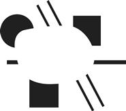
Figure 6.19 Most people see a faint illusory contour surrounding a blobby shape at the center of this figure.
A set of experiments by Field et al. (1993) proved to be a landmark in placing the Gestalt notion of continuity on a firmer scientific basis. In these experiments, subjects had to detect the presence of a continuous path in a field of 256 randomly oriented Gabor patches (see Chapter 5 for a discussion of Gabor functions). The setup is illustrated schematically in Figure 6.20. The results showed that subjects were very good at perceiving a smooth path through a sequence of patches. As one might expect, continuity between Gabor patches oriented in straight lines was the easiest to perceive. More interesting, even quite wiggly paths were readily seen if the Gabor elements were aligned as shown in Figure 6.20(a). The theory underlying contour perception is that there is mutual reinforcement between neurons that have receptive fields that are smoothly aligned; there is inhibition between neurons with nonaligned receptive fields. The result is a kind of winner-take-all effect. Stronger contours beat out weaker contours.

Figure 6.20 An illustration of the experiments conducted by Field et al. (1993). If the elements are aligned as shown in (a) so that a smooth curve can be drawn through some of them, a curve is seen. If the elements are at right angles, no curve is seen (b). This effect is explained by mutual excitation of neurons (c).
Higher order neurophysiological mechanisms of contour perception are not well understood. One result, however, is intriguing. Gray et al. (1989) found that cells with collinear receptive fields tend to fire in synchrony. Thus, we do not need to propose higher order feature detectors, responding to more and more complex curves, to understand the neural encoding of contour information. Instead, it may be that groups of cells firing in synchrony is the way that the brain holds related pattern elements in mind. Theorists have suggested a fast enabling link, a kind of rapid feedback system, to achieve the firing of cells in synchrony (Singer & Gray, 1995). The theory of synchronous firing binding contours is still controversial; however, there is agreement that some neural mechanism enhances the response of neurons that lie along a smoothly connected edge (Li, 1998; Grossberg & Williamson, 2001).
Representing Vector Fields: Perceiving Orientation and Direction
The basic problem of representing a vector can be broken down into three components: the representation of vector magnitude, the representation of orientation, and the representation of direction with respect to a particular orientation. Figure 6.21 illustrates this point. Some techniques display one or two components, but not all three; for example, wind speed (magnitude) can be shown as a scalar field by means of color coding.

Figure 6.21 The components of a vector.
There are direct applications of the Field et al. (1993) theory of contour perception in displaying vector field data. A common technique is to create a regular grid of oriented elements, such as the one shown in Figure 6.22(a). The theory suggests that head-to-tail alignment should make it easier to see the flow patterns (Ware, 2008). When the line segments are displaced so that smooth contours can be drawn between them, the flow pattern is much easier to see, as shown in Figure 6.22(c).
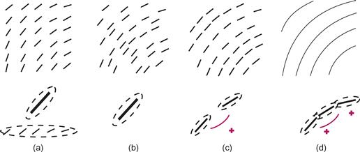
Figure 6.22 The results of Field et al. (1993) suggest that vector fields should be easier to perceive if smooth contours can be drawn through elements representing the flow. (a) A gridded pattern will weakly stimulate neurons with oriented receptive fields but also cause the perception of false contours from the rows and columns. (b) Line segments in a jittered grid will not create false contours. (c) If contour segments are aligned, mutual reinforcement will occur. (d) The strongest response will occur with continuous contours.
Instead of the commonly used grid of small arrows, one obvious and effective way of representing vector fields is through the use of continuous contours; a number of effective algorithms exist for this purpose. Figure 6.23 shows an example from Turk and Banks (1996). This effectively illustrates the orientation of the vector field, although it is ambiguous in the sense that for a given contour there can be two directions of flow. In addition, Figure 6.23 does not show magnitude.
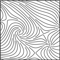
Figure 6.23 Streamlines can be an effective way to represent vector field or flow data. But here the direction is ambiguous and the magnitude is not shown. From Turk & Banks, 1996; with permission.
Comparing 2D Flow Visualization Techniques
Laidlaw et al. (2001) carried out an experimental comparison of the six different flow visualization methods, illustrated in Figure 6.24: (a) arrows on a regular grid; (b) arrows on a jittered grid to reduce perceptual aliasing effects; (c) triangle icons, with icon size proportional to field strength and density inversely related to icon size (Kirby et al., 1999); (d) line integral convolution (Cabral & Leedom, 1993); (e) large-head arrows along a streamline using a regular grid (Turk & Banks, 1996); and (f) large-head arrows along streamlines using a constant spacing algorithm (Turk & Banks, 1996).
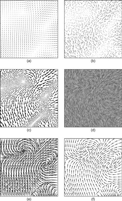
Figure 6.24 Six different flow visualization techniques evaluated by Laidlaw et al. (2001). From Laidlaw et al. (2001). Reproduced with permission.
In order to evaluate any visualization, it is necessary to specify a set of tasks. Laidlaw et al. (2001) had subjects identify critical points as one task. These are points in a vector or flow field where the vectors have zero magnitude. The results showed the arrow-based methods illustrated in Figure 6.24(a) and (b) to be the least effective for identifying the locations of these points. A second task involved perceiving advection trajectories. An advection trajectory is the path taken by a particle dropped in a flow. The streamline methods of Turk and Banks, shown in Figure 6.24(f), proved best for showing advection. The line integral convolution method, shown in Figure 6.24(d), was by far the worst for advection, probably because it does not unambiguously identify direction. It is also worth pointing out that three of the methods do not show vector magnitude at all; see Figure 6.24(d, e, f).
Although the study done by Laidlaw et al. (2001) was the first serious comparative evaluation of the effectiveness of vector field visualization methods, it is by no means exhaustive. There are alternative visualizations, and those shown have many possible variations: longer and shorter line segments, color variations, and so on. In addition, the tasks studied by Laidlaw et al. did not include all of the important visualization tasks that are likely to be carried out with flow visualizations.
Here is a more complete list:
• Judging the speed, orientation, and direction at an arbitrary point
• Identifying the location and nature of critical points
• Judging an advection trajectory
• Perceiving patterns of high and low speed (or magnitude)
• Perceiving patterns of high and low vorticity (sometimes called curl)
Both the kinds and the scale of patterns that are important will vary from one application to another; small-scale detailed patterns, such as eddies, will be important to one researcher, whereas large-scale patterns will interest another.
The problem of optimizing flow display may not be quite so complex and multifaceted as it would first seem. If we ignore the diverse algorithms and think of the problem in purely visual terms, then the various display methods illustrated in Figure 6.24 have many characteristics in common. They all consist principally of contours oriented in the flow direction, although these contours have different characteristics in terms of length, width, and shape. The shaft of an arrow is a short contour. The line integral convolution method illustrated in Figure 6.24(d) produces a very different-looking, blurry result; however, something similar could be computed using blurred contours. Contours that vary in shape and gray value along their lengths could be expressed with two or three parameters. The different degrees of randomness in the placement of contours could be parameterized; thus, we might consider the various 2D flow visualization methods as part of a family of related methods—different kinds of flow-oriented contours. Considered in this way, the display problem becomes one of optimizing the various parameters that control how vector magnitude, orientation, and direction are mapped to contour in the display.
Showing Direction
In order to show direction, something must be added to a contour to give it asymmetry along its path. A neural mechanism that can account for the perception of asymmetric endings of contours is called the end-stopped cell. Many V1 neurons respond strongly to a contour that ends in the receptive field of the cell, but only coming from one direction (Heider et al., 2000). The more asymmetry there is in the way contour segments terminate, the greater the asymmetry in neural response, so this can provide a mechanism for detection of flow direction (Ware, 2008). Figure 6.25 illustrates this concept.
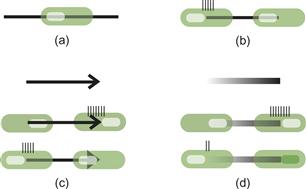
Figure 6.25 (a) An end-stopped cell (shown as a green blob) will not respond when a line passes through it. (b) It responds only when the line terminates in the cell from a particular direction. (c) This asymmetry of response will weakly differentiate the heads of arrows from their tails. (d) It will more strongly differentiate the ends of a broad line with a gradient along its length. The little bars represent neuron firing rates.
Conventional arrowheads are one way of providing directional asymmetry, as in Figure 6.25(c), but the asymmetric signal is relatively weak. Arrowheads also produce visual clutter because the contours from which they are constructed are not tangential to the vector direction.
An interesting way to resolve the flow direction ambiguity is provided in a 17th-century vector field map of North Atlantic wind patterns by Edmund Halley (discussed in Tufte, 1983). Halley’s elegant pen strokes, illustrated in Figure 6.26, are shaped like long, narrow airfoils oriented to the flow, with the wind direction given by the blunt end. Halley also arranges his strokes along streamlines. These can produce a stronger asymmetric signal than an arrowhead. We verified experimentally that strokes like Halley’s are unambiguously interpreted with regard to direction (Fowler & Ware, 1989).

Figure 6.26 Drawing in a style based on the pen strokes used by Edmund Halley (1696), discussed in Tufte (1983), to represent the trade winds of the North Atlantic. Halley described the wind direction as being given by “the sharp end of each little stroak pointing out that part of the horizon, from whence the wind continually comes.”
Fowler and Ware (1989) developed a new method for creating an unambiguous sense of vector field direction that involves varying the gray level along the length of a stroke. This is illustrated in Figure 6.27. If one end of the stroke is given the background gray level, the stroke direction is perceived to be in the direction of change away from the background gray level. In our experiments, the impression of direction produced by lightness change completely dominated that given by shape. This is what the end-stopped cell theory predicts—the greater the asymmetry between the two ends of each contour, the more clearly the direction will be seen. Unfortunately, the perception of orientation may be somewhat weakened. The problem is to get both a strong directional response and a strong orientation response.
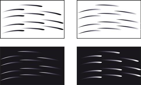
Figure 6.27 Vector direction can be unambiguously given by means of lightness change along the particle trace, relative to the background. This gives the greatest asymmetry between the different ends of each trace.
We can distill the above discussion into two guidelines.
[G6.8] For vector field visualizations, use contours tangential to streamlines to reveal the orientation component.
[G6.9] To represent flow direction in a vector field visualization, use streamlets with heads that are more distinct than tails, based on luminance contrast. A streamlet is a glyph that is elongated along a streamline and which induces a strong response in neurons sensitive to orientations tangential to the flow.
To reveal the magnitude component of a vector field, we can fall back on the basic principle of using something that produces a stronger neural signal to represent fast flow or a stronger field. Figure 6.28 gives an example that follows both guidelines G6.8 and G6.9, and in addition uses longer and wider graphical elements to show regions of stronger flow (Mitchell et al., 2009).
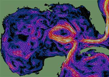
Figure 6.28 The surface currents in the Gulf of Mexico from the AMSEAS model. Head-to-tail elements are used, with each element having a more distinct head than tail. Speed is given by width, length, and background color.
[G6.10] For vector field visualizations, use more distinct graphical elements to show greater field strength or speed. They can be wider, longer, more contrasting, or faster moving.
Texture: Theory and Data Mapping
Texture can provide a whole set of subchannels for displaying information, and so far we have said little about how to accomplish this. Like color, we can use texture as a nominal code, displaying different categories of information, or as a method for representing quantity over a spatial map, using texture to provide ordinal or interval coding.
Texture segmentation is the name given to the process whereby the brain divides the visual world into regions based on texture. The Gabor model of V1 receptive fields, introduced in Chapter 5, is a key component of most theories of what makes a texture distinctive (Turner, 1986; Bovik et al., 1990; Malik & Perona, 1990). These theories of texture segmentation rely on the same set of feature maps that were introduced in Chapter 5 to account for rapid search of individual targets, so it will come as no surprise that the rules of texture segmentation are very similar to the rules for individual target salience. Indeed, the boundary between having many glyphs and having a texture is poorly defined, and texture can be thought of as a densely populated field of small glyphs.
The Malik and Perona (1990) type of segmentation model is illustrated in Figure 6.29. It has three main stages. In the first stage, feature maps of Gabor filters respond strongly to regions of texture where particular spatial frequencies and orientations predominate. In the next stage, the output from this early stage is low-pass filtered. This creates regions, each having the same general characteristics. At the final stage, boundaries are identified between regions with strongly dissimilar characteristics. This model predicts that we will divide visual space into regions according to the predominant spatial frequency and orientation information. A region with large orientation and size differences will be the most differentiated. Also, regions can be differentiated based on texture contrast. A low-contrast texture will be differentiated from a high-contrast texture with the same orientation and size components.
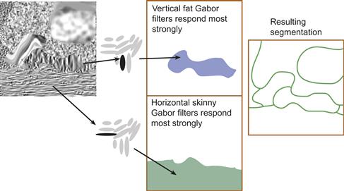
Figure 6.29 A texture segmentation model. Two-dimensional feature maps of Gabor detectors filter every part of the image for all possible orientations and sizes. Extended areas that excite similar classes of detectors form perceived regions of the image.
Figure 6.30 illustrates the Gabor segmentation theory applied to the classic perceptual conundrum. Why are the Ts and Ls difficult to distinguish? And why are they easy to distinguish when the Ts are rotated? The Gabor model accurately predicts what we see.
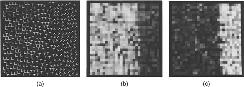
Figure 6.30 (a) The Ts and Ls in the left and middle are difficult to visually separate, but the region of rotated Ts on the right is easier to spot. (b) The output of a feature map consisting of vertical Gabors. (c) The output of a feature map consisting of oblique Gabors. From Turner (1986). Reproduced with permission.
Tradeoffs in Information Density: An Uncertainty Principle
Daugman (1985) showed that a fundamental uncertainty principle is related to the perception of position, orientation, and size. Given a fixed number of detectors, resolution of size can be traded for resolution of orientation or position. We have shown that same principle applies to the synthesis of texture for data display when we have a data field with a high degree of spatial variation (Ware & Knight, 1995). A gain in the ability to display orientation information precisely inevitably comes at the expense of precision in displaying information through size. If size is used as a display parameter, larger elements mean that less detail can be shown.
Figure 6.31 illustrates this tradeoff, with a set of textures created with Gabor functions, although the same point applies to other primitives. Recall that a Gabor is the product of a Gaussian envelope with a sine wave. In this figure, the textures are created by summing together a large number of randomly scattered Gabors. By changing the shape and size of the Gaussian multiplier function with the same sinusoidal grating, the tradeoff can be directly observed. When the Gaussian is large, the spatial frequency is specified quite precisely, as shown by the small image in the Fourier transform. When the Gaussian is small, position is well specified but spatial frequency is not, as shown by the large image in the Fourier transform. The lower two rows of Figure 6.31 show how the Gaussian envelope can be stretched to specify either the spatial frequency or the orientation more precisely. The implication here is that there are fundamental limits and tradeoffs related to the ways texture can be used for information display.
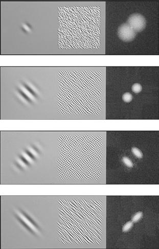
Figure 6.31 In the left-hand column are different Gabors constructed with the same sinusoidal component but with different Gaussian multipliers. The center panels show textures constructed by reducing the Gabor size by a factor of five and summing a large number using a random process. The right-hand panels show 2D Fourier transforms of the textures.
[G6.11] Consider using texture to represent continuous map variables. This is likely to be most effective where the data varies smoothly and where surface shape features are substantially larger than texture element spacing.
Primary Perceptual Dimensions of Texture
A completely general Gabor model has parameters related to orientation, spatial frequency, phase, contrast, and the size and shape of the Gaussian envelope. However, in human neural receptive fields, the Gaussian and cosine components tend to be coupled so that low-frequency cosine components have large Gaussians and high-frequency cosine components have small Gaussians (Caelli & Moraglia, 1985). This allows us to propose a simple three-parameter model for the perception and generation of texture.
Texture Contrast Effects
Textures can appear distorted because of contrast effects, just like the luminance contrast illusions that were described in Chapter 3. A given texture on a coarsely textured background will appear finer than the same texture on a finely textured background. This phenomenon is illustrated in Figure 6.32. The effect is predicted by higher order inhibitory connections. It will cause errors in reading data mapped to texture element size. In addition, texture orientation can cause contrast illusions in orientation, and this, too, may cause misperception of data (see Figure 6.33).
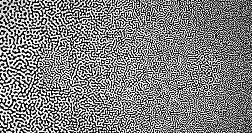
Figure 6.32 Texture contrast effect. The two patches to the left of center and the right of center have the same texture granularity, but texture contrast makes them appear different.
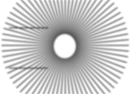
Figure 6.33 The radial texture causes the two parallel lines to the left to appear tilted.
Other Dimensions of Visual Texture
Although there is considerable evidence to suggest that orientation, size, and contrast are the three dominant dimensions of visual texture, it is clear that the world of texture is much richer than this. The dimensionality of visual texture is very high, as a visual examination of the world around us attests. Think of the textures of wood, brick, stone, fur, leather, and other natural materials. One of the important additional texture dimensions is certainly randomness (Liu & Picard, 1994). Textures that are regular have a very different quality from random ones.
Nominal Texture Codes
The most common use of texture in information display is as a nominal coding device. Geologists, for example, commonly use texture, in addition to color, in order to differentiate many different types of rock and soil. The orientation tuning of V1 neurons indicates that glyph element orientations should be separated by at least 30 degrees for a texture field of glyphs to be distinct from an adjacent texture field, and, because oriented elements will be confused with identical elements rotated through 180 degrees, fewer than six orientations can be rapidly distinguished.
Figure 6.34 shows examples of textures actually constructed using Gabor functions, randomly placed. In Figure 6.34(a), only orientation is changed among different regions of the display, and although the word TEXTURE appears distinct from its background, it is weak. The difference appears much stronger when both the spatial frequency and the orientation differ between the figure and the background, as in Figure 6.34(b). The third way that textures can be made easy to distinguish is by changing the contrast, as illustrated in Figure 6.34(c).
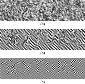
Figure 6.34 The word TEXTURE is legible only because of texture differences between the letters and the background; overall luminance is held constant. (a) Only texture orientation defines the letters. (b) Orientation and size differ. (c) Texture contrast differs.
Of course, textures can be constructed in much more conventional ways, using stripes and dots, like the examples shown in Figure 6.35, but, still, the main key to rapid segmentation will be the spatial frequency components. This figure shows the 2D Fourier transforms of the images. The theory we have been discussing suggests that the more displayed information differs in spatial frequency and in orientation, the more distinct that information will be. The psychophysical evidence suggests that for textured regions to be visually distinct the dominant spatial frequencies should differ by at least a factor of 3, and the dominant orientations should differ by more than 30 degrees, all other factors (such as color) being equal.
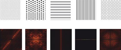
Figure 6.35 (Top row) A set of highly distinguishable textured squares, each of which differs from the others in terms of multiple spatial frequency characteristics. (Bottom row) The 2D Fourier transforms of the same textures.
[G6.12] In order to make a set of nominal coding textures distinctive, make them differ as much as possible in terms of dominant spatial frequency and orientation components. As a secondary factor, make texture elements vary in the randomness of their spacing.
The simple spatial frequency model of texture discrimination suggests that the number of textures that can be rapidly distinguished will be in the range of 12 to 24. The lower number is what we get from the product of three sizes and four orientations. When other factors, such as randomness, are taken into account, the number can be significantly larger. When we consider that in Chapter 4 we concluded that the number of rapidly distinctive color codes is fewer than 12, the use of texture clearly adds greatly to the possibility of distinctive nominal codes for areas. In addition, we can consider texture to provide a distinct channel from color, and this means that overlapping regions can be coded, as illustrated in Figure 6.14.
Using Textures for Univariate and Multivariate Map Displays
Texture can be used to display continuous scalar map information, such as temperature or pressure. The most common ways of doing this are to map a scalar variable to texture element size, spacing, or orientation. Figure 6.36 illustrates a simple texture variation using texture element size. No more than three or four steps can be reliably discriminated with such a scheme because texture elements must typically be quite small to maintain a reasonably information density, and this limits spatial channel bandwidth. Also, simultaneous contrast acting on the perceived size or orientation of texture elements can cause errors of judgment.
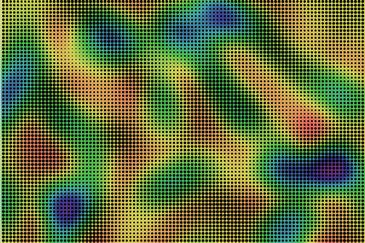
Figure 6.36 A bivariate map. One of the variables is mapped to a color sequence. The other is mapped to texture element size.
[G6.13] Use simple texture parameters, such as element size or element density, only when fewer than five ordinal steps must be reliably distinguished.
What are the prospects for encoding more than one scalar value using texture? Weigle et al. (2000) developed a technique called oriented sliver textures specifically designed to take advantage of the parallel processing of orientation information. Each variable in a multivariate map was mapped to a 2D array of slivers where all the slivers had the same orientation. Differently oriented 2D sliver arrays were produced for each variable. The values of each scalar map were shown by controlling the amount of contrast between the sliver and the background. Combining all of the sliver fields produced the visualization illustrated in Figure 6.37. The right-hand part of this figure shows the combination of the eight variables illustrated in the thumbnail patterns shown on the left. Weigle et al. conducted a study showing that if slivers were oriented at least 15 degrees from surrounding regions they stood out clearly; however, the experiment was only carried out with a single sliver at each location (unlike in Figure 6.37), making the task easier. To judge the effectiveness of the sliver plot for yourself, try looking for each of the thumbnail patterns in the larger combined plot. The fact that many of the patterns cannot easily be seen strongly suggests that the technique is not effective for so many variables. Also, tuning of orientation-sensitive cells suggests that slivers should be at least 30 degrees apart to be rapidly readable (Blake & Holopigan, 1985).
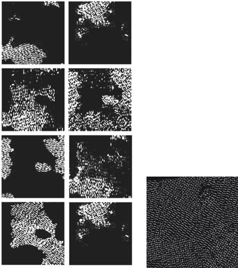
Figure 6.37 The sliver plot of Weigle et al. (2000). Each of the variables shown in the thumbnail patterns in the left part of the figure is mapped to a differently oriented sliver pattern in the combined plot. Courtesy of Chris Weigle.
Another attempt to map multiple variables to texture is illustrated in Figure 6.38. In addition to glyph color, which shows temperature, texture element orientation shows the orientation and direction of the wind. Wind speed is shown using glyph area coverage. Atmospheric pressure is shown in the number of elements per unit area. This example is based on a design by Healey et al. (2008). The reader is invited to try to see how many pressure levels are displayed (there are three) and where the highest winds are. Clearly, this is not an adequate solution for displaying forecast temperatures, pressures within a few millibars, or wind speeds within a few knots.
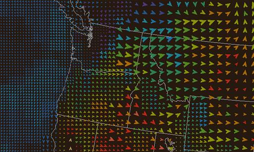
Figure 6.38 Weather patterns over the northwest continental United States. Wind orientation and direction are mapped to glyph rotation angle. Wind speed is mapped to glyph area coverage. Atmospheric pressure is mapped to density. Temperature is mapped to color.
A third example of high-dimensional data display comes from Laidlaw and his collaborators (Laidlaw et al., 1998) (Figure 6.39). This was created using a very different design strategy. Rather than attempting to create a simple general technique (like slivers), the data display mapping was handcrafted in a collaboration between the scientist and the designer. Figure 6.39 shows a cross-section of a mouse spinal column. The data has seven values at each location in the image. The image is built up in layers comprised of image intensity; sampling rate, which determines the grid; elliptical shapes, which show the in-plane component of principal diffusion and anisotropy; and texture on the ellipses, which shows absolute diffusion rate. Without specific knowledge of mouse physiology it is impossible to judge the success of this example. Nevertheless, it provides a vivid commentary on the tradeoffs involved in trying to display high-dimensional multivariate maps. In this figure, for example, each of the elliptical glyphs is textured to display an additional variable; however, the texture striations are at right angles to the ellipse major axes, and this camouflages the glyphs, making their orientation more difficult to see. The use of texture will inevitably tend to camouflage glyph shape; if the textures are oriented, the problem will be worse. In general, the more similar the spatial frequencies of the different pattern components, the more likely they are to disrupt one another visually.
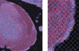
Figure 6.39 Cross-section of a mouse spinal column. Seven variables are shown at each location. Part of the image is enlarged on the right. See text for description. Courtesy of David Laidlaw.
None of the preceding three examples (Figures 6.37–6.39) shows much detail. There is a good reason for this; we only have one luminance channel, and luminance variation is the only way of displaying detailed information. If we choose to use texture (or any kind of glyph field), we inevitably sacrifice the ability to show detail, because to be clear each glyph element must be displayed using luminance contrast. Larger glyphs mean that less detail can be shown.
Texture is most likely to be valuable if two scalar variables are to be displayed. In this case, we can take advantage of the fact that color and texture provide reasonably separable channels. Although, to be visible, texture necessarily consumes at least some luminance channel bandwidth. For the two-variable problem, mapping one variable to texture and another to a carefully designed color sequence can provide a reliable solution.
[G6.14] To display a bivariate scalar field, consider mapping one variable to color and a second variable to variations in texture.
Quantitative Texture Sequences
As we have observed, simultaneous contrast causes problems when using textures just as it does with color. Because the eye judges relative sizes and other properties, large errors can result and only a few steps of absolute resolution are available. But, for many visualization problems, people wish to be able to read quantitative values from a map in addition to seeing overall patterns. The displays of atmospheric pressure and temperature are two examples. Bertin (1983) suggested using a series of textures to show quantitative values. I further developed the idea of using a carefully calibrated sequence of texture elements, each of which is monotonically lighter or darker than the previous, in order to show both quantity and form in a data set (Ware, 2009). Figure 6.40 shows an example of a 10-step sequence of texture overlaid on a map of color variation. Figure 6.41 shows a more complex example that has 14 texture steps visible, showing atmospheric pressure. This example actually uses three different perceptual channels. Motion is used for wind speed and direction, quantitative texture sequences are used for pressure, and a color sequence is used for temperature.
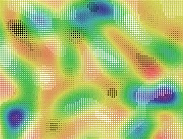
Figure 6.40 A carefully designed 10-step sequence of textures shows one variable, and a color sequence shows a second.
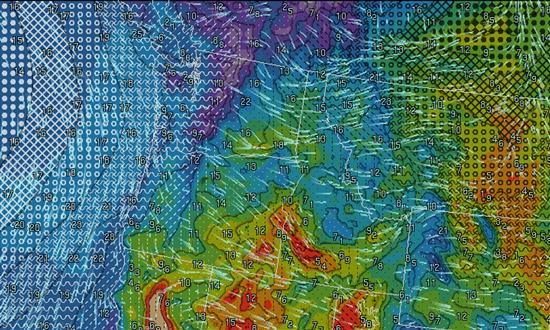
Figure 6.41 In this weather map, temperature is mapped to color. Pressure is mapped to a sequence of 14 textures. Wind orientation and direction are given using animated streaklets, and wind speed is displayed using the animation speed as well as numbers. Compare with the same data in Figure 6.38.
[G6.15] To design textures so that quantitative values can be reliably judged, use a sequence of textures that are both visually ordered (for example, by element size or density) and designed so that each member of the sequence is distinct from the previous one in some low-level property.
Perception of Transparency: Overlapping Data
In many visualization problems, it is desirable to present data in a layered form. This is especially common in geographic information systems (GISs). So that the contents of different layers are simultaneously visible, a useful technique is to present one layer of data transparently over another; however, there are many perceptual pitfalls in doing this. The contents of the different layers will always interfere with each other to some extent, and sometimes the two layers will fuse perceptually so that it is impossible to determine to which layer a given object belongs.
In simple displays, as in Figure 6.42(a), the two main determinants of perceived transparency are good continuity (Beck & Ivry, 1988) and the ratio of colors or gray values in the different pattern elements. A reasonably robust rule for transparency to be perceived is x < y < z or x > y > z or y < z < w or y > z > w, where x, y, z, and w refer to gray values arranged in the pattern shown in Figure 6.42(b) (Masin, 1997). Readers who are interested in perceptual rules of transparency should consult Metelli (1974).
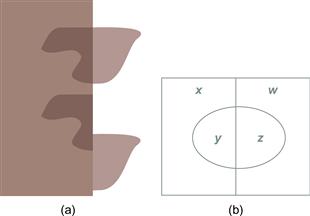
Figure 6.42 In (a) transparency depends both on the color relationships and on good continuity. (b) See text for transparency rules.
One possible application of transparency in user interfaces is to make pop-up menus transparent so that they do not interfere with information located behind them. Harrison and Vincente (1996) investigated the interference between background patterns and foreground transparent menus. They found that it took longer to read from the menu with text or wireframe drawings in the background than with continuously shaded images in the background. This is exactly what would be expected from an interference model. Because a continuously shaded image lacks the high spatial frequency detail of a wireframe image or text, there will be less interference between the two.
Another way to represent layers of data is to show each layer as a see-through texture or screen pattern (Figure 6.43). Watanabe and Cavanaugh (1996) explored the conditions under which people perceive two distinct overlapping layers, as opposed to a single fused composite texture. They called the effect laciness. In Figure 6.43(a) and Figure 6.43(b), two different overlapping shapes are clearly seen, but in Figure 6.43(c), only a single textured patch is perceived. In Figure 6.43(d), the percept is bistable. Sometimes it looks like two overlapping squares containing patterns of “—” elements, and sometimes a central square containing a pattern of “+” elements seems to stand out as a distinct region.
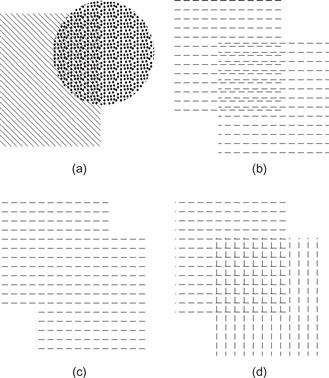
Figure 6.43 Watanabe and Cavanaugh (1996) called the texture equivalency of transparency laciness. This figure is based on their work.
In general, when we present layered data, we can expect the basic rules of perceptual interference, discussed in Chapter 5, to apply. Similar patterns interfere with one another. The problem with Figure 6.43(c) is one of aliasing. Graphical patterns that are similar in terms of color, spatial frequency, motion, and so on tend to interfere more (and fuse more) with one another than do those with dissimilar components.
[G6.16] When using overlapping textures to separate overlapping regions in a display, avoid patterns that can lead to aliasing problems when they are combined.
[G6.17] When using textures in combination with background colors for overlapping regions, choose lacy textures so that other data can be perceived through the gaps.
Because texture elements are small by definition, luminance contrast is needed to make them distinct from the background. When texture is layered transparently over other color-coded data, it is important that luminance contrast with the background coding exists; otherwise, the texture elements will not be visible. This constrains both the colors used in constructing the texture elements and the colors that can be used in the background. The easiest solution is to make the texture elements either black or white and to restrict the set of background colors so that they do not occupy either the low luminance or the high luminance end of the range, respectively.
[G6.18] When using lacy textures in combination with colors for overlapping regions, ensure luminance contrast between texture elements in the foreground and color-coded data presented in the background.
Perceiving Patterns in Multidimensional Discrete Data
One of the most interesting but difficult challenges for data visualization is to support the exploratory data analysis of discrete multidimensional data. Visualization can be a powerful tool in data mining, in which the goal is often a kind of general search for relationships and data trends. For example, marketing experts often collect large amounts of data about individuals in potential target populations. The variables that are collected might include age, income, educational level, employment category, tendency to purchase chocolate, and so on. Each of the measured variables can be thought of as a data dimension. If the marketer can identify clusters of values in this multidimensional data set related to the likelihood of purchasing different products, this can result in better targeted, more effective advertising. The task of finding particular market segments is one of finding distinct clusters in the multidimensional space that is formed by many variables.
Sometimes a scientist or a data analyst approaches data with no particular theory to test. The goal is to explore the data for meaningful and useful information in masses of mostly meaningless numbers. Plotting techniques have long been tools of the data explorer. In essence, the process is to plot the data, look for a pattern, and interpret the findings, so the critical step in the discovery process is an act of perception. The four scatterplots in Figure 6.44 illustrate very different kinds of data relationships. In the first, there are two distinct clusters, perhaps suggesting distinct subpopulations of biological organisms. In the second, there is a clear negative linear relationship between two measured variables. In the third, there is a curvilinear, inverted U-shaped relationship. In the fourth, there is an abrupt discontinuity. Each of these patterns will lead to a very different hypothesis about underlying causal relationships between the variables. If any of the relationships were previously unknown, the researcher would be rewarded with a discovery. It would be very difficult to see the patterns by scrutinizing tables of numbers. The power of a visualization method comes from enabling people to see patterns in noisy data or, in other words, letting them see meaningful signals in noise.

Figure 6.44 The scatterplot is an essential tool when looking for pattern in discrete data having two quantitative attributes.
Of course, there is an infinite variety of different meaningful patterns that may be found in data, and what is a signal in one context may be noise in another. But there are two particular kinds of patterns that are very commonly of interest: clusters and correlations. Examples are shown in the first two boxes of Figure 6.44. Conventional scatterplots like these are probably the best solution when each data point has two attributes. The problem gets more difficult when more than two numerical attributes are involved. For four attributes, it is common to add glyph size and color (Figure 6.45). Limoges et al. (1989) investigated glyph size, gray value, and the phase of oscillatory motion as a way of displaying correlations and found that subjects were most sensitive to phase differences. Nevertheless, the use of color and/or point size is well established as a method for representing three- or four-dimensional discrete data in scatterplots.
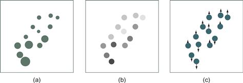
Figure 6.45 Three-dimensional discrete data. The third dimension is given by (a) point size, (b) gray value, and (c) phase of oscillatory point motion.
What do we do about data with more than three dimensions? One solution for higher dimensional discrete data display is the generalized draftman’s plot (Chambers et al., 1983). In this technique, all pairs of variables are used to create a set of 2D scatterplots. An example, from Li et al. (2010), is shown in Figure 6.46. Although the generalized drafter’s plot can often be useful, it suffers from a disadvantage in that it is very difficult to see higher dimensional data patterns that can be understood only when three or more data dimensions are simultaneously taken into account.
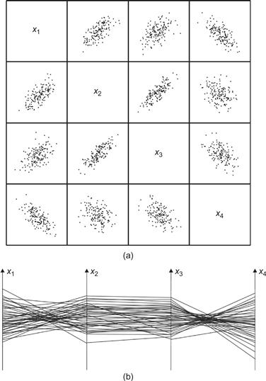
Figure 6.46 (a) Four-dimensional discrete data displayed using a generalized draftsman’s plot. (b) The same data displayed using a parallel coordinates plot. From Li et al. (2010). Reproduced with permission.
A second solution is the parallel coordinates plot (Inselberg & Dimsdale, 1990). In a parallel coordinates plot, each attribute dimension is represented by a vertical line, as shown in Figure 6.46(b) and Figure 6.47. The data points become lines that connect the various attribute values.
One of the problems with the parallel coordinates plot is that the patterns that are seen depend on the way the axes are ordered with respect to one another. It is much easier to see relationships between variables that have adjacent axes; permuting the order of the axes changes the patterns that are seen. Figure 6.47 shows views of a data set in a series of plots where the axes have been permuted in a so-called random tour. In certain arrangements, particularly the one on the right, the clusters are much more distinctive.

Figure 6.47 Parallel coordinates plot with permuted axes. From Holten & van Wijk (2010). Reproduced with permission.
In a study of subjects’ ability to see clusters in multidimensional discrete data using parallel coordinates plots, Holten and van Wijk (2010) found that a version with embedded scatterplots was the clear winner, both in terms of correctness and speed of response (Figure 6.48). This leads one to suspect that a generalized draftsman’s plot would have performed best without the parallel coordinates. A generalized draftsman’s plot is a set of 2D scatterplots that shows all pairwise combinations of dimensions.
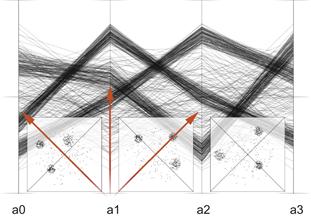
Figure 6.48 A parallel coordinates plot with embedded scatterplots. From Holten & van Wijk (2010). Reproduced with permission.
Another investigation compared scatterplots with generalized draftsman’s plots in terms of how well they allowed subjects to see correlations between variables (Li, Martens, & van Wijk, 2010). Again, the more conventional scatterplot was found to be considerably more effective than the generalized draftsman’s plot.
It is important to recognize, though, that parallel coordinates plots are intended to be used with an interactive technique called brushing. With brushing, a range on one of the axes is selected, causing the polylines passing through that range to become highlighted in some way. This makes the method become part of an exploratory process, where the instantaneous view may be less important; however, brushing can also be applied to generalized draftsman’s plots, so this is not a unique advantage.
Color mapping can be used to extend the number of displayable data dimensions to five in a single scatterplot, as shown in Figure 6.49(a). Ware and Beatty (1988) developed a simple scheme for doing this. The technique is to create a scatterplot in which each point is a colored patch rather than a black point on a white background. Up to five data variables can be mapped and displayed as follows:
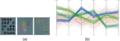
Figure 6.49 (a) Color-enhanced generalized draftsman’s plot. (From Ware & Beatty (1988). Reproduced with permission.) (b) Color-enhanced parallel coordinates plot using a method designed to help bring out clusters. From Holten & van Wijk (2010). Reproduced with permission.
In an evaluation of cluster perception in this kind of display, Ware and Beatty (1988) concluded that color display dimensions could be as effective as spatial dimensions in allowing the visual system to perceive clusters. For this task, at least, the technique produced an effective five-dimensional window into the data space, but there are drawbacks to this kind of color-mapped scatterplot. Although identifying clusters and other patterns can be easy, interpreting them can be difficult. A cluster may appear greenish because it is low on the red variable or high on the green variable. It can be difficult to distinguish the two. The use of color can help us to identify the presence of multidimensional clusters and trends, but once the presence of these trends has been determined, other methods are needed to analyze them.
Color can also be used to enhance parallel coordinates plots as well as scatterplots. Figure 6.49(b) shows an example from Holten and van Wijk, using a coloring method designed specifically to enhance the perception of clusters.
Taken together, the empirical results suggest that patterns are more readily perceived using a generalized draftsman’s set of scatterplots than using parallel coordinates.
[G6.19] To display discrete data with more than four dimensions, consider using color-enhanced generalized draftsman’s plots in combination with brushing.
Pattern Learning
If pattern perception is, as claimed, fundamental to extraction of meaning from visualizations, then an important question arises: Can we learn to see patterns better? Artists talk about seeing things that the rest of us cannot see, and ace detectives presumably spot visual clues that are invisible to the beat officer. What is the scientific evidence that people can learn to see patterns better? The results are mixed. There have been some studies of pattern learning where almost no learning occurred; an often-cited example is the visual search for the simple conjunction of features such as color and shape (Treisman & Gelade, 1980). Other studies, however, have found that learning does occur for certain types of patterns (Logan, 1994). A plausible way of reconciling the differences in results is that pattern learning occurs least for simple, basic patterns processed early in the visual system and most for complex, unfamiliar patterns processed late in the visual system. Fine and Jacobs (2002) reviewed 16 different pattern learning experiments and found very different amounts of learning. The studies they looked at all contained large numbers of trials (in which a subject would attempt to see a particular pattern in a display) distributed over several days. They found that for simple pattern-perception tasks, such as the ability to resolve a grating pattern like that shown in Figure 6.50(a), almost no learning occurred. This task depends on early-stage visual processing, for which the neural machinery is consolidated in the first few months of life. In tasks involving patterns of intermediate complexity, some learning did occur; for example, people could eventually learn to perceive spatial frequency differences within a pattern such as that shown in Figure 6.50(b). This is a “plaid” pattern constructed by summing a variety of the sinusoidal gratings. Processing of such patterns is thought to occur mostly at an intermediate stage of the visual system. The most learning was found in higher level pattern tasks, such as detecting the downward pointing triangles in Figure 6.50(c) (Sigman & Gilbert, 2000).
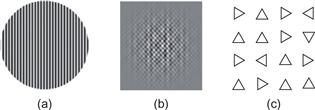
Figure 6.50 Three patterns used in perceptual learning studies.
Another factor that affects learning is the degree to which a particular pattern is already familiar. We would not expect much change in a subject’s ability to identify letters of the alphabet in a short experiment, because most people have already been exposed to millions of alphabetic characters. Rapid learning can only be expected for patterns that are unfamiliar. The change in rate of learning over time is captured by the power law of practice, which has the following form:
 (6.1)
(6.1)
This law states that the log of the time to respond on the nth trial (Tn ) is inversely proportional to the log of the number of trials. The constant C is the time taken on the first trial (or block of trials).
The power law of practice is usually applied to manual skill learning, but it has also been shown to apply to the perception of complex patterns. Kolers (1975) found that the power law applied to the task of learning to read inverted text. His results are illustrated in Figure 6.51. Initially, it took subjects about 15 minutes to read a single inverted page, but when over 100 pages had been read, the time was reduced to 2 minutes. Although Figure 6.50 shows a straight-line relationship between practice and learning, this is only because of the logarithmic transformation of the data. The relationship is actually very nonlinear. Consider a hypothetical task where people improve by 30% from the first day’s practice to the second day. Doubling the amount of practice has resulted in a 30% gain. According to the power law, someone with 10 years of experience at the same task will require a further 10 years to improve by 30%. In other words, practice yields decreasing gains over time.
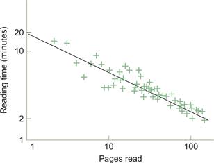
Figure 6.51 The time to read a page of inverted text is plotted against the number of pages read (Kolers, 1975). Both axes have logarithmic spacing. Data replotted from Newell & Rosenbloom (1981).
Priming
In addition to long-term pattern-learning skills, there are also priming effects that are much more transient. Whether these constitute learning is still the subject of debate. Priming refers to the phenomenon that, once a particular pattern has been recognized, it will be much easier to identify in the next few minutes or even hours, and sometimes days. This is usually thought of as a kind of heightened receptivity within the visual system, but some theorists consider it to be visual learning. In either case, once a neural pathway has been activated, its future activation becomes facilitated. For a modern theory of perceptual priming based on neural mechanisms, see Huber and O’Reilly (2003).
What are the implications of these findings for visualization? One is that people can learn pattern-detection skills, although the ease of gaining these skills will depend on the specific nature of the patterns involved. Experts do indeed have special expertise. The radiologist interpreting an X-ray, the meteorologist interpreting radar, and the statistician interpreting a scatterplot will each bring a differently tuned visual system to bear on his or her particular problem. People who work with visualizations must learn the skill of seeing particular kinds of patterns in data that relate to analytic tasks, for example, finding a cancerous growth. In terms of making visualizations that contain easily identified patterns, one strategy is to rely on pattern-finding skills that are common to everyone. These can be based on low-level perceptual capabilities, such as seeing the connections between objects linked by lines. We can also rely on skill transfer. If we know that our users are cartographers, already good at reading terrain contour maps, we can display other information, such as energy fields, in the form of contour maps. The evidence from priming studies suggests that when we want people to see particular patterns, even familiar ones, it is a good idea to show them a few examples ahead of time.
One of the main implications of perceptual learning was already stated in a guideline that was given in Chapter 1: [G1.4] Graphical symbol systems should be standardized within and across applications. This can be restated in terms of patterns.
[G6.20] Make every effort to standardize the mapping of data to visual patterns within and across applications.
Vigilance
Sometimes people must search for faint and rarely occurring targets. The invention of radar during World War II created a need for radar operators to monitor screens for long hours, searching for visual signals representing incoming enemy aircraft. This led to research aimed at understanding how people can maintain vigilance while performing monotonous tasks. This kind of task is common to airport baggage X-ray screeners, industrial quality-control inspectors, and the operators of large power grids. Vigilance tasks commonly involve visual targets, although they can be auditory. There is extensive literature concerning vigilance (for reviews, see Davies & Parasuraman, 1980; Wickens, 1992). Here is an overview of some of the more general findings.
1. Vigilance performance falls substantially over the first hour.
2. Fatigue has a large negative influence on vigilance.
3. To perform a difficult vigilance task effectively requires a high level of sustained attention, using significant cognitive resources. This means that dual tasking is not an option during an important vigilance task. It is not possible for operators to perform some useful task in their “spare time” while simultaneously monitoring for some signal that is difficult to perceive.
4. Irrelevant signals reduce performance. The more irrelevant visual information presented to a person performing a vigilance task, the more difficult the task becomes.
5. The difficulty of seeing targets varies inversely with target frequency. People are more than twice as likely to see frequent targets than rare ones (Wolfe et al., 2007).
Overall, people perform poorly on vigilance tasks, but there are a number of techniques that can improve performance. One method is to provide reminders at frequent intervals about what the targets will look like. This is especially important if there are many different kinds of targets. Another is to take advantage of the visual system’s sensitivity to motion. A difficult target for a radar operator might be a slowly moving ship embedded in a great many irrelevant noise signals. Scanlan (1975) showed that if a number of radar images are stored up and rapidly replayed, the image of the moving ship can easily be differentiated from the visual noise. Generally, anything that can transfer the visual signal into the optimal spatial or temporal range of the visual system should help detection. If the signal can be made perceptually different or distinct from irrelevant information, this will also help. The various factors that make color, motion, and texture distinct can all be applied.
Wolfe et al. (2007) found a method for counteracting the infrequent target effect. In a task that closely approximated airport screening, they showed that inserting retraining sessions into the work schedule improved detection rates considerably. These sessions contained bursts of artificially frequent targets with feedback regarding correctness of detection.
[G6.21] In search tasks for infrequent targets, insert retraining sessions during which targets are frequent and feedback is given regarding success or failure.
The Visual Grammar of Node–Link Diagrams
Diagrams are always hybrids of the conventional and the perceptual. Diagrams contain conventional elements, such as abstract labeling codes, that are difficult to learn but formally powerful. They also contain information that is coded according to perceptual rules, such as Gestalt principles. Arbitrary mappings may be useful, as in the case of mathematical notation, but a good diagram takes advantage of basic perceptual mechanisms that have evolved to perceive structure in the environment. By presenting examples, the following sections describe the visual grammar of two different kinds of diagrams: node–link diagrams and the layered maps used in GISs.
For a mathematician, a graph is a structure consisting of nodes and edges (links between the nodes). See Figure 6.52 for examples. There is a specialized academic field called graph drawing dedicated to making graphs that are pleasantly laid out and easy to read. In graph drawing, layout algorithms are optimized according to aesthetic rules, such as the minimization of link crossings, displaying symmetry of structure, and minimizing bends in links (Di Battista et al., 1998). Path bendiness and the number of link crossings have both been shown empirically to degrade performance on the task of finding the shortest path between two nodes (Ware et al., 2002). For the most part, however, there has been little attempt either to systematically apply our knowledge of pattern perception to problems in graph drawing or to use empirical methods to determine that graphs laid out according to aesthetic principles are, in fact, easier to understand.
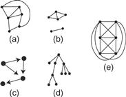
Figure 6.52 Node–link diagrams, technically called graphs: (a) A graph. (b) A graph with two connected components. (c) A directed graph. (d) A tree structure graph. (e) A nonplanar graph; it cannot be laid out on a plane without links crossing.
In the following paragraphs, we broaden the concept of a graph to consider a very large class of diagrams that we will call, generically, node–link diagrams. The essential characteristic of these diagrams is that they consist of nodes, representing various kinds of entities, and links, representing relationships between the entities. Dozens of different diagrams have this basic form, including software structure diagrams, data-flow diagrams, organization charts, and software modeling diagrams. Figure 6.53 provides four examples commonly used in software engineering. The set of abstractions common to node–link diagrams is so close to ubiquitous that it can be called a visual grammar. Entities are almost always shown using outline boxes, circles, or small symbols. The connecting lines generally represent different kinds of relationships, transitions, or communication paths between nodes.
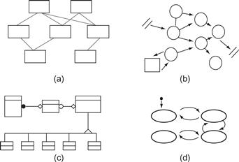
Figure 6.53 Four different kinds of node–link diagrams used in software engineering: (a) A code module diagram. (b) A data flow diagram. (c) An object modeling diagram. (d) A state-transition diagram. Each of these diagrams would normally contain text labels on the nodes and the arcs.
The various reasons why we may be justified in referring to these graphical codes as perceptual are distributed throughout this book, but are addressed mostly in this chapter and Chapter 5. The fundamental argument is that closed contours are basic in defining visual objects. Thus, although a circular line may be only a mark drawn on paper, at some level in the visual system it is objectlike. Similarly, two objects can be connected by a line, and this visual connection has the ability to represent any of a number of relationships. The likely explanation for why nodes represent entities so well and linking lines represent relationships so well is that there are deep metaphors, based on sensory perception of the world, that provide a scaffolding for even our most abstract concepts (Lakoff & Johnson, 1980; Pinker, 2007).
Although lines get their expressive power from neural mechanisms designed to interpret objects, they are fundamentally ambiguous. Kennedy (1974) elucidated several ways in which contours (lines) can represent aspects of the environment. Some of them are illustrated in Figure 6.54. A circle can represent a ring, a flat disk, a ball, a hole, or the boundary between two objects (a disk in a hole). This nicely illustrates the mixture of perception and convention that is common to diagrams. Our visual systems are capable of interpreting a line contour in any of these ways. In real-world scenes, additional information is available to clarify ambiguous contours. In a diagram, the contour may remain perceptually ambiguous, and some convention may be necessary to remove the ambiguity. In one kind of diagram, a circle may represent an object; in another, it may represent a hole; in a third, it may represent the boundary of a geographic region. The diagram convention, the context, and the Gestalt factors tells us which interpretation is correct, but contours are not subject to an infinite number of interpretations. Their power comes from the small set of general meanings that they support through deep perceptual analogies.
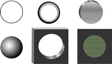
Figure 6.54 The line circle shown at the top left can represent many kinds of objects: a wire ring, a disk, a ball, a cut-out hole, or the boundary between regions of different color. More importantly, it can represent abstract concepts relating to objects.
Generally, though, the Gestalt figure–ground rules tell us that small, closed regions are likely to be seen as figures, or in other words, as objectlike. Looking ahead to the next chapter, we find theories suggesting that attributes such as color, shape, and size are mostly perceived as secondary attributes of objects.
[G6.22] When developing glyphs, use small, closed shapes to represent data entities, and use the color, shape, and size of those shapes to represent attributes of those entities.
Figure 6.55 provides a number of examples illustrating this guideline.
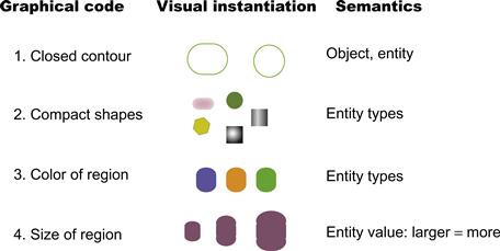
Figure 6.55 The basic visual grammar of entity representations for node–link diagrams.
A general data model that uses a form of node–link diagram is the entity–relationship model. It is widely used in computer science and business modeling (Chen, 1976). In entity–relationship modeling, entities can be objects and parts of objects, or more abstract things such as parts of organizations. Relationships are the various kinds of connections that can exist between entities (notice the metaphor in the use of the word connection). For example, an entity representing a wheel will have a part-of relationship to an entity representing an automobile. A person may have a customer relationship to a store. Both entities and relationships can have attributes. Thus, a particular customer might be a preferred customer. An attribute of an organization might be the number of its employees. There are standard diagrams for use in entity–relationship modeling, but we are not concerned with these here. We are more interested in the different ways diagrams can be constructed to represent entities, relationships, and attributes in an easily perceived manner.
The vast majority of node–link diagrams currently in use are very simple. For the most part, these diagrams use identical rectangular or circular nodes and constant width lines, like those shown in Figure 6.56. Although such generic diagrams are very effective in conveying patterns of structural relationships among entities, they are often poor at showing the types of entities and the types of relationships. Attributes, when they are shown, are often provided in the form of text labels attached to the boxes and lines, although occasionally dashed lines and other variations are used to denote types. As Figure 6.44 suggests, a great variety of graphical styles can be used to enrich diagrams and express attributes of both entities and relationships.
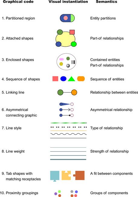
Figure 6.56 The visual grammar of relationship representations.
The visual metaphors embedded in language, in words such as connection, linkage, attachment, or part-of, suggest ways of graphically encoding relationships between entities. According to Pinker (2007), such metaphors are not embellishments to language, but reflect the basic structure of thought.
[G6.23] Use connecting lines, enclosure, grouping, and attachment to represent relationships between entities. The shape, color, and thickness of lines and enclosures can represent the types of relationships.
Figure 6.56 shows examples of graphical methods for defining relationships. Most of these methods are only useful for symmetric relationships, but in fact most relationships between entities are not symmetrical. One entity controls another in some way, or is used by another, or is part of another. A graph that shows asymmetric relationships is called directed, and a standardized convention that shows the asymmetry is a line with an arrowhead at one end. In a recent study, Holten and van Wijk (2009) showed that a better alternative exists, as illustrated in Figure 6.57. The version using the tapered lines made it significantly easier to trace relationships compared to the use of conventional arrows. A theory that explains why this may be superior is based on a concept of attention spreading along contours (Houtkamp et al., 2003). From a given node, activation should tend to spread more readily along lines that start out thick than lines that start out thin.
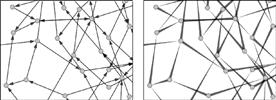
Figure 6.57 Two methods for representing directed relationships in a diagram. Research suggests that the one on the right can be interpreted more rapidly. From Holten & van Wijk (2009). Reproduced with permission.
[G6.24] As an alternative to arrows to represent directed relationships in diagrams, consider using tapered lines with the broadest end at the source node.
The Visual Grammar of Maps
A second visual grammar can be found in the way maps are designed and interpreted. As with node–link diagrams, we rely on strong visual metaphors, although in this case they are used to reason about geographical space. The terms enclosure, path, region, overlap, and connection all have visual expressions. Only three basic kinds of graphical marks are common to most maps: areas, line features, and small symbols (Mark & Franck, 1996). Figure 6.58 elaborates the basic grammar of maps and shows how areas, lines, or small symbols can work in isolation and in combination.
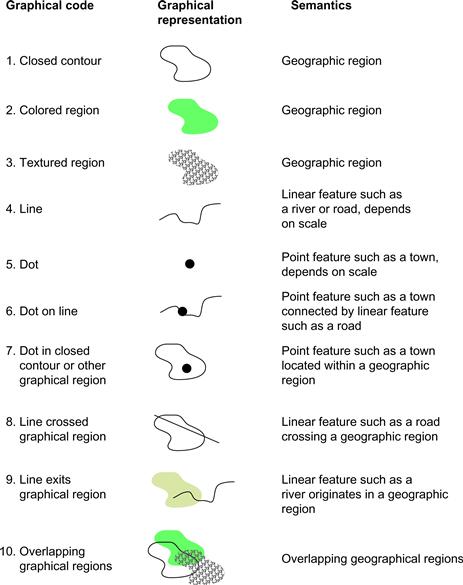
Figure 6.58 The basic visual grammar of map elements.
1, 2, 3. Geographical areas are usually denoted by closed contours, tinted areas, or textured areas. Often all three methods can be used—for example, lines to represent county boundaries, color coding to represent climate, and texture to represent vegetation.
4. Geographical linear features represent either boundaries or elongated geographical regions. The difference between geographical areas and linear features is sometimes related to scale. On a small scale, a river will be represented by a thin line of constant width; on a larger scale, it can become an extended geographical area.
5. Dots or other small symbols are used to represent point features, although whether or not something is a point feature depends on the scale. On a large scale, an entire city may be represented by a single dot; on a small scale, a dot might be used to show the locations of churches, schools, or tourist attractions.
6. A dot on a line means that the entity denoted by the point feature is on, or attached to, the entity denoted by the linear feature; for example, a city is “on” a river.
7. A dot within a closed contour means that the entity denoted by the point feature lies within the boundaries of the area feature; for example, a town is within a province.
8. A line crossing a closed contour region means that a linear feature crosses an area feature; for example, a road passes through a county.
9. A line that ends in a closed-contour region means that a linear feature ends or starts within an area feature; for example, a river flows out of a park.
10. Overlapping contour regions defined by contour, color, or texture denote overlapping spatial regions; for example, a forested region may overlap a county boundary.
[G6.25] Use closed contours, areas of texture, or areas of color to denote geographic regions. Use color, texture, or boundary style to denote the type of region.
[G6.26] Use lines to represent paths and linear geographic features. Use line color and style to represent the type of linear feature.
[G6.27] Use small, closed shapes to represent point entities, such as cities, that appear small on a map. Use color, shape, and size to represent attributes of these entities.
Maps need not be used only for geographical information. Johnson and Shneiderman (1991) developed a visualization technique they called a treemap, for displaying information about the tree data structures commonly used in computer science. Figure 6.59 shows an example of a tree data structure presented in treemap form and in a conventional node–link diagram.
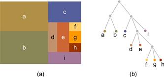
Figure 6.59 (a) A treemap representation of hierarchical data. Areas represent the amount of data stored in the tree data structure. (b) The same tree structure, represented using a conventional node–link diagram.
The original treemap was based on the following algorithm. First, the rectangle is divided with a vertical partition according to the number of branches from the base of the tree. Next, each subrectangle is similarly divided, but with horizontal partitions. This process is repeated to the leaves of the tree. The area of each leaf on the tree corresponds to the amount of information that is stored there.
The great advantage of the treemap over conventional tree views is that the amount of information on each branch of the tree can be easily visualized. Because the method is space-filling, it can show quite large trees containing thousands of branches. The disadvantage is that the non-leaf nodes are not shown and the hierarchical structure is not as clear as it is in a more conventional tree drawing. Of course, there are many hybrid designs where, for example, a node–link representation is used and the size of the node points represents some quantity.
[G6.28] Consider using a treemap to display tree structured data where it is only necessary to display the leaf nodes and where it is important to display a quantity associated with each leaf node.
[G6.29] Consider using a node–link representation of a tree where the hierarchical structure is important, where internal (non-leaf) nodes are important, and where quantitative attributes of nodes are less important.
Patterns in Motion
To this point, we have mainly discussed the use of static patterns to represent data, even though the data is sometimes dynamic—as in the case of a vector field representing a pattern of moving liquid or gas. We can also use motion as a display technique to represent data that is either static or dynamic. The perception of dynamic patterns is not understood as well as the perception of static patterns, but we are very sensitive to patterns in motion, and if we can learn to use motion effectively it may be a good way to display certain aspects of data.
We start by considering the problem of how to represent data communications with computer animation. One way of doing this is to use a graphical object to represent each packet of information and then to animate that object from the information source to its destination. In the simplest case, data is represented by a series of identical and equally spaced graphical elements, as shown in Figure 6.60. Because the elements are identical, there is a fundamental limitation on the throughput that can be represented. In a computer animation sequence, the basic process is a loop that involves drawing the animated object, displaying it, moving it, and then redrawing it. When this cycle is repeated fast enough, a sequence of static pictures is seen as a smoothly moving image. The limitation on perceived data throughput arises from the amount that a given object can be moved before it becomes confused with another object in the next frame—this is called the correspondence problem.

Figure 6.60 (a) If motion is represented using a regular sequence of identical and equally spaced elements, there is a strict limit on the throughput that can be perceived. (b, c) This limit can be extended by varying the sizes and shapes of the graphical elements.
If we define the distance between pattern elements as λ, we are limited to a maximum displacement of λ/2 on each frame of animation before the pattern is more likely to be seen as moving in the reverse direction from that intended. The problem is illustrated in Figure 6.60(a).
When all the elements are identical, the brain constructs correspondences based on object proximity in successive frames. This is sometimes called the wagon-wheel effect, because of the tendency of wagon wheels in Western movies to appear to be rotating in the wrong direction. Experiments by Fleet (1998) suggest that the maximum change per frame of animation for motion to be seen reliably in a particular direction is about λ/3 for the basic representation shown in Figure 6.60(a). Given an animation frame rate of 60 frames per second, this establishes an upper bound of 20 messages per second that can be represented.
There are many ways in which the correspondence limitation can be overcome by giving the graphical elements a different shape, orientation, or color. Two possibilities are illustrated in Figure 6.60(b) and (c). In one, the gray values of the elements are varied from message to message; in the other, the shapes of the elements are varied. Research with element shapes suggests that correspondence of shape is more important than correspondence of color in determining perceived motion (Caelli et al., 1993). In a series of experiments that examined a variety of enhanced representations like those illustrated in Figure 6.60(b) and (c), Fleet (1998) found that the average phase shift per animation frame could be increased to 3λ before correspondence was lost. Given an animation frame rate of 60 frames per second, this translates to an upper bound of 180 messages per second that can be represented using animation.
Of course, when the goal is to visualize high traffic rates, there is no point in representing individual messages in detail. Most digital communications systems transfer millions of data packets per second. What is important at high data rates is an impression of data volumes, the direction of traffic flow, and large-scale patterns of activity.
Form and Contour in Motion
A number of studies have shown that people can see relative motion with great sensitivity. For example, contours and region boundaries can be perceived with precision in fields of random dots if defined by differential motion alone (Regan, 1989; Regan & Hamstra, 1991). Human sensitivity to such motion patterns rivals our sensitivity to static patterns; this suggests that motion is an underutilized method for displaying patterns in data. For purposes of data display, we can treat motion as an attribute of a visual object, much as we consider size, color, and position to be object attributes. We evaluated the use of simple sinusoidal motion in enabling people to perceive correlations between variables (Limoges et al., 1989). We enhanced a conventional scatterplot representation by allowing the points to oscillate sinusoidally, either horizontally or vertically (or both), about a center point. An experiment was conducted to discover whether the frequency, phase, or amplitude of point motion was the most easily “read.” The task was to distinguish a high correlation between variables from a low one. A comparison was made with more conventional graphical techniques, including using point size, gray value, and x,y position in a conventional scatterplot. The results showed that data mapped to phase was perceived best; in fact, it was as effective as most of the more conventional techniques, such as the use of point size or gray value. In informal studies, we also showed that motion appears to be effective in revealing clusters of distinct data points in a multidimensional data space (see Figure 6.61). Related data shows up as clouds of points moving together in elliptical paths, and these can be easily differentiated from other clouds of points.
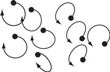
Figure 6.61 An illustration of the elliptical motion paths that result when variables are mapped to the relative phase angles of oscillating dots. The result is similar elliptical motion paths for points that are similar. In this example, two distinct groups of oscillating dots are clearly perceived.
Moving Frames
Perceived motion is highly dependent on its context. A rectangular frame provides a very strong contextual cue for motion perception, as shown in Figure 6.62(a). It is so strong that if a bright frame is made to move around a bright static dot in an otherwise completely dark environment, it is often the static dot that appears to move (Wallach, 1959). Johansson (1975) has demonstrated a number of grouping phenomena that show that the brain has a strong tendency to group moving objects in a hierarchical fashion. One of the effects he investigated is illustrated in Figure 6.62(b) and (c). In this example, three dots are set in motion. The two outer dots move in synchrony in a horizontal direction. The third dot, located between the other two, also moves in synchrony but in an oblique direction; however, the central dot is not perceived as moving along an oblique path as shown in Figure 6.62(b). Instead, what is perceived is illustrated in Figure 6.62(c). An overall horizontal motion of the entire group of dots is seen; within this group, the central dot also appears to move vertically.

Figure 6.62 (a) When a stationary dot is placed within a moving frame in a dark room, it is the dot that is perceived to move in the absence of other cues. (b) When dots are set in synchronized motion, they form a frame within which individual motion is seen. (c) The entire group of dots is seen to move horizontally, and the central dot moves vertically within the group.
Computer animation is often used in a straightforward way to display dynamic phenomena, such as a particle flow through a vector field. In these applications, the main goal from a perceptual point of view is to bring the motion into the range of human sensitivities. The issue is the same for viewing high-speed or single-frame movie photography. The motions of flowers blooming or bullets passing through objects are speeded up and slowed down, respectively, so that we can perceive the dynamics of the phenomena. Humans are most sensitive to motion ranging from 0.5 cm to 4 cm per second for objects viewed at normal screen distances (Dzhafarov et al., 1993).
[G6.30] When animation is used in a visualization, aim for motion in the range of 0.5 to 4 degrees/second of visual angle.
The use of motion to help us distinguish patterns in abstract data is at present only a research topic, albeit a very promising one. One application of the research results is the use of frames to examine dynamic flow-field animations. Frames can be used as an effective device for highlighting local relative motion. If we wish to highlight the local relative motion of a group of particles moving through a fluid, a rectangular frame that moves along with the group will create a reference area within which local motion patterns can emerge.
Another way in which motion patterns are important is in helping us perceive visual space and rigid three-dimensional shapes. This topic is covered in Chapter 8 in the context of the other mechanisms of space perception.
Expressive Motion
Using moving patterns to represent motion on communication channels, or in vector fields, is a rather obvious use of motion for information display, but there are other, more subtle uses. There appears to be a vocabulary of expressive motion comparable in richness and variety to the vocabulary of static patterns explored by the Gestalt psychologists. In the following sections, some of the more provocative results are discussed, together with their implications for data visualization.
Perception of Causality
When we see a billiard ball strike another and set the second ball in motion, we perceive that the motion of the first ball causes the motion of the second, according to the work of Michotte (translated 1963). Michotte’s book, The Perception of Causality, is a compendium of dozens of experiments, each showing how variations in the basic parameters of velocity and event timing can radically alter what is perceived. He conducted detailed studies of the perception of interactions between two patches of light and came to the conclusion that the perception of causality can be as direct and immediate as the perception of simple form. In a typical experiment, illustrated in Figure 6.63, one rectangular patch of light moved from left to right until it just touched a second patch of light and then stopped. At this point, the second patch of light would start to move. This was before the advent of computer graphics, and Michotte conducted his experiments with an apparatus that used little mirrors and beams of light. Depending on the temporal relationships between the moving light events and their relative velocities, observers reported different kinds of causal relationships, variously described as “launching,” “entraining,” or “triggering.”

Figure 6.63 Michotte (1963) studied the perception of causal relationships between two patches of light that always moved along the same line but with a variety of velocity patterns.
Precise timing is required to achieve perceived causality. Michotte found that, for the effect he called launching to be perceived, the second object had to move within 70 milliseconds of contact; after this interval, subjects still perceived the first object as setting the second object in motion, but the phenomenon was qualitatively different. He called it delayed launching. Beyond about 160 milliseconds, there was no longer an impression that one event caused the other; instead, the movements of the two objects were perceived as separate. Figure 6.64 shows some of his results. For causality to be perceived, visual events must be synchronized within at least one-sixth of a second. Given that virtual-reality animation often occurs at only about 10 frames per second, events should be frame accurate for clear causality to be perceived.
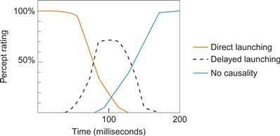
Figure 6.64 When one object comes into contact with another and the second moves off, the first motion may be seen to cause the second if the right temporal relationships exist. The graph shows how different kinds of phenomena are perceived, depending on the delay between the arrival of one object and the departure of the other. From Michotte (1963). Reproduced with permission.
If an object makes contact with another and the second object moves off at a much greater velocity, a phenomenon that Michotte called triggering is perceived. The first object does not seem to cause the second object to move by imparting its own energy; rather, it appears that contact triggers propelled motion in the second object.
More recent developmental work by Leslie and Keeble (1987) has shown that infants at only 27 weeks of age can perceive causal relations such as launching. This would appear to support the contention that such percepts are in some sense basic to perception.
The significance of Michotte’s work for data visualization is that it provides a way to increase the expressive range beyond what is possible with static diagrams. In a static visualization, the visual vocabulary for representing relationships is quite limited. To show that one visual object is related to another, we can draw lines between them, we can color or texture groups of objects, or we can use some kind of simple shape coding. The only way to show a causal link between two objects is by using some kind of conventional code, such as a labeled arrow; however, such codes owe their meaning more to our ability to understand conventional coded language symbols than to anything essentially perceptual. Arrows are used to show many kinds of directed relationships, not just causal ones. This point about the differences between language-based codes and perceptual codes is elaborated in Chapter 9. What Michotte’s work gives us is the ability to significantly enrich the vocabulary of things that can be immediately and directly represented in a diagram, although it would be premature to recommend this as a specific guideline.
Perception of Animated Motion
In addition to the fact that we can perceive causality using simple animation, there is evidence that we are highly sensitive to motion that has a biological origin. In a series of now classic studies, Gunnar Johansson attached lights to the limb joints of actors (Johansson, 1973). He then produced moving pictures of the actors carrying out certain activities, such as walking and dancing. These pictures were made so that only the points of light were visible, and, in any given still frame, all that was perceived was a rather random-seeming collection of dots, as shown in Figure 6.65(a). But, once the dots were animated, viewers were immediately conscious of the fact that they were watching human motion. In addition, they could identify the genders of the actors and the tasks they were performing. Some of these identifications could be made after exposures lasting only a small fraction of a second.
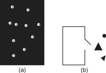
Figure 6.65 (a) In Johansson’s (1973) experiments, a pattern of moving dots was produced by making a movie of actors with lights attached to parts of their bodies. (b) Heider and Simmel (1944) made a movie of simple geometric shapes moving through complex paths. Viewers of both kinds of displays attribute anthropomorphic characteristics to what they see.
Another experiment pointing to our ability to recognize form from motion was a study by Heider and Simmel (1944). In this study, an animated movie was produced incorporating the motion of two triangles and a circle, as shown in Figure 6.65(b). People viewing this movie readily attributed human characteristics to the shapes; they would say, for example, that a particular shape was angry or that the shapes were chasing one another. Moreover, these interpretations were consistent across observers. Because the figures were simple shapes, the implication is that patterns of motion were conveying the meaning. Other studies support this interpretation. Rimé et al. (1985) did a cross-cultural evaluation of simple animations using European, American, and African subjects and found that motion could express such concepts as kindness, fear, and aggression. There was considerable similarity in these interpretations across cultures, suggesting some measure of universality.
Enriching Diagrams with Simple Animation
The research findings of Michotte, Johansson, Heider, Semmel, and others suggest that the use of simple motion can powerfully express certain kinds of relationships in data. Animation of abstract shapes can significantly extend the vocabulary of things that can be conveyed naturally beyond what is possible with a static diagram. The fact that motion does not require the support of complex depictive representations (of animals or people) for movement to be perceived as animate means that simplified motion techniques may be useful in multimedia presentations. The kinds of animated critters that are starting to crawl and hop over web pages are often unnecessary and distracting. Just as elegance is a virtue in static diagrams, so is it a virtue in diagrams that use animation. A vocabulary of simple expressive animation requires development, but research results strongly suggest that this will be a productive and worthwhile endeavor. The issue is pressing, because animation tools are becoming more widely available for information display systems. More design work and more research are needed.
The Processes of Pattern Finding
We conclude this chapter with some remarks on the process within which the pattern-finding machinery of the brain operates. When we look at something that is well known to us, what we perceive is largely a product of information stored in our brains. For the most part we see what we know, but the discovery of novel patterns is very different, since the brain does not have the same memory resources to build meaning.
In data exploration, cognitive task demands lead to the formation of visual queries, and this results in a retuning of the different channels. If the task seems to require information stored in color channels, then that information will be neurally enhanced, and colored targets will become more distinct. In this respect, looking for patterns is the same as looking for individual glyphs, as discussed in the previous chapter.
Ullman (1984) proposed that low-level processes run in the brain to pull out abstract patterns, and, in this chapter, we have seen research suggesting how these may operate in terms of extended contours, and suggested that similar mechanisms exist for regions of common texture or color. A key point about Ullman’s theory is that only a small number of pattern operators can run simultaneously. We can only mentally trace a very small number of contours, probably fewer than five at the same time, if they are simple and only one that is slightly more complex. The same goes for regions defined by texture or color. The theory of attentional shrouds proposes that there are mechanisms whereby regions of different texture compete for attention (Bhatt et al., 2007). How attention is allocated to them depends both on how salient they are and the top-down influence of visual queries derived from the cognitive task of the moment.
Figure 6.66 is designed to support a phenomenological self-experiment. It deliberately uses different channels in showing a variety of interrelated structures. To appreciate it, make visual queries such as “Are all the yellow squares connected by the red lines?” or “What kinds of symbols lie on the blue region?” Notice how, as you look at the display to answer these questions, certain features become more visually distinct and others fade. This is due to both eye movements and the action of attention acting through the medium of the visual channels, pulling out certain pattern components. In later chapters, we will delve deeper into the processes of visual thinking, but for now it is important to note that there are strict limits on the complexity of a novel pattern that can be held in the mind. Beyond a certain complexity, novel patterns cannot be easily grasped.
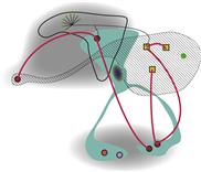
Figure 6.66 Try this subjective experiment. Attend to different components and notice how the other parts fade from consciousness.