Chapter eleven. 31 practical logo design tips
We’ve covered a lot of ground up to this point. Although writing about the design process and all its intricacies could amount to many more books of a similar size, let alone one, by now you should have a good grasp of what’s required to go out and create your own iconic brand identities.
This penultimate chapter of the book provides a refresher for those looking for a brief roundup. Here you’ll find a rundown of 31 tips, and while many of them have been discussed in more detail in previous chapters, there are a few noted for the first time.
1. Interview your client
From the beginning of any design project, you need to ask your client questions. Lots of them. You need to have a comprehensive understanding of your client’s desires, as well as who the competition is and what’s been done with past identities. The last thing you want is to discover near the end of the project that a previously unknown competitor uses a similar mark, or that the style of design just simply doesn’t relate to your client’s goals.
2. Think clearly
The public will most likely glance at the logos you design for only a second or two before moving on. So clarity is key, especially when the brand isn’t well-known. For instance, a client’s handwriting may look pretty, but if most people can’t read it immediately, then don’t consider using it to form a wordmark.
3. Expect the unexpected
If you’re unsure how long a task will take to complete, always estimate longer. For instance, if you think it will take one week to act upon client feedback and to deliver revised artwork, say it takes two, and then pleasantly surprise your client by delivering sooner than expected. Design projects are like construction work—you piece lots of little elements together to form a greater whole, and setbacks can crop up at any time.
4. A logo doesn’t need to show what a company does
The Tiger Woods logo isn’t a golf club. The Virgin Atlantic logo isn’t an airplane. The Aston Martin logo isn’t a car.
Dentist logos don’t need to show teeth, plumbing logos don’t need to show toilets, and furniture store logos don’t need to show furniture.
Just because it’s relevant doesn’t mean you can’t do better using a design that shows something different from the product or service your client provides.
Egg-n-Spoon Sameday Couriers
By Thoughtful Studios
“Speed with care.”
5. A symbol isn’t always necessary
Sometimes your client just needs a professional wordmark to identify his business. The use of a symbol can be an unnecessary addition.
You may want to ask your client if she has a preference one way or the other. If the company is considering future expansion into other markets, it might be better to opt for a distinctive wordmark, because an identifying symbol could prove restrictive, especially if the symbol is a literal interpretation of what your client is selling at that point in time.
6. Offer one thing to remember
All strong logos have one single feature that helps them stand out. Apple has the bite. Mercedes has the three-pointed star. The Red Cross has, well, the red cross.
Leave your client with just one thing to remember about the mark you’ve created.
One thing. Not two, three, or four.
Just one.
Curious Pictures
By Paula Scher, Pentagram

7. Treasure your sketchpad
You don’t need to be an artist to realize the benefits of sketching during the design process. Imaginative ideas flow much faster when you use a pen and paper compared to a mouse and monitor. Carry a notebook with you as much as possible because you never know when an idea might present itself.
8. Leave trends to the fashion industry
Trends come and go. When you’re talking about changing a pair of jeans, or buying a new dress, then following trends can work for you. But where your client’s brand identity is concerned, longevity is key.
Don’t follow the pack.
Stand out.
Nottingham Jazz
By Glad Creative

10. Work in black and white
It doesn’t matter how beautiful your color spectrum is—no amount of gradients or color choices will rescue a poorly designed mark.
By leaving color until toward the end of the process, you and your client aren’t distracted by a preference for, say, blue, which leaves you free to focus on the idea.
11. Keep it relevant
Are you designing for a law firm? Ditch the fun approach. Designing for a kid’s TV show? Nothing too serious. A Michelin star restaurant? Probably best to avoid bright, fluorescent colors. I could go on, but you get the gist.
12. Understand print costs
Ask your client early if she has a specific printing budget, because your suggested embossing or die cut or report binding or quality paper stock might not be affordable, which could place a few limits on the project scope. Every printer’s prices are unique. With some printers, you might find that full-color print costs are on par with single-color jobs, or that one printer charges more than another for the same paper stock. It’s your job to inform the client about commercial print requirements and limitations early in the process.
13. Preserve brand equity
Many visual identities are accompanied by style guides, and the creation of these guides will often be your responsibility. They ensure that anyone within the client’s company who uses the design does so in a way that keeps everything looking as it should, preserving brand equity. Consistency breeds trust. Trust wins customers.
14. Match the type to the symbol
Display a level of unity across the logos you design. For example, if you show a playful symbol, match it with a playful typeface. If your symbol uses a heavy line weight, don’t pair it with thin characters.
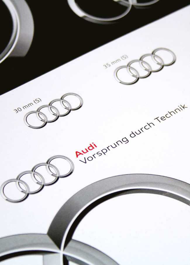
Audi
By MetaDesign
15. Tag it
Taglines tend to come and go much faster than logos, but it can be important to present your designs with and without these brief client statements.
16. Offer a single-color version
A logo might contain a number of different colors, but it’s good practice to supply a version that uses just one. It’s a small addition to what you deliver, but by doing so you’ll save your client from coming back to you if the company opts for a single-color print run.
17. Pay attention to contrast
Whether a design brief calls for a soft approach or something that’s in your face, the contrast levels of your work can make a huge difference to the outcome. Your changes might be subtle, but they make you the expert you are.
18. Test at a variety of sizes
Try printing the marks you design to appreciate how they look on paper rather than on screen. But don’t just print a single logo. Replicate the design at a range of sizes for variation. If a symbol loses detail at small sizes, you can always create different versions for different measurements, where a small-scale symbol might contain fewer and heavier lines than one that’s large scale.
19. Reverse it
Offer clients a logo option that works on dark backgrounds—in other words, supply a white version. It’s such a quick alteration to make, but one that your client will appreciate.
20. Turn it upside down
Just because your design looks okay the right way up doesn’t mean it will be as suitable when viewed upside down. If your logo appears on the cover of a report that’s sitting on a coffee table, for example, you don’t want people who are viewing it upside down to see a phallic symbol. Consider your design from all angles before finalizing it.
Ann
By Kevin Burr,
Ocular Ink

21. Don’t neglect the substrate
The paper or card stock on which a logo is printed can make a very big difference to how it appears on final presentation. The color and sharpness of your logo can change dramatically. So be sure to discuss all the possibilities for variation with your commercial printer (or advise your client about it) before final production.
22. Know enough about trademark registration
Registering a trademark can prevent legal issues for your client. But the actual registration process is lengthy and complex, so it’s worth passing the task to a trademark lawyer. Even so, learn what you can about the process so that you’re prepared for any basic questions your client might have.
23. Don’t be afraid of mistakes
Everyone makes mistakes. Learn from them, and move on.
24. Be flexible
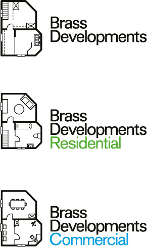
Your client may need the option to extend or grow the logo in line with an expanding market strategy. Ask yourself how sub-brands will be identified.
Brass Developments
By Glad Creative
25. A logo is just one small but important element
A logo is not a brand; it’s one part of a company’s brand identity. The brand, as a whole, represents much more—the mission of the company, its history, people’s perceptions of it, and so on. Given time, an effective logo plays an important role, but it will never save a poor product or service.
26. Remember, it’s a two-way process
Projects don’t always pan out the way you think they will. Your client might request something you don’t initially agree with. If this happens, work with him on what he wants, and if you still disagree, then show what you believe is an improvement, and give your reasons why. Your clients will be more open to your ideas if you’re open to theirs.
27. Differentiation is key
If the competition is using blue and green, it will clearly help to differentiate your client by choosing red or orange. As Marty Neumeier said: “When everybody zigs, zag.”
28. Exercise cultural awareness
Gestures and colors can mean different things in different parts of the world. Clients who trade internationally need to pay particular attention to the varying cultures of their customers, and as such, that’s something you need to consider, too. For example, some cultures read left to right, others read right to left, so a design that displays a sense of direction can be interpreted as forward or backward depending on where you live.
29. Aid recognition
Keeping your designs simple makes it easier for people to recognize the logos the next time they see them. Consider large corporations like Mitsubishi, Samsung, FedEx, and BBC. Their logos are simple in appearance, and they’re easier to recognize because of it. Simplicity also allows for flexibility in size. Ideally, your logo will work at a minimum of around one inch without loss of detail, but remember that it’s possible to create slightly different versions for different size reproductions.
Kairos
By David Airey
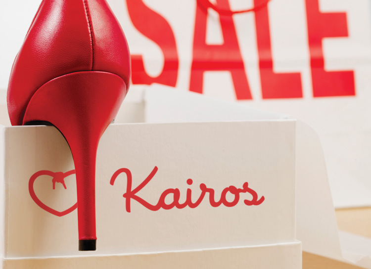
30. Give context
Applying your logos to a variety of touchpoints can help clients to buy into your ideas. One of my projects was for Kairos, a shoe store in England. My design ideas were presented as they would be seen by potential customers.
31. Make people smile
Don’t be afraid to show some wit.
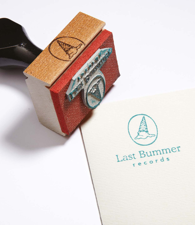
Last Bummer Records
By High Tide
Photograph by
Kevin Kunstadt
